Base Guide 7.2
Chapter 4
Forms
This document is Copyright © 2021 by the LibreOffice Documentation Team. Contributors are listed below. You may distribute it and/or modify it under the terms of either the GNU General Public License (https://www.gnu.org/licenses/gpl.html), version 3 or later, or the Creative Commons Attribution License (https://creativecommons.org/licenses/by/4.0/), version 4.0 or later.
All trademarks within this guide belong to their legitimate owners.
|
Pulkit Krishna |
Dan Lewis |
|
|
Robert Großkopf |
Pulkit Krishna |
Jost Lange |
|
Dan Lewis |
Hazel Russman |
Jochen Schiffers |
|
Jean Hollis Weber |
|
|
Please direct any comments or suggestions about this document to the Documentation Team’s mailing list: documentation@global.libreoffice.org.
Note
Everything you send to a mailing list, including your email address and any other personal information that is written in the message, is publicly archived and cannot be deleted.
Published December 2021. Based on LibreOffice 7.2 Community.
Other versions of LibreOffice may differ in appearance and functionality.
Forms are used when direct entry into a table is inconvenient, to pick up errors in data entry promptly, or when too many tables make direct management of data impossible.
Note
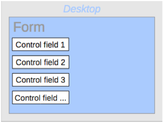
A form in Base is a structure invisible to the user. It serves within Base to allow contact with the database. What is visible to the user is the set of controls, which serve for the entry or display of text, numbers, etc. These controls are divided by the GUI into various types.
The term Form has two meanings. It can stand for the whole content of the input window which is used to manage data for one or more tables. Such a window can hold one or more main forms, and each of these can contain subforms. The word Form is also used for these partial areas. It should be clear from the context which meaning is intended so that misunderstandings should be avoided.
The simplest way to create a form is to use the Form Wizard. Use of it to create a form is described in Chapter 8, Getting Started with Base, in the Getting Started Guide. That chapter also explains how you can further modify the form after using the Wizard.
This guide describes the creation of a form without using the Wizard. It also describes the properties of the various types of controls in a form.
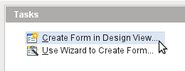
We start by using the task Create Form in Design View in the Forms area of the main Base window.
This calls up the Form Editor and the form is shown in the Design View window (Figure 1).
The Form Controls toolbar is docked on the left side. The Form Design toolbar (Figure 2) is docked at the bottom. If these toolbars do not appear automatically, use View > Toolbars to display them. Without these toolbars, it is not possible to create a form.
Figure 1: Form shown in Design View
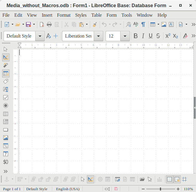
The blank area shows a grid of dots. This grid helps you to position the controls accurately, especially in relation to each other. The symbols at the right end of the Form Design toolbar show that the grid is visible and active. The last three symbols should be visible and active. If not all are, click the ones that are not.
A form is created on the empty page. This can be done in two ways:
Use the Form Navigator to set up a form, or
Design the form controls and set up the form by using the context menu.
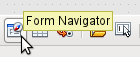
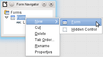
To display the Form Navigator, click the Form Navigator button (shown in Figure 3). A window appears (Figure 2); it shows only one folder, labeled Forms. This is the highest level of the area that we are editing. Several forms can be accommodated here.
Figure 2: Using the Form Navigator to create a new form
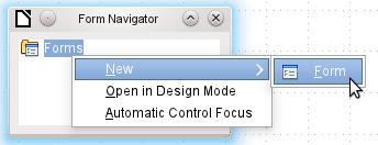
Figure 3: Form Design toolbar

In the Form Navigator (Figure 2), right-click on Forms to open a context menu. Choose New > Form to create a new form. The other choices in the context menu (Open in Design Mode and Automatic Control Focus) correspond to buttons in Figure 4; we will discuss them later.
Note
To launch a form with the cursor in the first field, use the option Automatic control focus. What counts as the first element is determined by the form’s activation sequence.
Unfortunately there is currently a bug (Bug 87290) in this function. If a form contains a table control, the focus is set automatically to the first field in this control. Oddly enough, this bug is cured if, after choosing automatic control focus, you change the user interface language.
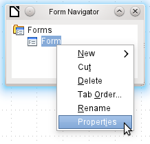
The form carries the default name Form. You can change this name immediately or later. It has no significance unless you need to access some part of the form using macros. The only thing you need to ensure is that two elements with the same name do not occur on the same level in the folder tree.
The context menu of the form (shown below) provides the way to create form properties.
The Form Controls toolbar (Figure 4) contain the buttons with which the controls (label plus field) can be created. Not all of the buttons are directly visible along the left side of the form. Click the bottom button (») to see the rest of the visible buttons. To see all of the buttons both visible or not, right-click any part of the toolbar and select Visible Buttons. The visible buttons are checked; the unchecked ones are not.
This permits selecting the buttons that the user wants to use regularly while removing the undesirables. As an example, the Table Control button is not visible, but can be made so by first locating it in the list of all of the button and then checking it.
Figure 4: Form Controls

When you select a form control, you automatically create a form. For example, suppose you choose a text field: the cursor changes shape and a rectangular shape may be drawn on the white surface of the form. Then, on the stippled surface of the form, a text field appears.
Now you can create the form by right-clicking and using the context menu for the control (Figure 5).
Figure 5: Context menu for form
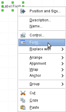
Select the Form menu option (highlighted in the illustration) to set properties for the form you have just created. The form has the default name Form.
As well as forms that are created within Base, there is also a possibility to create forms in Writer or Calc. These are described in Chapter 7, Linking to Databases.
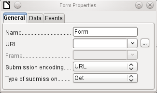
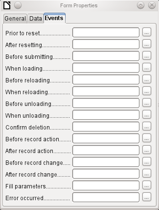
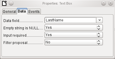
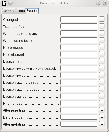
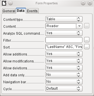
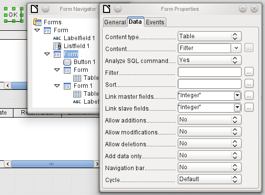
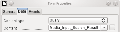
When the form properties are called up using the context menu in the Form Navigator or the context menu of a form control, a Form Properties window appears. It has three tabs: General, Data and Events.
General tab
Data tab
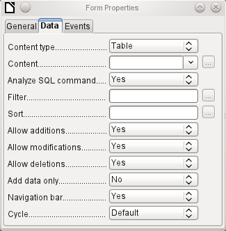
Tip
This property can be useful when there is data is to be added to the database but the person doing it is not allowed to only enter it but not to modify it in any way. Modification is to be left for another person to do with a different form which allows doing this.
Events tab
Once a form has been created, it can be filled with visible controls. Some controls allow the content of the database to be displayed or data to be entered into the database. Other controls are used exclusively for navigation, for searching, and for carrying out commands (interaction). Some controls serve for additional graphical reworking of the form.
|
Control |
Use |
|
Text field |
Text entry |
|
Numeric field |
Entering numbers |
|
Date field |
Entering dates |
|
Time field |
Entering times |
|
Currency field |
Numeric entry, preformated for currency |
|
Formatted field |
Display and entry with additional formatting, for example using measurement units |
|
List box |
Choosing between several different possibilities, also for transfer into the database of values other than those displayed |
|
Combo box |
Similar to a list field, but with only the displayed value transferred, or you can enter new values by hand |
|
Check box |
Yes/No Field |
|
Options button |
Radio button; allows you to choose from a small number of possibilities |
|
Image control |
Display of images from a database and entry of images into a database via a path selection |
|
Pattern field |
Entry into a preset mask; limits the entry possibilities to specific character combinations |
|
Table control |
Universal entry module, which can display a whole table. |
|
Design |
|
|
Control |
Use |
|
Label field |
Heading for the form, description of other controls |
|
Group box |
A frame around, for example, a set of option buttons |
|
Control |
Use |
|
Button |
Button with label |
|
Image button |
Like a button, but with an additional image (graphic) displayed on it |
|
Navigation bar |
Toolbar very similar to the one at the bottom edge of the screen |
|
File selector |
For selecting files, for example to upload in an HTML form—not further described |
|
Spin box |
Can only be used with a macro—not further described |
|
Scrollbar |
Can only be used with a macro—not further described |
|
Hidden control |
Here a value can be stored using macros and then read out again, |
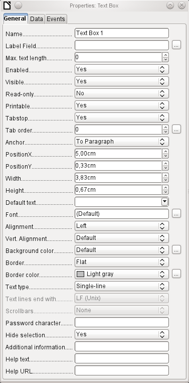
As with forms, control properties are grouped into three categories: General, Data, and Events. General comprises everything that is visible to the user. The Data category specifies the binding to a field in the database. The Events category controls actions, which can be bound to some macro. In a database without macros, this category plays no role.
General tab
|
|
The name of a control must be unique within the form—used to access using macros. |
|
|
Does the field have a label? This groups field and label together. A label allows the form field to be reached directly with a keyboard shortcut. |
|
|
Non-enabled fields cannot be used and are grayed out. Useful to control using macros. (Example: If Field 1 contains a value, Field 2 must not contain one; Field 2 is deactivated.) |
|
|
Usually Yes; invisible fields can be used as intermediate storage, for example in creating combination fields with macros. See Chapter 9, Macros. |
|
|
Yes will exclude any modification of the value. This is useful, for example, for an automatically generated primary key. |
|
|
Sometimes it is useful to print a page from a form rather than a separate report. In this case, not all fields may be required to appear. |
|
|
Within a form, the Tab key is normally used for navigation. |
|
|
Does the field have a tab stop? Here the activation sequence within the form is specified. |
|
|
Anchoring of graphics within a text field. |
|
|
Position from the top left corner relative to the left side of the form. |
|
|
Position from the top left corner relative to the top of the form. |
|
|
Width of the field. |
|
|
Height of the field. |
|
|
Font, font size, and font effects can be set here. |
|
|
Alignment. Here text entry is left-justified. |
|
|
Vertical alignment: Standard | Top | Middle | Bottom. |
|
|
Background color of the text field. |
|
|
Framing: No frame | 3D-Look | Flat. |
|
|
If there is a frame, its color can be set here only if Flat is selected as the border. |
|
|
Highlighted text loses the highlight when the text field loses focus. |
|
|
Used for information to be read by macros. See Chapter 9, Macros. |
|
|
Appears as a tooltip when the mouse is hovered over the text field. |
|
|
Points to a help file, useful mostly for HTML. Can be invoked using F1 when the focus is on the field. |
In addition, numeric, date fields, etc. have the following properties.
|
|
With testing enabled, only numbers and decimal points may be entered. |
|
|
Never does not allow alterations using the mouse wheel; When selected allows such changes when the field is selected and the mouse is over the field; Always means whenever the mouse is over the field. |
|
|
A spin symbol is incorporated into the right side of the field. |
|
|
If a spin arrow is pressed down and held, this determines if the entry in the box should be incremented beyond the next value. |
|
|
Determines the minimum delay after a mouse button press that triggers repetition. |
Data tab
Caution
Caution – with large contents, this choice can use a lot of storage.
Events tab
Caution
Under no circumstances must the macro create a message dialog on the screen; clicking in such a dialog causes the form field to lose the focus and then recover it, triggering the macro again. A loop is created which can only be broken by using the keyboard.
As well as the properties set out on page 11, text fields can have the following additional properties:
General tab
|
|
When this value is 0, entry is not permitted. Usually the length of the database field to which the text field corresponds is used here. |
|
|
Should default text be put into an empty field? This text must be deleted if any other entry is to be made successfully. |
|
|
Possible types: Single-line | Multi-line | Multi-line with formatting (the last two differ in tabbing behavior and, in addition, a pattern field can not be bound to a database). The vertical alignment is not active for multi-line fields. |
|
|
Unix or Windows? This mainly affects line endings. Internally Windows lines end with two control characters (CR and LF). |
|
|
Only for multi-line fields: Horizontal | Vertical | Both. |
|
|
Active only for single-line fields. Changes characters to see only points. |
Data tab
Events tab
In addition to properties already described, the following properties exist:
General tab
|
|
Minimum value for the field. Should agree with the minimum value defined in the table. |
|
|
Maximum value. |
|
|
Scrolling increment when using the mouse wheel or within a spin box. |
|
|
Value displayed when a new record is being created. |
|
|
Number of decimal places, set to 0 for integers. |
|
|
Separator for thousands, usually a comma. |
Data tab
Events tab
As well as the properties described on page 1, the following are to be noted.
General tab
|
|
Minimum value for the field, selectable using a drop-down calendar. |
|
|
Maximum value. |
|
|
Short form as 10.02.12 or various forms using '/' instead of '.' or '-' in the American style. |
|
|
Here you can enter a literal date but unfortunately not (yet) the current date (Today) at the time the form is opened. |
|
|
A month calendar for selecting dates can be included. |
Data tab
Events tab
As well as the properties listed on page 1, the following features are available.
General tab
|
|
Minimum value for the field, by default set to 0. |
|
|
Maximum value, by default set to 1 second before 24:00. |
|
|
Short form without seconds, long form with seconds, and also 12-hour formats with AM and PM. |
|
|
You can set a fixed time but unfortunately not (yet) the actual time of saving the form. |
Data tab
Events tab
In addition to the properties already listed on page 1, the following features are available:
General tab
|
|
The symbol is displayed but not stored in the table that underlies the form. |
|
|
Should the symbol be placed before or after the number? |
Data tab
Events tab
In addition to the properties listed on page 1, the following features are offered:
General tab
|
|
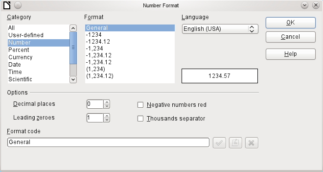
The button to the right with the three dots provides a choice of numeric formats, as you usually do in Calc. |
Figure 6: Formatted field with general numeric options
Data tab
Events tab
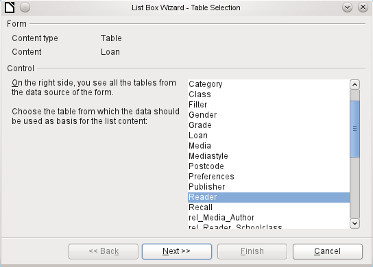
When a list box is created, the List Box Wizard appears by default. This automatic appearance can be switched off if required using the Wizards On/Off button (shown in Figure 1).
Wizard
In addition to the properties listed on page 1, the following features are available.
General tab
|
|
The list entries have already been set using the Wizard. Here you could add further entries that are not from any table in the database. List entries here mean the visible entries, not those that the form will transmit to the table. |
|
|
If the field is not specified as drop-down, scroll arrows will appear on the right side of the list box when the form is loaded. The list field then automatically becomes a multi-line field, in which the actual value selected is highlighted. |
|
|
If the field is drop-down, this property gives the maximum visible number of lines. If the content extends over more lines, a scrollbar appears when the list drops down. |
|
|
Can more than one value be selected? In the above example, this is not possible since a foreign key is being stored. Usually this function is not used for databases, since each field should only contain one value. If necessary, macros can help in the interpretation of multiple entries in the list field. |
|
|
As the deactivated button makes clear, a default selection makes little sense in the context of a binding with a database table, as created by the List Field Wizard. It could well be the case that the record corresponding to the default selection in the example table Readers is no longer present. |
Data tab
Note
If you want a time field that can handle time in milliseconds, you will need a timestamp field, as described in the section on “Time field”. The representation of milliseconds is incompatible with the way characters are assembled in list boxes. To get around this, you must convert the timestamp into text:
SELECT REPLACE(LEFT(RIGHT(CONVERT(”Required_service(??)”.
”Time”, VARCHAR),15),8),’.’,’,’) AS “Listcontent”, “ID” FROM “Required_service”
This will give a display in minutes:seconds:hundredths.
|
Name |
ID |
|
Anneliese |
2 |
|
Dorothea |
3 |
|
Sieglinde |
1 |
Note
The change of the bound field to “0” or “–1” was introduced with LO version 4.1. Previously, only the selection of values >= 1 was possible.
Events tab
As soon as a combo box is created, a Wizard appears by default, just as with a list box. This automatic behavior can be switched off if necessary using the Wizards On/Off button.
Combo boxes write the selected text directly into the table underlying the form. Therefore the following example shows both the table linked to the form and the one selected for the control is the Reader table.
Wizard
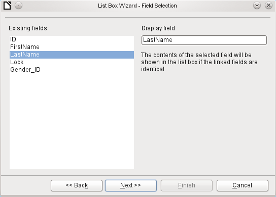
Again the form is predefined, this time with the Reader table. As the data to be displayed in the combo box is also to be stored in this table, the source selected for the data for the list is likewise the Reader table.
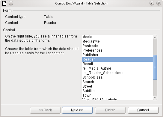
In the Reader table the FirstName field occurs. This should be displayed in the combo box.
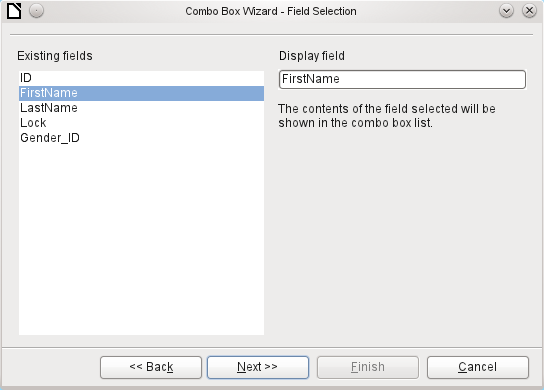
In a database, there seems to be little point in not storing the value of a combo box within a field. We want to read given names from the Reader table, and also to make them available for new readers, so that new records do not need to be created for a given name that already exists in the database. The combo box shows the first name, and text input is not necessary.
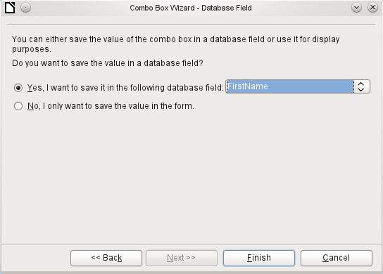
If a new value does need to be entered, this can be done easily in a combo box, as the box shows exactly what is going into the underlying table for the form.
In addition to the properties shown on page 1 and described for list boxes, the following features are available.
General tab
|
|
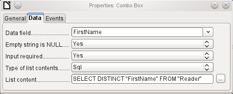
During entry of new values, a list of matching values (if any) is displayed for possible selection. |
Data tab
Events tab
The check box appears immediately as a combination of a check box field and a label for the box.
In addition to the properties described on page 1, the following features are available.
General tab
|
|
The label for this box appears by default to the right of the box. In addition you can bind it to a separate label field. |
|
|
Here, dependent on the choice in the Tri-state field, up to three possibilities are available: Not selected | Selected | Not defined. Not defined corresponds to a NULL entry in the table underlying the form. [State] |
|
|
By default, the label is not broken up. The label is truncated if the field is not big enough. |
|
|
Here you can specify a graphic instead of or in addition to the label. You should note that these graphics are not bound into the *.odb document by default. For small graphics, it is useful to embed the graphic and not link it. |
|
|
If you have chosen to use a graphic, its alignment with the label can be set here. |
|
|
By default, checkboxes have only two states: Selected (Value: 1) and Not selected (Value: 0). With Tri-state, a definition of Empty field (NULL) is added. |
Data tab
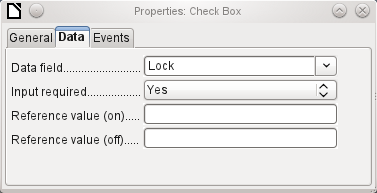
Events tab
The option button is similar to the check box described above, except for its general properties and its external (round) form.
When several option buttons in the form are linked to the same table field, only one of the options can be selected.
General tab
|
|
The option button is designed to be used in groups. One of several options can then be selected. That is why a Group name appears here, under which the options can be addressed. |
Data tab
Events tab
A graphical (image) control manages the input and display of images for the database. The underlying data field must be a binary field if it is to store the image directly. It can also be a text field storing the relative path to the image. In that case you must take care that the path to images remains valid if the database is copied.
Caution
Pictures should in any case be reduced in size when stored in the database. With 3MB photographs in an internal HSQLDB database, you will very quickly get Java errors (NullpointerException) that make it impossible to store the records. This can lead to the loss of all the records that were input in the current session.
Entry into an image control takes place either by a double-click with the mouse to open a file selection dialog, or a right-click to choose whether an existing graphic is to be deleted or replaced.
A graphical control by default has no Tab stop.
In addition to the properties described on page 1, the following features are available.
General tab
|
|
The graphic selected here is only shown inside the control, while the form is being edited. It has no significance for later input. |
|
|
No: The image will not be fitted to the field. If it is too big, the field will show only apart of the image. The image is not distorted. |
Data tab
Events tab
An input mask is used to control input into the field. Characters are pre-specified for particular positions, determining the properties of entered characters. The preset characters are stored along with the entered ones.
In addition to the properties described on page 1, the following features are available.
General tab
|
|
This determines what characters can be entered. |
|
|
This is what the form user sees. |
|
Character |
Meaning |
|
L |
A text constant. This position cannot be edited. The actual character is displayed at the corresponding position in the literal mask. |
|
a |
Represents any of the letters a–z/A–Z. Capital letters are not converted into lower case. |
|
A |
Represents any of the letters A–Z. If lower-case letters are entered, they will automatically be converted to upper case. |
|
c |
Represents any of the characters a–z/A–Z plus the digits 0–9. Capital letters are not converted into lower case. |
|
C |
Represents any of the letters A–Z plus the digits 0–9. If lower-case letters are entered, they will automatically be converted to upper case. |
|
N |
Only the digits 0–9 can be entered. |
|
x |
All printable characters are allowed. |
|
X |
All printable characters are allowed. If lower-case letters are entered, they will automatically be converted to upper case. |
Data tab
Events tab
This is the most comprehensive control. It provides a table, which can then be provided with controls for individual columns. This not only allows the actual data to be viewed during input, but also the previously entered data, without the need to use the Navigation bar to scroll through the records.
Not every field that is possible in a form can be selected for a table control field. Push buttons, image buttons, and option buttons are not available.
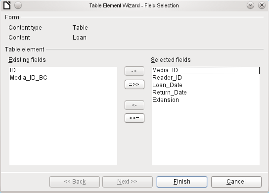
The Table Control Wizard assembles in a window the fields that will appear afterwards in the table.
The Loans table is available for editing in the control. In addition to the ID (primary key) field and the Media_ID_BC field (entry of media using a bar-code scanner), all fields are to be used in the control.
The previously created table control must now be further developed, to allow entry into the Loans table. For fields such as Reader_ID or Media_ID, it would be more useful to be able to choose the reader or the media directly, rather than a number representing the reader or media. For this purpose, controls such as list boxes can be placed within the table control. This is declared later. The formatting of the Extension field with two decimal places was certainly not intended.
Figure 7: Output of the Table Control Wizard
In addition to the properties listed on page 1, the following features are available.
General tab
|
|
Height of individual lines. With no value here, the height is automatically adjusted to the font size. Multi-line text fields are then shown as single lines to be scrolled. |
|
|
As with tables, the lower edge of the control shows the record number and navigation aids. |
|
|
By default there is a record marker on the left edge of the control. It indicates the current record. You can use the record marker to access the delete function for the whole record. |
Data tab
Events tab
In addition to the properties described on page 1, the following features are available.
General tab
|
|
The title acts as a description of another control. If the title is bound to a control, it can be used as a shortcut to it. An inserted “~” indicates a particular letter that becomes the shortcut “Na~me” defines “m” as this letter. When the cursor is anywhere in the form, Alt+m goes straight to the field. |
|
|
By default a label is not wrapped. If it is too long for the field, it is truncated. Caution: word wrapping does not recognize spaces, so if the field is too small, a break can occur within a word. [MultiLine] |
Data tab
Events tab
A group box graphically groups several controls and provides them with a collective label.
If a group box is created with Wizards active, the Wizard proceeds from the assumption that several option buttons will occur together within this frame.
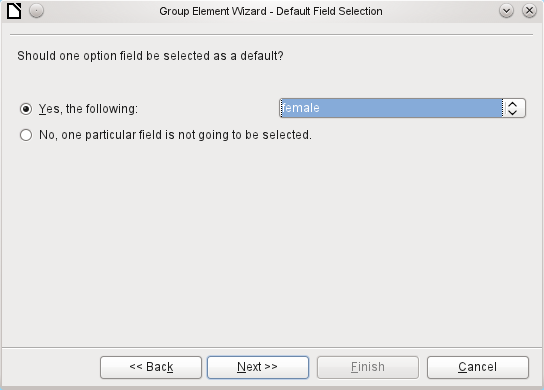
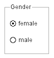
This form is based on the Reader table. We are dealing with the choice of gender. The entries are the labels of the option buttons.
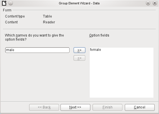
Here the default option is "female". If there is to be no default field, the default entry in the underlying table is NULL.
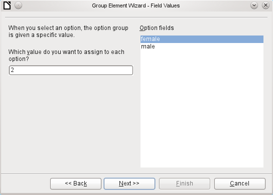
The Wizard gives the option buttons separate values by default, here 1 for female and 2 for male. These values correspond to the examples of primary key fields in the Gender table.
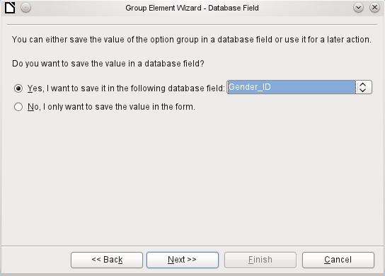
The value selected by clicking an option button is transferred to the Gender_ID field of the form’s underlying table Readers. In this way the Readers table is provided with the corresponding foreign key from the Gender table by using the option button.
The option button group is given a group box (frame) with the label Gender.
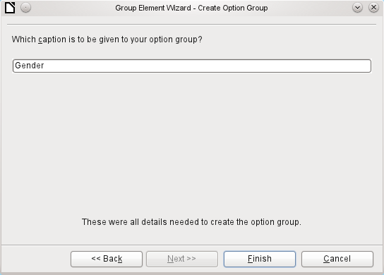
If female is selected in the active form, male is deselected. This is a characteristic of option buttons that are bound to the same field in the underlying table. In the example shown above, the option buttons replace a two-element list box.
In addition to the properties described on page 1, the following features are available.
General tab
Data tab
Events tab
In addition to the properties described on page 1, the following features are available.
General tab
|
|
Label on the button. By inserting “~”, a specific letter of the label can be turned into a shortcut. “Push ~Button” defines “b” as the shortcut. When the cursor is anywhere in the form, Alt + b will take you to the button. |
|
|
The button receives the focus when it is clicked. This might not always be desirable. For example, you might want a click on the button to put some content into a different form field, in which case the cursor should remain in that field when you click the button. |
|
|
If Yes, the button can be shown pressed in. The button state is shown as for a switch. When you press it a second time, it shows an unpressed button. |
|
|
Active, when Toggle is set to Yes. Selected corresponds to the pressed-in button. |
|
|
Word wrapping if the button is too narrow. |
|
|
A variety of actions similar to those for the navigation bar are available. If the action is to open a document or website, put the URL in the next field. |
|
|
HTML: File to be called up with this button. Here you must choose the resource which is to be opened by ‘Open document/website’ under ‘Action’. As well as HTML, ‘Action’ can be used to open other LO modules. So if you enter here .uno:RecSearch, the search function of the navigator will be assigned to the button. You can also open Writer files so that pressing the button carries out a mail merge using records from the database. The commands available here can be determined using the macro recorder. |
|
|
Only for HTML forms: The target‑frame (frame arrangement for different HTML pages) in which the file should be opened. |
|
|
The default button is framed when this is set to Yes. When there are several alternative buttons on a form, the one most often used should have this characteristic. It is activated by pressing the Enter key, when no other action needs to depend on this key. Only one button on the form can be the default button. |
|
|
Should a graphic appear on the button? |
|
|
Only active when a graphic has been selected. Specifies the alignment of the graphic to the text. |
Data tab
Events tab
In addition to the properties already described on page 1, the following features are available.
General tab
Data tab
Events tab
Figure 8: Navigation bar control

The standard Form Navigation bar is inserted into forms at the lower edge of the screen. The insertion of this toolbar can cause a brief rightward shift of the form as it builds up on the screen. This can be distracting in cases where the navigation bar is switched off again for some parts of the visible form, for example when there are subforms or more than one form in the visible form.
By contrast, a navigation bar control that is part of the form, separate from the corresponding items, makes it clear through which items you navigate with the toolbar. The form for Loans, for example, needs to search first through the readers and then show the media loaned to the reader. The navigation bar control is positioned near the reader, so the user notices that the navigation bar is used for the reader and not for the media loaned to the reader.
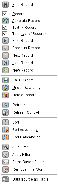
The standard Form Navigation bar makes available the buttons shown in Figure 9. The navigation bar control shows the same buttons except those for Find Record, Form-Based Filters, and Data source as Table.
In addition to the properties listed on page 1, the following features are available for the Navigator Bar control.
General tab
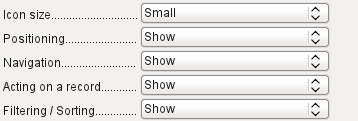
|
|
The icon size is adjustable. In addition you can choose which groups are displayed. These are shown in Figure 8 from left to right using a vertical line as a group separator: Positioning, Navigation, Acting on a record, and groups of commands for Filtering and Sorting. |
Figure 9: Navigation buttons
Data tab
Events tab
Independent of this form control, the insertable navigation bar naturally continues to exist with the same items as the above figure.
This insertable navigation bar provides additionally the general record search, the form-based filter and the display of the form's underlying data source in table view above the form.
If you are working not just with a form but with subforms and ancillary forms, you must be careful that this insertable navigation bar does not disappear as you switch forms. That creates a disturbing effect on the screen.
Neither of these fields has a direct connection to data in the database. They can only be utilized by means of macros, where the spin button is integrated into, for example, a numeric field.
A scrollbar differs from a spin button in having slider in addition to buttons for incrementing and decrementing the value within a fixed range.
When the form is opened, the scrollbar must be told the current value of the field to which it is linked. This macro is bound to Form Properties > Events > After record change.
First the variable is declared. The event that it will handle is specified on the form to which the macro will eventually be bound. The scrollbar will be found by its name on the form. Its current value is set to the number stored in numeric_field in the underlying table.
If the value is altered using the scrollbar, this change must be transmitted to the underlying field. This macro is bound to Properties: Scrollbar > Events > While adjusting.
First the variables are declared. The selected value is read as an integer from the field. The corresponding field in the underlying table numeric_value is then updated to this value.
A detailed explanation of this kind of code is given in Chapter 9, Macros.
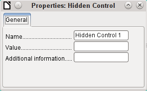
One type of control that cannot be inserted from the controls toolbar is the Hidden Control. It must be created within the form navigator, using the form’s context menu.
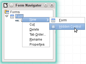
Like any other control, a hidden control is part of the form. However it is not visible in the user interface.
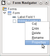
A hidden control has only a few properties. The Name and the Additional information have the same meaning as for other controls. In addition, the control can be assigned a value [Hidden Value].
There is no point in a hidden control if you are not using macros. With macros however, it is often useful to be able to store intermediate values somewhere on the form, to be accessed later. An example of this way of using macros is described in Chapter 9, Macros, in the section “Hierarchical Listboxes”.
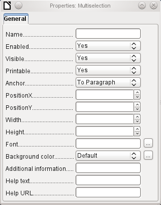
If you use the Select button to select a large region or several elements of a form, the following modifications may be carried out.
You should not alter the name. That would cause all the selected elements suddenly to acquire the same name. It would make finding individual elements using the Form Navigator difficult, and management of the form by using named controls in macros impossible.
Multiple selection is more useful for changing the font, the height or the background color of controls. Note that changing the background color affects the labels as well.
If you want to alter only the labels, hold down the Control key and click these controls directly or in the Navigator, or right-click on a field to call up the control properties. Now the choice of properties that you can change is greater as you are dealing only with similar fields. You can change anything here that is available in a label field.
The possibilities of multiple selection depend therefore on the choice of fields. You can simultaneously change controls of the same kind that have all the properties that exist for a single instance.
Figure 10: General properties of form fields in a multiple selection
A simple form has form controls for writing or reading records from a single table or query. Its construction is shown by the following example.
The example of a simple form for library loans is shown here using several variants. The quick way to use the Form Wizard is described in Chapter 8, Getting Started with Base, in the Getting Started Guide. Here we describe the creation in Design View.
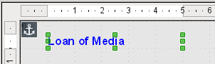
The heading for the form was created using a label field. The font was changed. The label field is anchored to a paragraph in the top left corner of the document. Using the context menu of the label field, a form was created that was linked to the Loans table (see “Form properties” on page 1). The page has also been given a uniformly colored background.
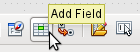
A quick variant for direct entry of fields with labels is to use the Add Field function.
This function, available on the Formula Design toolbar (see Figure 2), allows all fields of the underlying table to be selected.
Double-click on the fields to insert them into the form as a group with labels (unfortunately all on the same spot). The group needs to be separated out so that the form eventually looks like the following illustration. For a better view, all unnecessary toolbars have been removed from the window, which has also been compressed so that not all elements of the Navigation bar are visible.
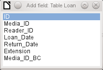
All fields have been selected except Media_ID_BC, which is designed to be used only with a barcode scanner.
Figure 11: Simple form made by using Add Field
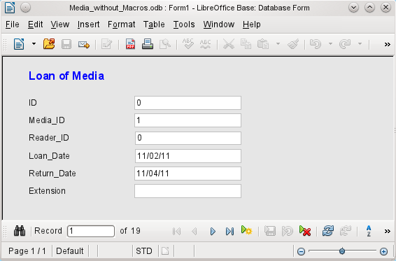
For each table field, an appropriate form control has been automatically selected. Numbers are in numeric fields and are declared as integers without decimal places. Date fields are represented correctly as date controls. All fields have been given the same width. If a graphical control had been included, it would have been given a square field.
We can now do some creative things, including adjusting the length of the fields and making the dates into drop-down fields. More important still is for the Media_ID and the Reader_ID fields to be made more user-friendly, unless every library user has a library ID card and every medium is supplied with an ID on accession. That will not be assumed in what follows.
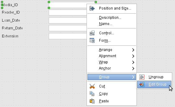
To adjust individual fields, we must edit the group. This can be done with a right-click on the group and then following the context menu (Figure 12). For future work, it will be clearer if we use the Form Navigator.
Figure 12: Form controls: editing the group
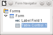
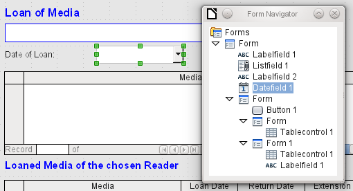
The Form Navigator displays all the elements of the form with their labels. For controls, the names are taken directly from the names of the fields in the underlying table. The names of the labels have the suffix Label.
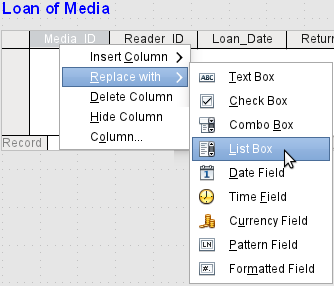
A click on Media_ID selects this field (Figure 13). Right-click to replace the selected field with a different type of field, using the context menu (Figure 14).
Figure 13: Selecting form controls directly using the Form Navigator
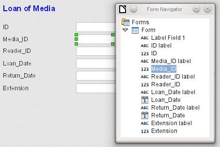
Figure 14: Replacing one kind of control by another using the Form Navigator
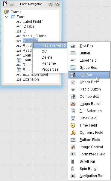
This replacement is carried out for the Media_ID and Reader_ID controls.
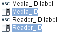
The change is made visible in the Form Navigator by the change in the accompanying icon.
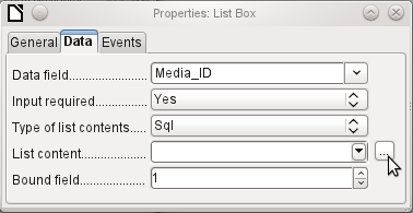
The SQL query for the list field can now be created through the graphical user interface by clicking on the button at the right. This is carried out automatically when a list box is created directly, but not when it is formed by conversion from another type of control. For the SQL command, see Chapter 5, Queries.
Since the list boxes are to be made drop-down, the following defects can be corrected at the same time:
The labels for the list boxes should be Media instead of Media_ID and Reader instead of Reader_ID.
The ID control should be declared as read-only.
Any fields which are not absolutely necessary for issuing loans for a new medium do not need a tab stop. Without it, the form can be traversed much faster. If necessary, the tab stop can also be adjusted using the activation sequence (see page 1). Only the Media, Reader, and Loan_date fields must be accessible in all cases using the Tab key.
If the form is intended for carrying out loans, it is unnecessary and also confusing for returned media to be displayed. Media with a return date should be filtered out. In addition, the display order could be sorted by Reader, so that media on loan to the same person are displayed successively. See the note on “Form properties” on page 1. However, there is a problem here in that readers can be sorted only by ID, not alphabetically, because the table underlying the form only contains the ID.
The addition of single fields is a bit more complicated. The fields must be selected, dragged onto the form surface, and the appropriate field from the underlying table specified. In addition, the type of field must be correctly chosen; for example, numeric fields have two decimal places by default.
Only when creating list boxes does the Wizard come into play, making it easier for a novice to carry out the steps for creating the correct fields—up to a point. Beyond that point, the Wizard ceases to meet requirements because:
The entries are not automatically sorted.
Combining several fields in the list box content is not possible.
Here again we need to make retrospective improvements, so that the required SQL code can be created quite quickly using the built-in query editor.
When adding single controls, the field and its label must be explicitly associated (see “Default settings for many controls” on page 1). In practice it could be better if you do not associate fields with the labels, so you do not have to use Edit Group before changing the properties of a field.
The use of the Table Wizard to create a table control has already been described on page 1. It has however some defects which need to be improved:
The Media_ID and Reader_ID fields must become list boxes.
Numeric fields must be stripped of their decimal places, since the Wizard always specifies two decimal places for numbers.
Changing fields within the table control is not possible using the same method as described for other controls. In the Navigator, the description of fields ends with the table control. The Navigator knows nothing about the controls that lie within the table control, referring to fields in the underlying table. This equally applies later, when attempts are made to access the fields using macros. They cannot be accessed by name.
The controls within the table control are called columns. Using the context menu, it is now possible to replace one type of field by another. However the whole range of types is not available. There are no push buttons, option boxes, or graphical controls.
The properties of the fields are hidden in the context menu behind the concept of columns. Here, for example, the numeric field Extension can be changed so that no decimal places are shown. Also the default minimum value of –1,000,000.00 hardly makes sense for a loan extension. The number should always remain small and positive.
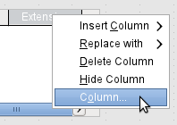
As soon as the properties of a column are called up, you can select another column without shutting the properties dialog. In this way you can work on all the fields, one after another, without having to save in between.
Note
The value is saved in the dialog as soon as movement is made between properties. Such is also the case when moving from one column to the next.
End by saving the entire form, and finally the database itself.
The properties of the fields built into a table control are not so comprehensive as for those outside. The font, for example, can be set only for the entire table control. In addition, you do not have the option of skipping individual columns by removing their tab stops.
Tip
You can move through a form using either the mouse or the Tab key. If you tab into a table control, the cursor will move one field to the right for each additional tab; at the end of the line, it will move back to the first field of the next record in the table control. To exit the table control, use Ctrl+Tab.
If only certain fields should be visible during use, you can use several different table controls in the form, as the Tab is captured by default by each table control.
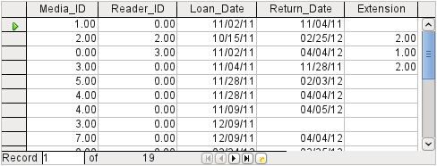
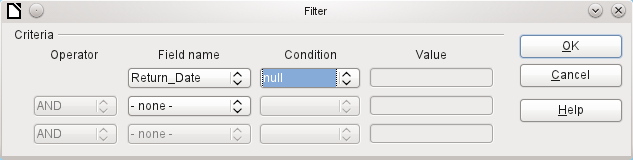
The form shown in Figure 15 is for the loan of media. Only the fields immediately necessary are shown in the upper table control. The lower one shows all the fields, so that it is apparent which person and medium the return is for.
Figure 15: A form with multiple table controls
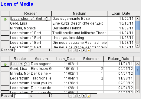
This figure shows an aesthetic failing that needs urgent attention. In the upper table control, the same medium sometimes occurs more than once. This happens because the table also shows media that have been returned earlier. Therefore the data needs to be filtered to show only the loans. Records with a return date should not appear.
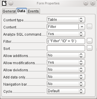
This filtering is possible either by a query or directly using the form properties. If it is done using the form properties, the filter can be temporarily switched off during input. Filtering using a query is described in Chapter 5, Queries. Here we describe how to do it using form properties.
The filtering is carried out using the button with the three dots (an ellipse, which opens the dialog shown below. You can also enter the filter directly into the Filter text field if you know the SQL coding.
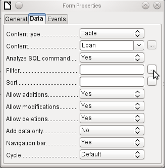
Using the GUI, you can now select the field named Return_Date. It will show only the records for which the field is empty, where “empty” stands for the SQL designation NULL.
The cleaned-up form (shown in Figure 16) now looks rather simpler.
Of course there is still room for improvement, but compared with the earlier form, this version has a clear advantage in that all the media are visible at a glance.
The processing of data using table controls is similar to using an actual table. A right-click on the record header of an existing record causes it to be deleted, and an entry can be canceled or saved in the case of new records.
When you leave a line, the record is automatically saved.
Figure 16: Amended form
We can still improve the Loan of Media form in a number of ways.
It would be nice if selecting a reader in one part of the form caused the media on loan to this reader to be displayed in another.
In the table shown above, you can see a lot of records that are not necessary because these media are already on loan. The table was created to allow loans to be made, so it would be better if only an empty page appeared, which could then be filled with the new loan.
Such solutions are available using further forms that are hierarchically arranged and make possible separate views of the data.
Tip
Table controls can be combined with other fields in the form. For example, the table control field shows only the titles of those media for which changes have been made in the underlying form fields.
When table controls are combined with other form fields, there is a small bug, which can be easily worked around. If both types of the field are present together in a form, the cursor moves automatically from the other fields into the table control even though by default this type of field has the setting Tabstop > No. This can be fixed by switching the tabstop property to Yes and then back to No again. This will cause the “No” value to be registered.
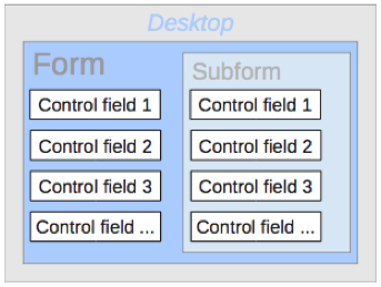
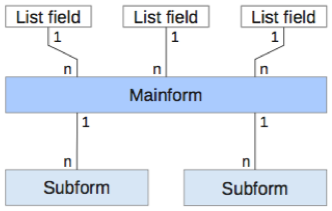
A subform lies within a form like a form control. Like a form control, it is bound to data from the main form. However its data source can be another table or a query (or a SQL command). The important thing for a subform is that its data source is somehow linked to the data source of the main form.
Typical table structures that lend themselves to use as subforms are tables with a one-to-many relationship (see Chapter 3, Tables). The main form shows a table with records to which many dependent records in the subform can be linked and displayed.
First we will use the relationship of the Reader table to the Loan table (see Chapter 3, Tables). The Reader table will form the basis for the main form and the Loan table will be reproduced in the sub‑form.
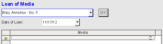
Here the main form is linked to the Reader table. To speed up the search for readers, the table is sorted alphabetically. We will do without a navigation bar, since the content of the subform would come between the main form and the navigation bar. Instead we will use the built-in form control (Figure 8).
Right-click on the main form in the Form Navigator to use the context menu to create a new form. Once again this form has the default name of Form, but it is now an element in the subfolder of the main form.
The properties of the subform must now be set up to give it the right data source, in order to reproduce the data for the correct reader.
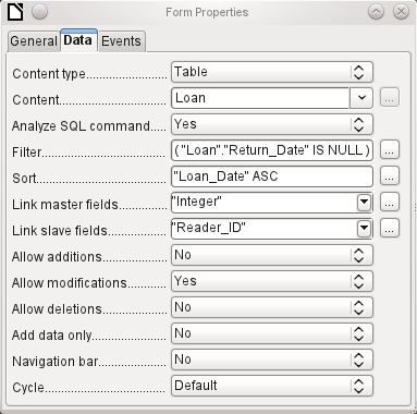
The Loans table is chosen for the subform. For the filter we specify that the Return_Date field should be empty ("Return_Date" IS NULL). This prevents any media that have already been returned from appearing. The records should be sorted by loan date. The ascending sort shows the medium on loan for the longest period at the top.
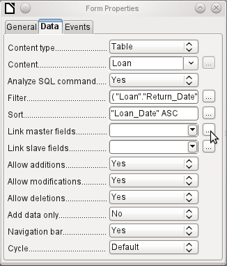
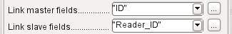
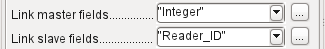
Link master fields and Link slave fields are used to create a linkage to the main form, in which the subform lies. The button with three dots shows once again that a helpful dialog is available for creating these.
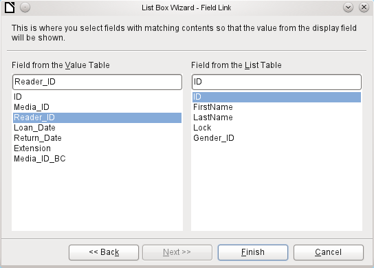
Under Loans, the fields in the Loans table are shown, under Readers those of the Reader table. The Reader_ID from Loans should be set as equivalent to the ID from the Reader table.
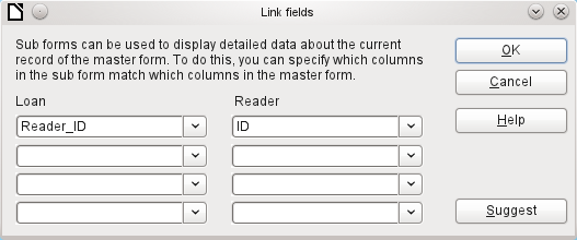
Although this linkage has already been created in the database using Tools > Relationships (see Chapter 3, Tables), the function that lies behind the Suggest button in this dialog does not reference this and would suggest that the first foreign key in the Loan table, namely Media_ID, should be linked with ID from the Reader table. The Form Creation Wizard solves this better by reading the relation from the relationship of the database.
The chosen link between the table for the subform and the table for the main form is now specified in terms of fields from the tables.
To create a table control for the main form, we must now select the main form in the Form Navigator. Then, if the Table Control Wizard is enabled, it will show the fields available in the main form. We deal with the subform in a similar way.
Once the table controls have been set up, we need to carry out the modifications already discussed when creating the simpler form:
Replacing the numeric field Media_ID in the subform with a list box.
Renaming the Media_ID field to Media.
Modifying the numeric fields to a format without decimal places.
Limiting the minimum and maximum values.
Renaming other fields, to save space or to add non-ASCII characters which should not be used in field names in database tables.
Sort and filter functions are supplemented for the main form by adding a navigation bar. The other fields on the navigation bar are not needed, as they are mostly available from the table control (record display, record navigation) or else carried out by movement through the table control (data storage). The final form might look like Figure 17.
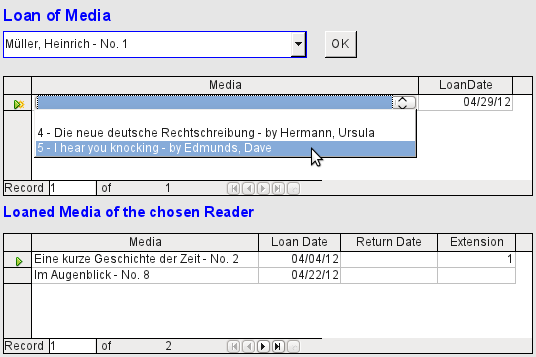
Figure 17: Form consisting of a main form (above) and a subform (below).
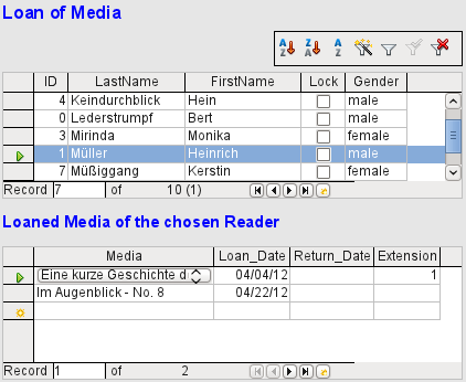
If a reader is now selected in the main form, the subform will show the media on loan to that reader. When an item is returned, it continues to appear on the form until the form itself is refreshed. This occurs automatically when another record is loaded into the main form. If the original reader is selected again, returned media are no longer displayed.
This delayed updating is actually desirable in this case, as it allows one to inspect the media currently lying on the library counter and see at once whether these have been registered.
This form structure is significantly easier to use than the previous one with only a single form. However there are still details that can be improved:
Media and loan dates might be changed when the media is to be loaned out for longer. Changing the media date might make it impossible to trace which item is still available in the library and which is on loan. Changing the loan date could lead to errors. Recall notices could not be verified.
If a reader record is not selected by clicking on the record header at the left, only the little green arrow on the header shows which record is currently active. It is quite possible that the active record will be scrolled right out of the table control window.
Instead of the text “Loaned Media of the chosen Reader”, it would be better to have the reader’s name.
It is possible to loan out the same medium twice without it having been returned.
It is possible to delete the record for an item on loan quite easily.
Data can be changed or deleted in the main form. This can be useful for small libraries with little public traffic. However when things become hectic at the loans counter, editing of user data should not take place at the same time as issuing loans. It would be better if new users could be registered but existing user data left untouched. For libraries, this applies equally to deletions or complete name changes.
First let us improve the selection of readers. This should protect us from changes to the loan records. A simple solution would be not to allow any modification except the entry of new records. This still requires a search function when a reader wishes to borrow an item. It would be better to use a list box to find the reader and carry out the issue and return operations in separate table controls.
For the main form we need a table, into which the list box can write a value linked to this table. The table requires an integer field and a primary key. It will always contain only one record, so the primary key field ID can safely be declared as Tiny Integer. The following table named Filter should therefore be created.
Table name: Filter
|
Field name |
Field type |
|
ID |
Tiny Integer, Primary key |
|
Integer |
Integer |
The table is given a primary key with the value 0. This record will be repeatedly read and rewritten by the main form.
The main form is based on the Filter table. It will just read the value from the table which is associated with the primary key (ID) of 0. No data will be added; the current record will just be repeatedly rewritten. As only edits of a single record are allowed, a navigation bar would be superfluous.
This main form is linked to the subform in such a way that the value of the Integer field in the Filter table is the same as the value of the Reader_ID field in the Loan Table. The subform’s properties are unchanged from the version shown above.
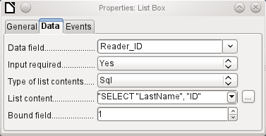
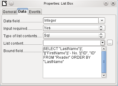
Before we create a list box in the main form, we must switch off the wizards. The list box Wizard only allows you to create a box that shows the content of a single field; it would be impossible to have surname and given name and an additional number in the display area of a list box. As in the simpler form, we now enter for the list box contents Surname, Given name – ID Nr. The list box transmits the ID to the underlying table.
Next to the list box, a button is created. This button is actually part of the subform. It takes over two functions: saving the record in the main form and updating the table in the subform. It is good enough to entrust the update to the button in the subform. The save process for the modified main form is then carried out automatically.
The button can simply be labeled OK. The action assigned to it in the general properties of the button is Refresh Form.
Figure 18: Main form as a filter for a subform
The main form consists only of the heading and the list box; the subform contains another heading, the table control from the previous version and the button.
The form now functions better in that:
No reader can now be edited, altered or deleted, and
Readers can be found more quickly by typing into the control than by using a filter.
For a greater degree of functionality (returns without alteration of previous data) a second subform must be created, linked to the same Loans table. To ensure the functionality of the list box in Figure 18, both subforms must be placed one level further down, as subforms of a subform. Data is updated hierarchically from the main form down through the subforms. The button in the previously described form must now be placed in the first subform and not in the two subforms that come under it.
Here the Form Navigator is used to show the different levels. In the main form we have the text field for the form title and the list box for finding the reader. The list box appears at the bottom of the form, as it is declared after the subform. Unfortunately this display sequence cannot be altered. The subform has only one button, for updating its contents and at the same time saving the main form. One level further down are the two additional subforms. These are given different names when created so that no confusion arises in any level of the tree.
Note
Basically the names of forms and controls are without significance. However if these names are to be accessed by macros, they must be distinguishable. You cannot distinguish identical names at the same level.
Naturally it makes sense, when creating larger form structures to have meaningful names for forms and their controls. Otherwise finding the right field could quickly become problematic.
The main form and the subform use the same table. In the subform, no data are entered. That is why all the fields for this form are set to No. The main form and the subform are linked through the field, whose value is to be transmitted to the sub‑subforms: the Integer field in the Filter table.
In the first sub-subform, no existing data are displayed; it is used only for creating new data. For this, the suggested filter is adequate. Only records matching the Reader_ID and with an empty loan date field ("Loan_Date" IS NULL) will be displayed. In practice, this means an empty table control. As the table control is not continuously updated, newly loaned media will remain within it until the OK update button is used either to select a new name or to transfer the data into the second sub-subform.

The second sub-subform requires more settings. This form too contains data from the "Loans" table. Here the data is filtered for an empty return date. ("Return_Date" IS NULL). The data are sorted as in the previous form, so that the media on loan for the longest time are immediately visible.
The following points are also important. Old records can be changed, but no new records can be added. Deletion is also impossible. This is the first necessary step to prevent loan records from being simply deleted later on. But it would still be possible to change the medium and the loan date. Therefore the properties of the columns will require adjustment. Eventually the medium and the loan date should be displayed but protected from modification.
The table control is simply duplicated after the creation of the form. This is done by selecting it, copying, deselecting, and then pasting it in from the clipboard. The copy will be at the same position as the original, and will therefore need to be dragged away. After that, both table controls can be edited separately. The table control for the media return can be left practically the same. Only the write access for the Media and Loan date columns need to be changed.
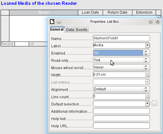
While for the Loan_Date it is only necessary to choose Read only, this is not sufficient for list boxes. This setting does not prevent the list box from being used to make changes. However if Enabled is set to No, a choice cannot be made there. A list box contained within the table control is then displayed as a read-only text field.
In the above table control, all fields that have nothing to do with the loan are removed. Only the medium as a selection field and the loan date Loan_Date remain.
If finally the query for the list box in the upper table control is selected, only those media are displayed which can actually be loaned out. More about this is in Chapter 5, Queries.
Figure 19: The selection field in the upper subform shows only media that are not on loan.
The media loan form is already significantly more useful. When a reader arrives at the loan counter, his or her name is searched. The media to be loaned can be selected using the list box and the loan date entered. The Tab key then takes you to the next record.
A final improvement is also desirable: at present the loan date must be selected each time. Imagine a day in the library with perhaps 200 loan transactions, perhaps just one person, who has to loan out about 10 media each time. That would require the same entry for the date field over and over again. There must be a way to simplify this.
Our main form is linked to the Filter table. The main form works only with the record that has as its primary key the "ID" 0. But additional fields can be built into the Filter table. At present there is no field that can store a date, but we can easily create a new field with the field name Date and the field type Date. In the Filter table we now have stored not only the Reader_ID ("Filter"."Integer") but also the Loan_Date ("Filter"."Date").
In the main form, an additional date field appears, along with a label referring to its content. The value from the date field is stored in the Filter table and transferred by the linkages from subform to sub-subform.
The linkage between the two forms now refers to two fields. The Integer field is bound to the Reader_ID field of the sub-subform. The Date field is bound to the Loan_Date field. This ensures that the Loan_Date is automatically transferred from the Filter table to the Loans table when the loan is made.
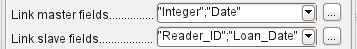
Figure 20: The date of the loan is entered only once. When the Reader changes, it must be reentered.
The date field is now removed from the table control, so that the latter contains only one search field. This would be the ideal requirement for speeding up even more the work of the library. For in fact each medium will have a printed identification number, so why does that have to be searched? You can just enter the number directly. Or, better still, it could be scanned in with a barcode reader. Then media can be loaned as rapidly as the borrower can put them in his bag.
This is illustrated in the example database. The above example should suffice for understanding the initial form design but, as the example database, Media_without_Macros.odb, develops the form further, the extra refinements are briefly presented below.
The Loan form shows the following properties:
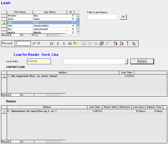
Readers are displayed in a table control. Here you can also enter new readers.
Using a filter, linked to the Filter table, names can be filtered using their initial letter. So, if you enter A, only people whose surname begins with A will be displayed. This filtering is case-independent.
The subtitle shows again the name of the person to whom the loan is to be made. If a lock has been placed on this borrower, this is also displayed.
The loan date is set to the current date. This is done in the filter table using SQL such that, when no date is entered, the default value to be stored is the current date.
Loanable media are selected using a list box. When the Update button is pressed, the loan is transferred to the table control below.
The table control in the middle serves only to display the actual date of loan for the media. Here it is also possible to correct an error retrospectively by deleting the line.
In the lower table control, as in the above example, alteration of media and loan dates is not possible. Nor is it possible to delete records.
Apart from the entry of the return date or, if appropriate, an extension of the loan, this table also displays the number of days for which the medium can be loaned and how many days remain of the current loan period.
If this remaining time becomes negative, the medium must be returned immediately. The issue is then locked. It becomes possible again only when the medium is returned. After the return, the Update button need only be pressed once.
This form, made by using queries, is significantly more complex in its structure than the previously shown version. You can learn more about the essentials of this in Chapter 5, Queries.
While the example for the Loans form only involves entries into one table (the Loans table) and additionally allows entry into the subform for new readers, the entry procedure for media is significantly more extensive. In its final form, the media table is surrounded by a total of eight additional tables (see Chapter 3, Tables).
The Subtitle and rel_Media_author tables are linked to subforms of the Media form through an n:1 relationship. By contrast, tables with a 1:n relationship to the Media table should be represented by forms that lie above the Media table. As there are several such tables, their values are entered into the main form using list boxes.
The table of a main form and the table of a subform are in a 1:n relationship, or in some exceptional cases 1:1. Therefore, after long use of the database, the main form usually manages a table which has significantly fewer records in it than the table belonging to the subform.
Multiple main forms cannot include the same subform. Therefore it is not possible to create a form arrangement for many simultaneous 1:n relationships in which the subform has the same content. When there is a 1:n relationship for the table belonging to a form, you can use a list box. Here there are only a few terms available from another table, those whose foreign keys can be entered into the main form's table in this way.
Using list boxes, the main form based on the Media table can be assigned values from the Category, Town or Publisher tables. Subforms are used to link the rel_Media_Author and Subtitle tables with the main form and through it with the Media table.
The subform for the rel_Media_Author table again consists of two list boxes so that the foreign keys from the Authors and Author_Add_ID (additions might be for example editor, photographer, and so on) do not have to be entered directly as numbers.
For the media entry form, the list boxes usually have to be filled up gradually during the entry process. For this purpose, further forms are built in alongside the main form. They exist independently of the main form.
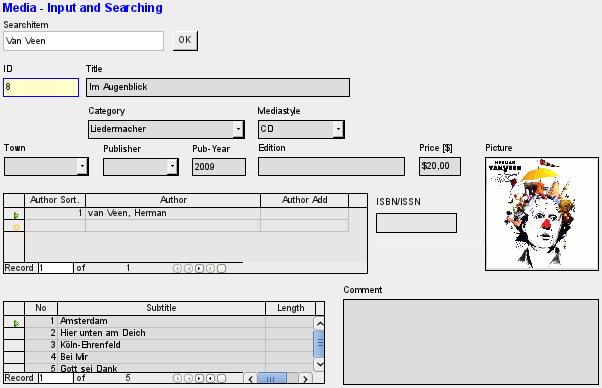
The overall form for entering media looks like this:
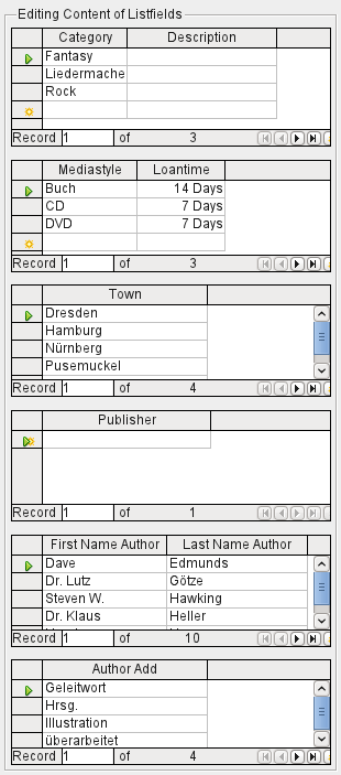
On the left side is the main form with a view to searching and entry of new media. On the right side is a group box with the label Editing Contents of List box, providing a separate area intended for filling up the list boxes in the main form. If the database has not existed for long, it will often be necessary to make entries into these fields. However, the more entries that are available for the list boxes of the main form, the less often will access to the table controls in the group box be necessary.
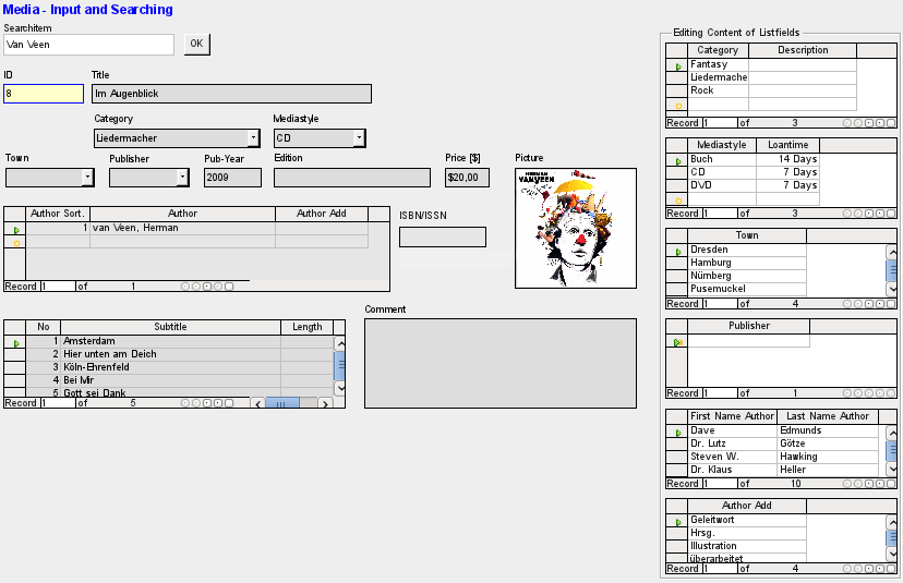
The following table controls are all subordinated as individual side forms to the main form, the entry form.
Here in each case the complete data for a table are entered. In the early stages, it is often necessary to have recourse to these side forms, since not many authors are yet stored in the corresponding table.
When a new record is stored in one of the table controls, it is necessary to find the corresponding list box in the main form and use the Update control (see Navigation bar) to read in the new values.
The Form Navigator shows a correspondingly large list of forms.
The forms have been individually named to aid recognition. Only the main form still has the name of MainForm given to it by the Wizard. Altogether there are eight parallel forms. The Filter form hosts a search function while the MainForm form is the main input interface. All the other forms relate to one or another of the table controls shown above.
Without the table controls, the main form looks somewhat simpler.
The field for the search term lies in the Filter form, the two table controls (for the author and the subtitle) lie in the subform of the Media Entry main form.
In the Form Navigator, this form looks much more complex, as all the controls and labels appear there. In the previous form, most of the fields were actually columns within the table controls and were thus invisible to the Form Navigator.
Unfortunately the sequence within the Form Navigator cannot easily be changed. So, for example, it would seem more sensible to place the subforms Subtitle and Author as branches of MainForm right at the beginning. But within the Form Navigator, individual controls and subforms are simply shown in the order in which they were created.
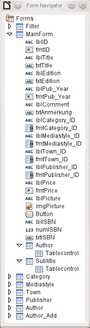
The Form Wizard provides the controls with particular abbreviations which appear next to the icons and indicate what type of control this is. Labels begin with 'lbl', text fields with 'txt' and so on. Altogether labels provide only secondary information for data entry. They can also be placed directly above text frames and then do not appear in the Form Navigator.
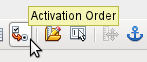
The sequence of the elements in the navigator has nothing to do with the tab sequence. That is determined by the Activation Order.
The activation sequence for a particular form is invoked when an element of the form is selected and then the Activation sequence button is clicked. For a simple form, it is not necessary to do things in this order, but where there are many parallel forms, the function needs to know which form is intended. Otherwise, by default, it is the first form in the Form Navigator. In the above example, this contains only a single text field.
The activation sequence allows all the elements that transmit data to the underlying table of the form or can carry out actions, to be put in order. This corresponds to setting the activation sequence in the control properties listed on page 1.
Note that in the activation sequence, some controls appear for which the tab stop is actually switched off. They are included in the list, but are not in fact accessed through the keyboard when working with the form.
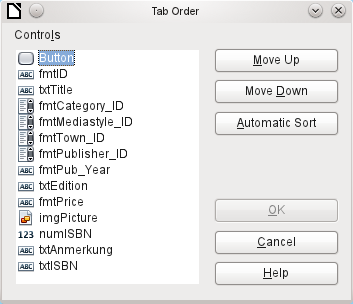
Fields can be automatically sorted in the order in which they appear on the form background. The higher up a field lies, the earlier it comes in the sequence when you use Automatic Sort. For fields at the same height, the leftmost field comes first. This sorting functions without error only when the elements were exactly positioned using the grid when the form was created. Otherwise you will need to adjust them. Simply select a control and use Move Up or Move Down to move it higher or lower in the sequence.
If there is a subform, Automatic Sort jumps directly into the subform after completing the main form. In the case of a table control, this causes the cursor during keyboard input to be trapped within this subform; you can only free it by using the mouse or by pressing Ctrl+Tab.
The Automatic Sort functions only once for a table control. A subsequent subform with a table control will not be included. Parallel forms are not taken into account either. An Automatic Sort cannot be made retrospectively for a subform with a table control. The subform must be completely removed (temporarily moved to another form).
The data substrate for the form for media entry is in this case not a table but a query. This is necessary as the form is to be used not just for entering records but also for searching. The form also contains a text field which shows, after saving, whether the ISBN number entered was correct. This too is only possible using a comprehensive query. To understand the background of this, it is therefore necessary to discuss the fundamentals of queries, covered in Chapter 5.
Some error messages that commonly occur when a form is first designed are briefly explained here.
Attempt to insert null into a non-nullable column: column: ID table: Tablename in statement …
There are fields which are not allowed to be empty. If they are so defined in the table (NOT NULL), you get this error message. If it has also been declared non-null in the form as well, you also see a native language message with the exact name of the field that must be filled in.
The above message appears very often when the primary key, in this case ID, has not been imported into the form. It was designed as an automatically incrementing field, but unfortunately the designer forgot to define it as AutoValue. So you must either correct this or the field must appear in the form, so that you can enter a value.
Defining a field retrospectively as AutoValue is sometimes problematical, if the table has relationships with other tables or when the table is accessed using a view. All links must be removed to make the primary key field of the table editable. The content of the SQL command that was used to create the view can be stored temporarily in a query.
Integrity constraint violation - no parent SYS_FK_95 table: Tablename in statement …
Here we have a link between the table underlying the form and another table. This table is supposed to supply its primary key for use in a foreign key field. Normally this is done using a listbox which carries out the correct query for retrieving the key. If you are not using a listbox, or if the listbox was incorrectly constructed, the foreign key field can acquire an incorrect value which is not actually present in the source table as a primary key. That is what is meant by “Integrity constraint violation". ‘no parent SYS_FK_95’ means that in the second table, the source “Parents“ table, the corresponding index value with the name 'SYS_FK_95'is not present.
.Errors when entering new records
Errors in running functions
Suppose a form supplies data to a subform. Base does not see this as a change in a field value. The graphical user interface offers to save the value but the record appears empty. The answer is to include a simple field, for example a yes/no field, in the underlying table. Now, before you save, remove this field and the record can be saved without any problem.
Values passed on via other forms are apparently only entered into the corresponding fields when there is at least one additional action in the form.
The form’s navigation bar offers various possibilities for searching and filtering. Individual elements on the navigation bar have already been listed above.
A simple record search with parameters is described in Chapter 3, Tables. It offers a considerable number of settings. A characteristic of this type of search is that basically all records are sifted rather than limiting the records displayed to those containing the search parameters.
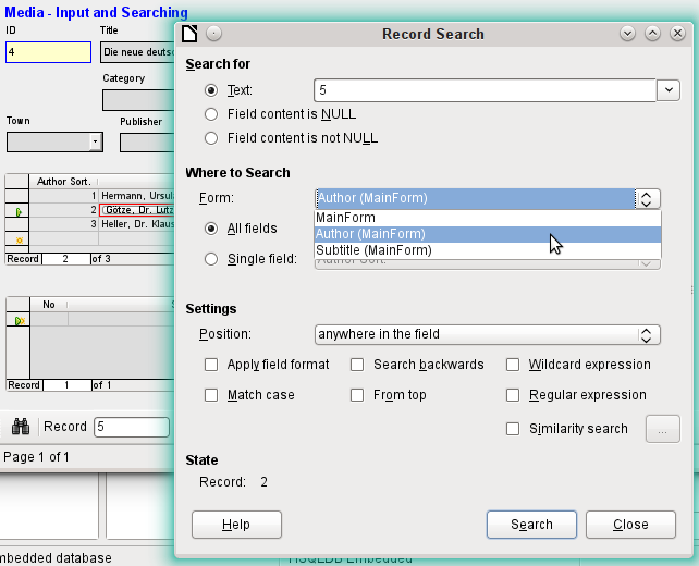
Record searches in forms allow you to search both the form and any subforms, but it is not possible to search all the forms at once.
The illustration shows access to the subform Form_author in the main form MainForm. This is a listfield containing the names of the authors. However, what is searched is not the text in the listfield but the values that are entered as foreign keys when the field is used.
Unfortunately this type of search has the following shortcomings:
The parameter search is too complicated for normal use.
The search function itself is very slow as it does not use the query functions of the database.
The search only works for one form at a time, although for all fields. Subforms must be separately searched.
We are searching a subform that belongs to the current main form. Entries into other subforms will not be revealed. So, for example, it is not possible to find a subtitle of any medium other than the one currently displayed.
The search applied to listfield functions on the basis of key fields (foreign keys) stored in the table. The displayed data cannot be used.
The Autofilter can be directly selected in the navigation bar. Click on a field in the main form and it will filter on the content of that field. The autofilter functions with list fields too, and has an obvious advantage over the entry of foreign keys by hand.
In the example shown above, a record is retrieved that has ‘CD’ in the Mediastyle field. Then the autofilter button is toggled. Of the original 9 records in the Media table, only 3 records now show in the record counter.
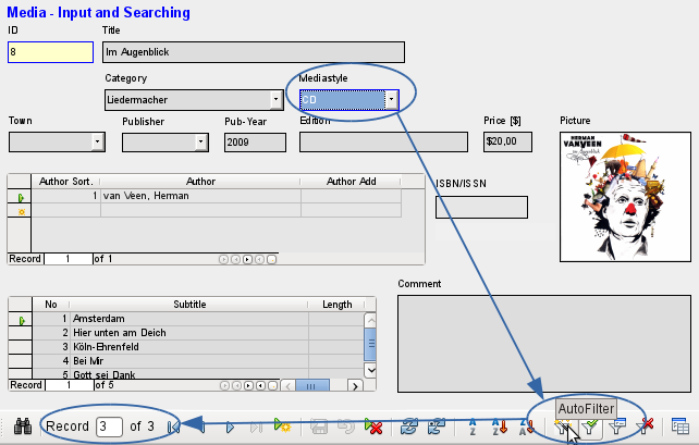
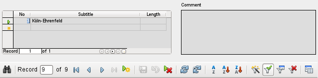
Although only two records have a ‘3’ in the No. field, the main forms for all the other records continue to be displayed. In the subform, only records that match ‘3’ are displayed.
However using the autofilter cannot solve the following problems:
If you search in a subform, only the specified value will be shown in it, but the main form is shown for all the records even if they don’t contain that value. So if, for example, you are looking for a medium with a second author, you will still see all media that have only one author. In these records, the author field will be empty.
The value used for the filter must be specific. There is no possibility of a similarity search to find related materials.
The form-based filter offers a form for inserting actual values to be used for filtering rather than just a filter button. Here you can filter for several values at the same time. These values can either be combined as a joint condition (AND) or as alternatives (OR).
Start Form-Based Filter
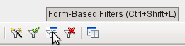
The filter values entered need not be unique. Here therefore you can formulate conditions like those described in the filtering of tables. So LIKE’%eye%’ entered in the media title field will yield all records for which the title contains the word ‘eye’.
Filtering of listbox fields is carried out by direct selection of displayed list field contents. You do not need to input the underlying foreign keys.
Here we search for all records with the mediastyle ‘CD’ (corresponding to a foreign key value of ‘1’) and also have somewhere in the title the character sequence ‘eye’. When you enter LIKE ‘*eye*’, the GUI replaces the usual SQL wildcard symbols “%“ with the “*” character, a more familiar wildcard symbol for most users.
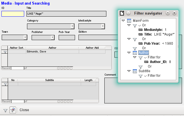
We also add the condition that all records be displayed for which the year of publication is “1980”.
The author ‘Edmunds, Dave’ is selected from the listbox in the subform. The corresponding foreign key value is ‘8’.
During entry, the form-based filter shows only the fields that show a tick before OR. In this way several conditions can be set for the field. Unfortunately it causes the filter to suppress the display of the Mediastyle list field contents, whereas this works in the table control of the subform.
During the creation of the filter, you do not see the navigation bar; instead the choices for the form-based filter are displayed. You filter according to your requirements, insert the filter values, and then simply close the display.
The filter is applied and the form is filtered according to your specification.
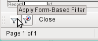
When filtering is on, the number of records is limited to those that match. In this case there are five matches. In the illustration, neither the title nor the media type match; the condition that the year of publication be less than 1980 provides the match.
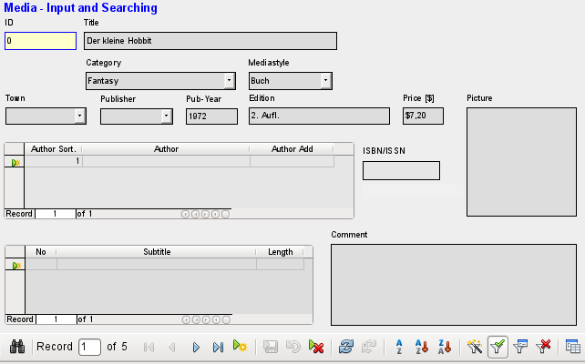
The subform shows something interesting. As this too is to be filtered, the author of the book “The Little Hobbit“ is not shown. The filter value is linked to the author Dave Edmunds. This again shows the logic behind the filtering: it uses the filter properties of the current form. Subforms are separately filtered and a filtering of the subform does not affect the main form – and vice versa.
This fairly successful filter still has the following disadvantages:
The filtering again functions only in the main form. In the subform, as in the case of Autofilter, values that fail to match are not displayed.. This has no effect on the display of the main form. Therefore in the main form, content is shown which cannot generate any filtered content for the subform.
You need detailed knowledge of how to set conditions if you are searching for something more complicated than complete fields. Most users, even if they are accustomed to using search engines, lack the necessary skills.
The default filter can be reached by requesting the display of the data source as a table. Then the procedures are the same as when using the default filter in a table.
Launching the default filter with Data source as Table
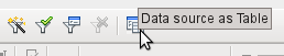
At the right of the Form navigator, you can see a Data source as Table button. In table view, the default filter becomes available. Unlike the view of the actual Media table, foreign keys are shown, not with their actual values, but with the content that corresponds to it. A click on the Mediastyle field shows that this is the source of the list field that appears in the form.
Note
Unfortunately the above view shows a bug that goes back to the beginning of Base. The 13-digit ISBN number is not correctly formatted. The corresponding field is given instead the minimum possible number of digits. If a number has more than 9 digits, take care: editing can lead to loss of data (Bug 82411).
This bug also shows up in table controls. They are shown correctly if you use a formatted fiend instead of a numeric field.
The table view of a form has the following disadvantages for this search method:
The search only works within the one table or query that underlies the form and not in a subform that belongs to it.
In the data view, list fields are shown but you can’t use them for filtering. Once again you need to know the actual foreign key values for those fields. So for example, if the media type is “Book“ and this has the primary key value “1“, then the Media table has “1“ stored in that field. You must search for this value, even though the composite view shows the value “Book“.
The search and filter functions are of limited use for forms. A search is much too slow and does not limit the total number of records to those that truly match. The filters only work within one form at a time. If you want to filter in a subform, only the subform is affected. You simply cannot get the correct number of matching records.
Therefore in the forms of the example database, a user-friendly search function has been integrated into the form, a procedure that needs to be worked out by hand and requires some knowledge of SQL.
If a form has been so designed that opening it activates the control focus, the cursor will appear in the first input field. Instead of using the mouse to move from field to field, you use the tab key to move to the next field in the sequence.
Sometimes a form allows you to jump to another field, either with the mouse or with a shortcut.
Using Properties: Text Box > Label field, a label field is assigned. The label of this label field is changed from “Name” to “Na~me”. In the form, the letter “m” of the label is now shown underlined. Now you can jump to this text field instantly by using the shortcut Alt+m. This only works if the cursor is already in a field of the form.
In principle, any letter can be used as a shortcut, as the jump takes place entirely within the form. However if the cursor is not initially in a form control, the shortcuts activate the LibreOffice user interface instead. So, for example, the shortcut “a“ would not jump to the Name field but would instead open the Table menu.
Unfortunately field jumps only work within a single form, not structures that involve subforms. A jump from a subform back into the main form is not currently possible.
When the cursor is in a table control, it should jump out when you use Ctrl+Tab. Sometimes it happens that this key combination does not have the desired effect. So here is an alternative:
A button is created in the subform. Its title is “~New”. The tilde character is used, as described above, so that Alt+N can be used to activate the button. The Additional information field for the button names the field in the main form to which the cursor should be transferred on activation. The button is bound to the following macro using Properties > Events > Execute action:
The macro can be used just to jump back into the main form. It can also be used with the above settings to create a new record immediately or, using another button on the navigation bar for Next record, to jump to the next record. If the cursor in the main form is on the last record, the jump will lead to a new record. For more on macros, see Chapter 9.
Jumping to a button requires the button to be visible. However it can be quite small or even have a width and height of 0 cm. If the width and height are not defined, it can happen that the button appears as a line running across the entire screen.
Forms can be so constructed so that a direct printout of the form is possible. To get usable results, you must take care not to place elements outside the printable area. Choose View > Normal. Properties for the page can then be set. A colored background is not an advantage here.
Any individual element can be excluded from printing using Properties > General > Printable.
If the database is registered in LibreOffice (using Tools > Options > LibreOffice Base > Database, or directly as part of the creation process), the form can be used for mail merges. The form is opened for editing. The data sources are made accessible using View > Data Sources, or pressing F4. Database fields can now be dragged into the form by their table headers. Then the form is saved. If the same form is now opened for input, LibreOffice recognizes that these are fields for a mail merge and asks if you want to print the letters.
Details of how to do a mail merge are contained in Chapter 7, Linking to Databases.