
Calc Guide 24.8
Chapter 7 Gallery of Chart Types
This document is Copyright © 2024 by the LibreOffice Documentation Team. Contributors are listed below. You may distribute it and/or modify it under the terms of either the GNU General Public License (https://www.gnu.org/licenses/gpl.html), version 3 or later, or the Creative Commons Attribution License (https://creativecommons.org/licenses/by/4.0/), version 4.0 or later.
All trademarks within this guide belong to their legitimate owners.
|
Dione Maddern |
Olivier Hallot |
|
|
|
Skip Masonsmith |
Christian Chenal |
Pierre-Yves Samyn |
Jean Hollis Weber |
|
Laurent Balland-Poirier |
Shelagh Manton |
Barbara Duprey |
Philippe Clément |
|
Peter Schofield |
John A Smith |
Kees Kriek |
Steve Fanning |
|
Cathy Crumbley |
Felipe Viggiano |
Leo Moons |
Olivier Hallot |
|
B. Antonio Fernández |
|
|
|
Please direct any comments or suggestions about this document to the Documentation Team’s forum at https://community.documentfoundation.org/c/documentation/loguides/ (registration is required) or send an email to: loguides@community.documentfoundation.org.
Note
Everything you send to a forum, including your email address and any other personal information that is written in the message, is publicly archived and cannot be deleted. Emails sent to the forum are moderated.
Published December 2024. Based on LibreOffice 24.8 Community.Other versions of LibreOffice may differ in appearance and functionality.
Some keystrokes and menu items are different on macOS from those used in Windows and Linux. The table below gives some common substitutions for the instructions in this document. For a detailed list, see the application Help and Appendix A (Keyboard Shortcuts) to this guide.
|
Windows or Linux |
macOS equivalent |
Effect |
|
Tools > Options on Menu bar |
LibreOffice > Preferences on Menu bar |
Access to setup options |
|
Right-click |
Ctrl+click and/or right-click depending on computer setup |
Opens a context menu |
|
Ctrl or Control |
⌘ and/or Cmd or Command, depending on keyboard |
Used with other keys |
|
Alt |
⌥ and/or Alt or Option depending on keyboard |
Used with other keys |
While data can be presented using a variety of charts, focus on the message of the chart to determine which type of chart to use. The following sections present examples of the chart types that Calc provides, with some notes on the uses of each one.
A column chart shows vertical bars, with the height of each bar proportional to its value. The X axis shows categories and the Y axis shows the value for each category.
Column charts are commonly used for data that show trends over time. They are best for a relatively small number of data points. It is the default chart type provided by Calc, as it is one of the most useful and easy to understand. For a larger time series, a line chart would be more appropriate.
The column chart type has three variants, with a preview pane for each variant as shown in Figure 1.
Figure 1: Chart Type dialog – Column
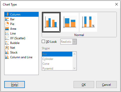
When a preview is clicked, its borders are highlighted and the name appears below. The 2D variants are:
Normal
Stacked
Percent stacked
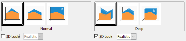
Additional options for creating column charts are:
3D Look
Realistic – tries to give the best 3D look.
Simple – tries to mimic the chart view of other products.
Shape
A bar chart is like a column chart that has been shifted 90 degrees. It shows horizontal bars rather than vertical columns. In contrast to some other chart types, the Y axis is horizontal and the X axis is vertical. The Chart Type dialog for a bar chart is essentially the same as for a column chart, which was described above, with the previews modified to show horizontal bars.
Bar charts can have an immediate visual impact when time is not an important factor — for example, when comparing the popularity of a few products in a marketplace. They may be preferred to column charts when the category names are long or there are a significant number of categories.
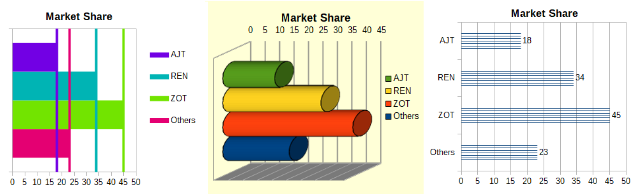
In the examples in Figure 2 below:
To make the first chart, after using the Chart Wizard enter the edit mode and go to Insert > Grids, deselect Y axis, and choose Insert > Mean Value Lines. Right-click each mean value line and select Format Mean Value Line to increase the width of the lines. Create rectangles from the Drawing toolbar to cover the mean value line entries in the legend. Make them white by right-clicking and selecting Line and then Area.
The second chart is a 3D chart created with a simple border and cylinder shape. The chart area is rotated (described in Chapter 6 – Creating Charts and Graphs).
The third chart eliminates the legend by using labels with the names of the companies on the Y axis. Whereas the first two charts treat the data as separate data series, this chart treats the data as one data series in order to have category labels for the X axis. Rather than colors, a colored hatch pattern is used for the bars.
Figure 2: Bar chart examples
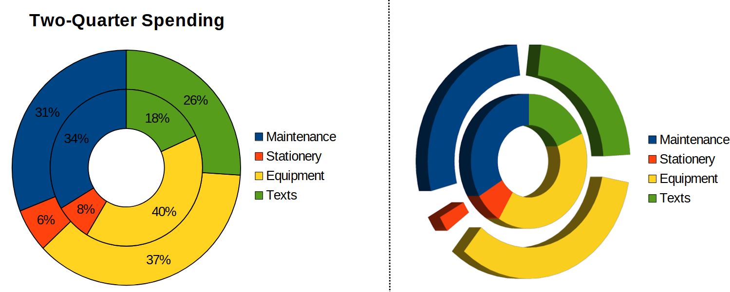
A pie chart shows values as circular sections of a circle. The area of each section is proportional to its value.
Pie charts are excellent for comparing proportions — comparisons of departmental spending, for example. They work best with smaller numbers of values, up to about half a dozen; more than this and the visual impact begins to fade.
Figure 3: Chart Type dialog - Pie
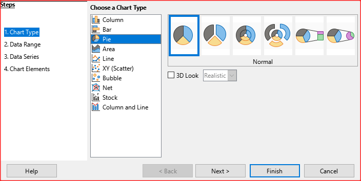
Pie variant options, shown in Figure 3, are:
Normal
Exploded Pie
Donut
Exploded Donut
Bar of Pie
Pie of Pie
The Chart Wizard initially guesses how the data should be presented in the chart. Adjust this on the Data Range and Data Series pages of the Chart Wizard or by using the Data Ranges dialog.
You can do some interesting things with a pie chart, especially if you make it into a 3D chart. It can be tilted, given shadows, and generally turned into a work of art. Just do not clutter it so much that the message is lost, and be careful that tilting does not distort the relative sizes of the segments.
You can choose in the Chart Wizard to use the exploded pie variant, but this option explodes all of the pieces (contrary to the preview graphic in Figure 3). If the aim is to accentuate just one piece of the pie, separate out a piece by carefully highlighting it and dragging it out of the group. After this, the chart area may need to be enlarged to regain the original size of the pieces.
Figure 4: Pie chart examples
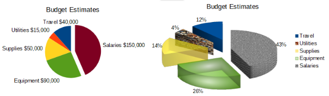
The effects achieved in Figure 4 are explained below.
2D pie chart with one section of the pie exploded
3D pie chart, exploded variant, with realistic schema and various fill effects
Donut and exploded donut variants, shown in Figure 5, are used to display two sets of related information, such as two years of financial data. This variant can be misleading for comparing numeric data, since inner circles are necessarily smaller. For more variety, use a 3D look.
Figure 5: Donut chart examples
Like a line or column chart, an area chart shows values as points on the Y axis and categories on the X axis. The Y values of each data series are connected by lines and the areas below the lines are colored.
Area charts emphasize volumes of change from one category to the next. They have greater visual impact than line charts, but the data used will make a difference.
Figure 6: Chart Type dialog - 2D and 3D Area
Area chart variants, shown in Figure 6 are:
Normal
Deep
Stacked
Percent Stacked
Figure 7: Area chart examples
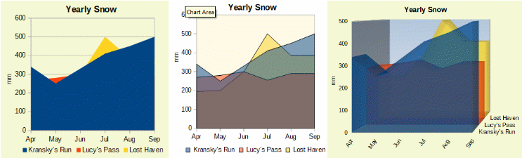
Area charts are sometimes tricky to create. Using transparency values may be helpful. To create the charts in Figure 7, first set up the basic chart using the Chart Wizard. The chart on the left shows the result. Because of the data overlap, some of it is missing behind the first data series. This is probably not desirable. The other examples are better solutions.
To create the chart in the center:
To create the chart on the right:
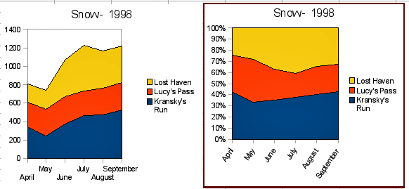
Other ways of visualizing the same data series are the stacked area chart and the percentage stacked area chart (Figure 8). In the first example, each point in a data series is added to the other data series to show the total area. The second example shows a percentage stacked chart, showing each value in the series as a percentage of the whole.
Figure 8: Stacked and percentage stacked area charts
A line chart is useful for showing trends or changes over time when you want to emphasize continuity. Values are shown as points on the Y axis and the X axis shows categories—often time series data. The Y values of each data series may be connected by a line.
Note
The difference between line charts, described in this section, and XY (scatter) charts, described in the next section, is this: line charts show categories along the X axis while XY (scatter) charts show values along the X axis.
As shown in Figure 9, four variants are available:
Points Only
Points and Lines
Lines Only
3D Lines
When Stack series is selected, it shows cumulative Y values above each other. The options are:
On top – places the value of each data series above the others. The Y values no longer represent absolute values, except for the first data series, which appears at the bottom of the chart. This is the default setting.
Percent – scales the Y values as percentages of the category total.
Figure 9: Chart Type dialog – Line
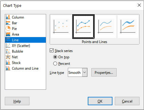
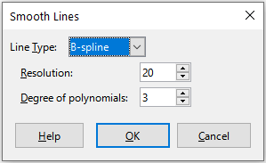
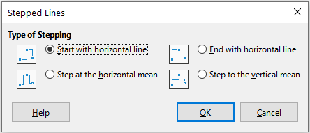
The Line type drop-down list has three options that determine how the data points are connected:
Straight
Smooth
Figure 10: Smooth Lines dialog
Stepped
Figure 11: Stepped Lines dialog
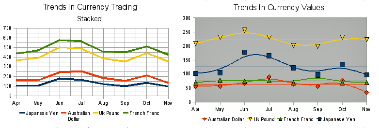
Things to do with lines: thicken them, smooth the contours, just use points, or make them 3D. However, 3D lines can confuse the viewer, so just using a thicker line often works better. Figure 12 shows some examples of line charts.
Figure 12: Line chart examples
In contrast to line, column, and bar charts, which contain numeric values on the Y axis and categories on the X axis, scatter or XY charts contain values along both axes. They are quite useful, especially for understanding relationships among data that are precise and complex. An XY chart may contain more than one data series and can perform many tasks, such as generating a parameter curve or drawing the graph of a function.
Tip
When plotting time on the X axis, make sure that it is not text and is written in the correct format for your locale. For example, instead of January, use a format such as 1/1/2022. Check locale formats at Tools > Options > Languages and Locales > General > Formats > Date acceptance patterns.
XY charts are most frequently used to explore the statistical associations among quantitative variables. There is often a constant value against which to compare the data — for example, weather data, reactions under different acidity levels, or conditions at various altitudes.
Tip
By custom, if one of the variables is either controlled by an experimenter or it changes consistently (such as time) it is considered an independent variable and plotted on the X axis.
Figure 13: Chart Type dialog – XY (Scatter)
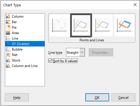
As shown in Figure 13, when the XY (Scatter) chart type is selected, the following variants are available:
Points Only
Points and Lines
Lines Only
3D Lines
The following options are available:
Sort by X values
Line type – Straight
Line type – Smooth
Cubic spline interpolates the data points with polynomials of degree 3. The transitions between the polynomial pieces are smooth, having the same slope and curvature.
B-spline uses parametric, interpolating B-spline curves. The curves are built from polynomials.
Resolution determines how many line segments are calculated to draw a piece of polynomial between two data points. A value in the range 1 to 100. Click any data point to see the intermediate points.
Degree of polynomials (only for B-spline line type) sets the degree of these polynomials. A value in the range 1 to 15.
Line type – Stepped
After a scatter chart is created, its default settings can be changed in ways such as the following. Be sure to first double-click the chart to enter edit mode. Depending on the option, a data point or data series may also need to be double-clicked.
Line styles and icons – double-click or right-click on a data series in the chart to open the Data Series dialog. See “Chapter 6: Lines, areas, and data point icons” for further information.
Error bars – For 2D charts, select Insert > Y Error Bars or X Error Bars to enable the display of error bars. See “Chapter 6: Error bars” for further information.
Mean Value Lines and Trend Lines – Enable the display of mean value lines and trend lines with commands on the Insert menu. See “Chapter 6: Trend and mean value lines” for further information.
By default, the first column or row of data (depending on whether the data is arranged in columns or rows) is represented on the X axis. The rest of the rows of data are then compared against the first row of data.
Scatter charts may surprise those unfamiliar with how they work. This can be seen in examples using the following data (Figure 14), which is organized with data series in rows.
Figure 14: Sample currency data
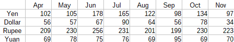
The data range for the chart on the left in Figure 15 includes the cells containing the months. However, the months do not appear on the chart because only values can be used in XY (scatter) charts and Calc substitutes them for cardinal numbers.
The data range for the chart on the right in Figure 15 does not include the cells containing the months. Calc assumes that the first row (or column) of data contains values for the X axis. The Y values of the other data series are paired with each of those X values. This means that there are no data points for the Japanese yen but each of the other currencies are shown in comparison to the yen, since it supplies the X values.
Figure 15: XY (Scatter) chart examples
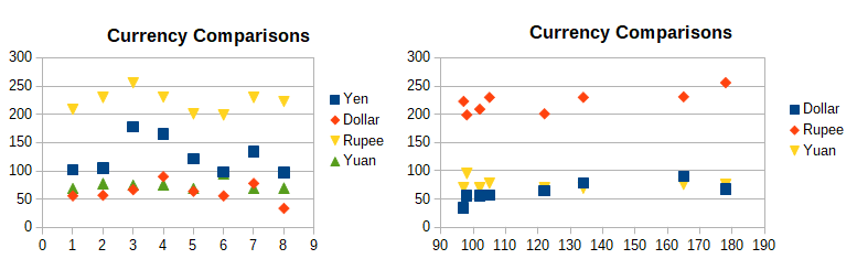
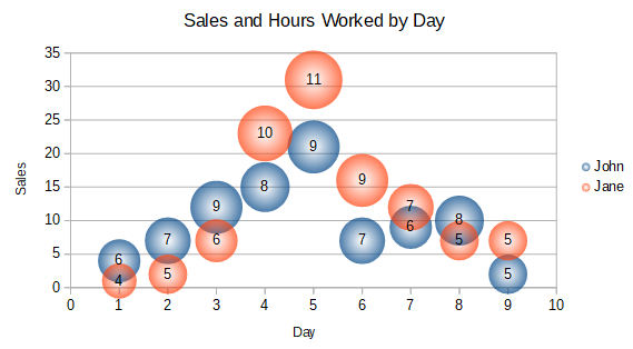
A bubble chart is a variation of a scatter chart that can show three variables in two dimensions. The data points are shown with bubbles. Two variables are plotted along the X and Y axes, while the third variable is represented by the relative size of the bubbles. These charts are often used to present financial data or social/demographic data.
One or more data series can be included in a single chart. The data series dialog for a bubble chart has an entry to define the data range that determines the size of the bubbles.
It may be necessary to build a bubble chart manually in the data series page of the Chart Wizard. Figure 16 shows how the data ranges can be set for a bubble chart.
Figure 16: Data series entries for a bubble chart
The chart in Figure 17 is based on the data in Figure 16. To format the chart, the data series are 50% transparent with a radial gradient. The data labels are formatted to be numbers in the center of the data points (bubbles).
Note
Remember that bubble charts require numeric data. If the data series for the X axis contains text (or dates not formatted as numbers) cardinal numbers will be used for axis labels.
Figure 17: Bubble chart example
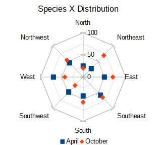
Net charts are also known as spider, polar, or radar charts. They display data values as points on radial spokes, with each spoke representing a variable. They compare data that are not time series, but show different circumstances, such as variables in a scientific experiment. They are especially useful for displaying clusters and outliers.
Figure 18 shows an example of a simple net chart. The radial spokes of the net chart are equivalent to the Y-axes of other charts. All data values are shown with the same scale, so all data values should have about the same magnitude.
Figure 18: Simple net chart example
Generally, between three and eight axes are best; any more and this type of chart becomes confusing. Before and after values can be plotted on the same chart, or perhaps expected and real results, so that differences can be compared.
Figure 19 shows the options for creating a net chart. These are similar to those for area and line charts, described above. However, keep in mind that area increases as the square of the distance along the linear spokes. Therefore, net charts can distort the areas representing the data. Be especially careful about choosing to stack data series. In this case, successive data series show increasingly large areas that are not proportional to their values.
Figure 19: Chart Type dialog - Net
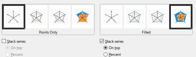
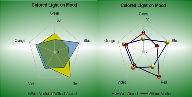
Figure 20 shows examples of two types of net charts.
The example on the left is a filled net chart. The color of one of the data series is 50% transparent. Partial transparency is often best for showing all of the series.
The example on the right is a net chart with lines and points. The data point icons are taken from the Gallery and have a 3D look.
Figure 20: Filled net chart and net chart with 3D data point icons
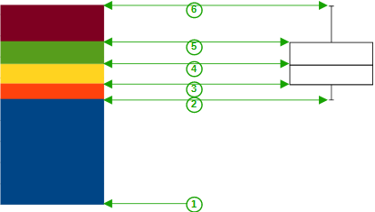
A stock chart illustrates the market trends for stock and shares by giving opening price, bottom price, top price, and closing price. The transaction volume can also be shown and the X axis usually represents a time series.
When setting up a stock chart in the Chart Wizard, the data should be arranged as shown in Figure 21. It specifies which columns should be the opening, low, high, and closing prices of the stock as well as the transaction volume. However, manual adjustments may still be needed when defining the data series.
Figure 21: Example data arrangement for stock charts
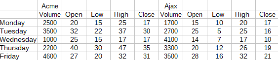
A stock chart organizes data series in two basic ways. The first way is not used in other chart types. In this case, the open, low, high, and closing values of a row create one data unit in the chart and one data series consists of several rows containing such data units. The columns containing transaction volumes are the second way used to organize data series. This is the familiar way used in other chart types.
Figure 21 shows the data for four data series: 1) the price data for Acme, which contains columns for open, low, high, and closing prices, 2) the price data for Ajax, which contains columns for open, low, high, and closing prices, 3) the Acme transaction volume, which is one column, and 4) the Ajax transaction volume, which is one column.
The Chart Wizard offers four stock chart variants, as shown in Figure 22. Note that some of them do not use all of the data columns.
Figure 22: Chart Type dialog - Stock
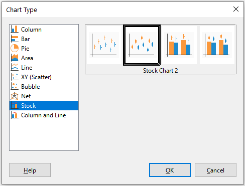
The data table in Figure 21 is used to illustrate the variants, which are as follows.
Stock Chart 1
Stock Chart 2
Stock Chart 3
Note
Variants 3 and 4 automatically align data to the secondary Y axis. For more information about a secondary Y axis, see “Chapter 6: Aligning data to secondary Y axis”.
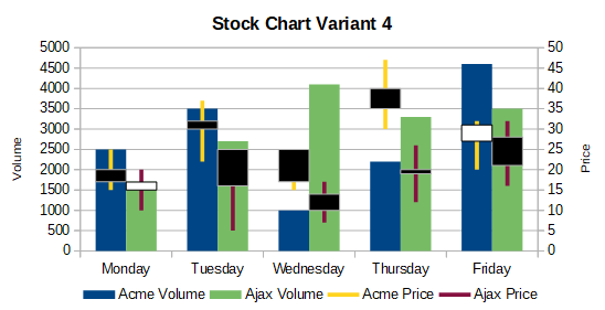
Stock Chart 4
Figure 23: Stock chart variant 1
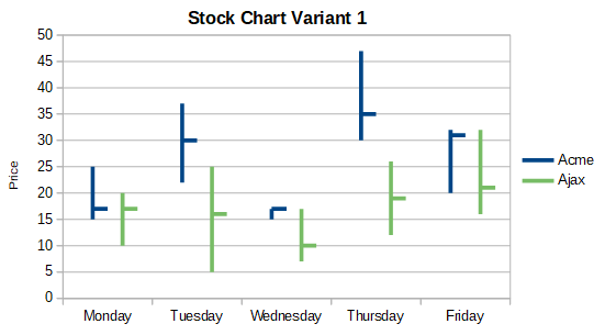
Figure 24: Stock chart variant 2
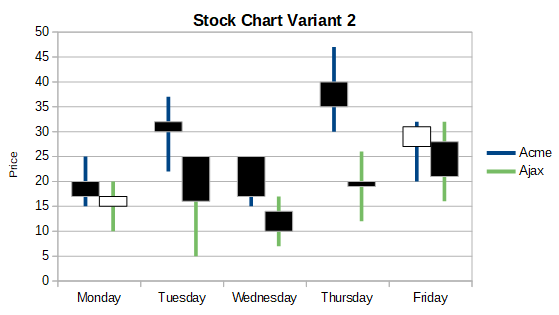
Figure 25: Stock chart variant 3
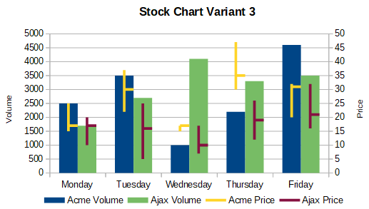
Figure 26: Stock chart variant 4
A column and line chart is useful for displaying two or more distinct but related data series, such as sales over time (columns) and profit margin trends (lines). It could also show constant minimum and maximum lines, such as used in medical testing or quality control.
Specify in the Chart Type dialog the number of lines. By default, the first column or row of data is categories and the last columns or rows of data are lines.
Choose between two variants:
Columns and Lines
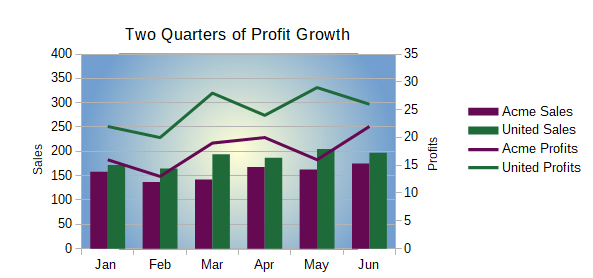
Figure 27: Column and line chart with secondary Y axis
Stacked Columns and Lines
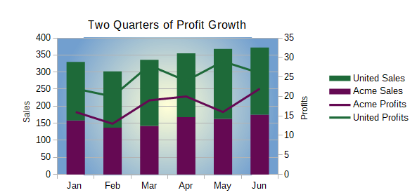
The charts in Figure 27 and Figure 28 show sales and profit data for two firms over a period of time. Note that when first created, the lines were different colors than the columns for the same company. To reflect the company relationships, change the line colors individually by clicking on a line, right-clicking, selecting Format Data Series, and formatting the line color and size on the Line page.
For the background, right-click the chart wall, select Format Wall, and select desired options on the Gradient page of the Area tab. To align the two data series to the secondary Y axis, see “Chapter 6: Aligning data to secondary Y axis”.
Figure 28: Column and line chart with stacked columns
Pivot tables are special types of data tables that simplify the manipulation and analysis of data. They are widely used, especially for processing large amounts of data. Pivot charts are based on pivot tables and are created by selecting Insert > Chart, or clicking the Insert Chart icon in the Standard toolbar, after left-clicking a cell inside a pivot table. Pivot charts inherit many properties of the other chart types described in this chapter but also have other characteristics that are described in Chapter 10, Using Pivot Tables.
Calc does not currently have the option of creating a data series as a box plot. However, it is possible to convert the minimum, 1st quartile, median, 3rd quartile, and maximum of a stacked column chart with the data series in rows and without a legend into a box plot with whiskers.
The conversion of this stacked column chart to a box plot with whiskers is done by replacing the stacks in the chart with:
Minimum of the data series
The difference between the first quartile and the minimum of the data series.
The difference between the median and the first quartile of the data series.
The difference between the third quartile and the median of the data series.
The difference between the maximum and the third quartile of the data series.
When calculating the differences of the first and third quartiles, it is important whether the data series contains an even or an odd amount of data. For an even amount of data, the function QUARTILE.EXC (range, parameter) should be used and for an odd amount of data use the function QUARTILE.INC (range, parameter).
The MIN (range), MEDIAN (range), and MAX (range) functions can be used to calculate the minimum, median, and maximum, respectively.
Figure 29 shows a stacked column chart in rows of minimum, 1st quartile, median, 3rd quartile, maximum (with no legend), together with a box plot with whiskers constructed from that column chart.
Figure 29: Stacked column chart and box plot with whiskers
Minimum of the data series
The first quartile of the data series
Bottom of the box to be formed
The median of the data series
The third quartile of the data series is also the top of the shapes box
The maximum of the data series
You can convert a column char to box plot with whiskers by following the next steps:
Remove or apply the color white to the bottom stack with Format Data Series in the context menu.
While in edit mode, right-click on the chart and select Insert Y Error Bars from the context menu.
Set the style in the Line Properties section of the Line tab in the Data Series Y Error Bars dialog box to Continuous and the width to 0.03 cm.
On the Y Error Bars tab, select Cell Range and in the Error Indicator section choose Negative. In the now opened Negative (-) box insert the difference between the 1st quartile and the minimum.
Remove or apply the color white to the top stack with Format Data Series in the context menu.
Set the configuration of the top whisker by performing steps similar to the described above.
The box consists of the middle stack and the stack above it with the median separating the two stacks. Both stacks should be framed with borders by selecting Format Data Series from the context menu. On the Borders tab of the dialog, the Style should be set to Continuous and the thickness to 0.03 cm. If desired, you can remove or whiten the background on the Plane tab.
For more detailed instructions about making a boxplot, see https://wiki.documentfoundation.org/Documentation/HowTo/Calc/BoxplotWithWhiskers.
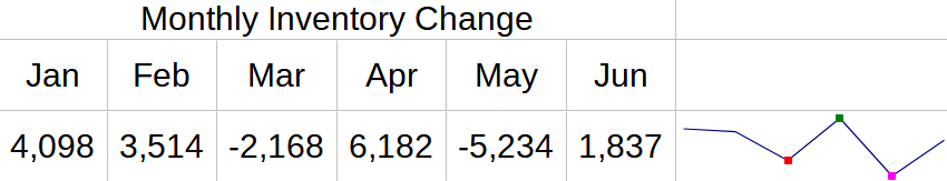
Sparklines are small, simple, cell-sized charts that convey the general shape of data variation within a dataset. Typically, sparklines are used to show variation over time and are usually drawn without axes or coordinates.
Figure 30: A simple sparkline example
Tip
Calc’s sparklines are compatible with Microsoft Excel’s version of sparklines and can be both imported from and exported to Excel.
To create a sparkline:
Select the row or column of source data.
Either right-click on the selected data and choose Sparklines > Sparkline from the context menu, or go to Insert > Sparkline on the Menu bar.
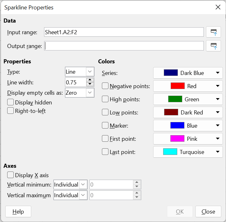
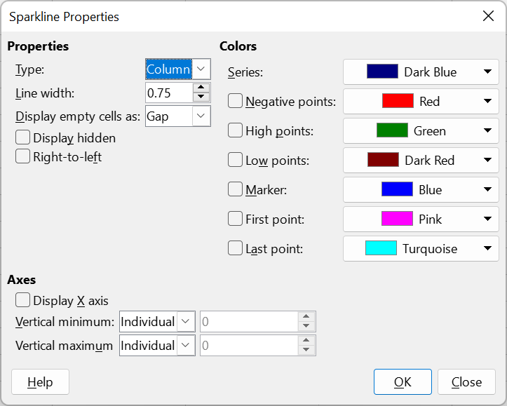
Calc displays the Sparkline Properties dialog, configured for sparkline creation (Figure 31).
Select a single cell as the Output range.
Complete the remainder of the Sparkline Properties dialog, as required for the new sparkline. The available options are described below.
Click OK to close the Sparkline Properties dialog and create the sparkline.
For sparkline creation, the Sparkline Properties dialog provides the following fields:
Data
Input range – The input data range for the sparkline. This will be auto-populated if you selected a data range before creating the sparkline.
Output range – The cell(s) where the sparkline(s) will be drawn.
Properties
Type – Select the sparkline type: Line, Column, or Stacked. These options are described further in the “Types of sparkline” section below.
Line width – Set the line width for line sparklines.
Display empty cells as – Gap (skips the missing data and shows a gap in the sequence), Zero (displays the missing data as zero), or Span (skips the missing data and draws a line to the next value).
Display hidden – Check to show all data in the selected input range in the sparkline. If unchecked, hidden data will be ignored.
Right-to-left – By default, the sparkline will display the data from left to right for rows and top to bottom for columns. Checking this box will reverse the display order.
Colors
Set the main color for the Series of values and check and select colors for various value types to display in the sparkline. Marker will set the default color for the data points in line sparklines only.
Axes
Display X axis – Check to show an x-axis in the sparkline.
Vertical minimum, Vertical maximum – set the minimum and maximum values for the y‑axis with options Individual, Group (see “Creating multiple sparklines” below), and Custom. The adjacent numeric input fields are available only when the Custom option is selected in the corresponding menu.
Note
A sparkline is limited to one cell. To increase the size of the sparkline, increase the size of the cell. If the sparkline cell is merged into other cells, the sparkline will remain the same size as in the original cell but the option to modify the sparkline’s formatting will be lost until the cell is unmerged.
Figure 31: Sparkline Properties dialog (sparkline creation)
There are three types of sparkline – line, column, and stacked.
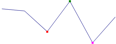
Line
Figure 32: Line sparkline example
Column
Figure 33: Column sparkline example

Stacked
Figure 34: Stacked sparkline example

To create multiple sparklines at once:
Select multiple rows or columns of source data.
Either right-click on the selected data and choose Sparklines > Sparkline from the context menu, or go to Insert > Sparkline on the Menu bar.
Calc displays the Sparkline Properties dialog, configured for sparkline creation (Figure 31).
Select an equal number of cells for the Output range as there are rows or columns in the Input range.
Complete the remainder of the Sparkline Properties dialog, as required for the new sparklines. The available options are described in the notes above Figure 31.
Click OK to close the Sparkline Properties dialog and create the sparklines.
The new sparklines will appear in the Output range cells in the same order as the rows or columns selected in the Input range. They will all share the same formatting and the same sparkline group (see “Sparkline groups” below).
When setting the Vertical minimum or Vertical maximum to Group, each associated sparkline’s y‑axis will enlarge to include the lowest (for minimum) or highest (for maximum) value from all of the data in the associated sparklines.
Tip
If the OK button in the Sparkline Properties dialog is unavailable, it is because the number of cells in the Output range does not match the number of rows or columns selected in the Input range. Update these dimensions to match and the OK button will become available.
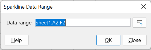
To update a sparkline’s data range:
Right-click on the sparkline and choose Sparklines > Edit Sparkline from the context menu.
Calc displays the Sparkline Data Range dialog (Figure 35).
Update the Data range as required.
Click OK to close the Sparkline Data Range dialog.
Figure 35: Sparkline Data Range dialog
To update a sparkline’s formatting properties (excluding input and output ranges):
Either right-click on the selected sparkline and choose Sparklines > Sparkline from the context menu, or select the sparkline and go to Insert > Sparkline on the Menu bar.
Calc displays the Sparkline Properties dialog, configured for sparkline modification (Figure 36). Note that the controls on this version of the Sparkline Properties dialog are identical to those for the sparkline creation version shown in Figure 31, except that the fields in the Data area for entering the Input range and the Output range are omitted.
Modify the fields of the Sparkline Properties dialog, as required. The available options are as described in the notes above Figure 31.
Click OK to close the Sparkline Properties dialog and update the formatting properties of the selected sparkline.
Figure 36: Sparkline Properties dialog (sparkline modification)
Sparklines are defined for one cell, but multiple sparklines can be linked together into a group. The group shares the same formatting properties for rendering the sparkline. The unique data that is defined for each sparkline is the data range that will be used.
Each individually created sparkline is associated to one sparkline group. When multiple sparklines are created at once, they initially share the same sparkline group. Any change to the formatting properties of a sparkline group will affect all related sparklines.
When a sparkline is selected, all sparklines in the same group are highlighted.
To update the formatting properties of a sparkline group:
Right-click on a sparkline in the group to be modified and choose Sparklines > Edit Sparkline Group from the context menu, or select a cell containing a sparkline in the group to be modified and go to Format > Sparklines > Edit Sparkline Group on the Menu bar.
Calc displays the Sparkline Properties dialog, configured for sparkline modification. Note that the controls on this version of the Sparkline Properties dialog are identical to those for the sparkline modification version shown in Figure 36.
Modify the fields of the Sparkline Properties dialog, as required. The available options are described in the notes above Figure 31.
Click OK to close the Sparkline Properties dialog and update the formatting properties for all sparklines in the group.
To group sparklines so that they share the same formatting:
First select the sparkline with the group formatting that is to be applied to other sparklines.
Next select the other sparkline(s) to add to the group.
Then do one of the following to finish the grouping:
Right-click one of the selected cells and choose Sparklines > Group Sparklines from the context menu.
Go to Format > Sparklines > Group Sparklines on the Menu bar.
To ungroup sparklines so that they can be formatted separately, select the sparklines to be removed from the sparkline group and do one of the following:
Right-click one of the selected cells and choose Sparklines > Ungroup Sparklines from the context menu.
Go to Format > Sparklines > Ungroup Sparklines on the Menu bar.
The sparklines that were ungrouped will now each have their own sparkline group.
To delete a single sparkline, do one of the following:
Select the sparkline and press Delete.
Select the sparkline and go to Format > Sparklines > Delete Sparkline on the Menu bar.
Right-click the sparkline and choose Sparklines > Delete Sparkline from the context menu.
To delete all sparklines in a group, do one of the following:
Select a sparkline in the group and go to Format > Sparklines > Delete Sparkline Group on the Menu bar.
Right-click a sparkline in the group and choose Sparklines > Delete Sparkline Group from the context menu.