
Calc Guide 24.8
Chapter 10 Using Pivot Tables
This document is Copyright © 2024 by the LibreOffice Documentation Team. Contributors are listed below. You may distribute it and/or modify it under the terms of either the GNU General Public License (https://www.gnu.org/licenses/gpl.html), version 3 or later, or the Creative Commons Attribution License (https://creativecommons.org/licenses/by/4.0/), version 4.0 or later.
All trademarks within this guide belong to their legitimate owners.
|
Steve Fanning |
Olivier Hallot |
Edward Olson |
|
Barbara Duprey |
Martin J Fox |
Jean Hollis Weber |
|
John A Smith |
Klaus-Jürgen Weghorn |
Kees Kriek |
|
Steve Fanning |
Leo Moons |
Felipe Viggiano |
|
Stefan Weigel |
Vasudev Narayanan |
Skip Masonsmith |
|
Olivier Hallot |
B. Antonio Fernández |
|
Please direct any comments or suggestions about this document to the Documentation Team’s forum at https://community.documentfoundation.org/c/documentation/loguides/ (registration is required) or send an email to: loguides@community.documentfoundation.org.
Note
Everything you send to a forum, including your email address and any other personal information that is written in the message, is publicly archived and cannot be deleted. Emails sent to the forum are moderated.
Published December 2024. Based on LibreOffice 24.8 Community.Other versions of LibreOffice may differ in appearance and functionality.
Some keystrokes and menu items are different on macOS from those used in Windows and Linux. The table below gives some common substitutions for the instructions in this document. For a detailed list, see the application Help and Appendix A (Keyboard Shortcuts) to this guide.
|
Windows or Linux |
macOS equivalent |
Effect |
|
Tools > Options on Menu bar |
LibreOffice > Preferences on Menu bar |
Access to setup options |
|
Right-click |
Ctrl+click and/or right-click depending on computer setup |
Opens a context menu |
|
Ctrl or Control |
⌘ and/or Cmd or Command, depending on keyboard |
Used with other keys |
|
Alt |
⌥ and/or Alt or Option depending on keyboard |
Used with other keys |
Many spreadsheet support requests stem from using overly complex formulas to address simple, everyday tasks. For a more efficient and effective approach, consider using pivot tables. These tools simplify the process of combining, comparing, analyzing, and summarizing large datasets.
With pivot tables, you can:
Generate different summaries of your source data.
Drill down into specific details of interest.
Create detailed reports, regardless of your skill level—beginner, intermediate, or advanced.
Additionally, pivot charts can be created from pivot tables to provide a clear graphical representation of the data.
To use a pivot table, you need a list of raw data structured like a database table, with rows representing data sets and columns representing data fields. The field names should be in the first row above the data.
The data source can come from an external file or database. If the data is already within a Calc spreadsheet, simpler sorting functions may suffice without the need for a pivot table.
To process data in lists, Calc needs to identify where the list is located within the spreadsheet. Lists can appear anywhere on the sheet and multiple unrelated lists can coexist.
Calc automatically detects your lists using the following logic:
Starting from the currently selected cell (which must be within the list), Calc scans in all four directions—left, right, up, and down.
It identifies the list boundaries when it encounters an empty row or column or reaches the spreadsheet's edges (Figure 1).
For these functions to work correctly:
Ensure there are no empty rows or columns within the list.
Avoid using empty rows for formatting purposes. Instead, apply formatting directly to the cells within the list.
Tip
To make sure that Calc automatically recognizes a list correctly, check that there are no empty rows or empty columns within the list.
Figure 1: Automatic list selection with cursor in cell B7
If you select more than one cell before creating a pivot table, then Calc’s automatic list recognition logic is not applied. Instead, Calc assumes that the pivot table is to be created using exactly the cells that you selected.
Tip
Always select only one cell before initiating creation of a pivot table. This allows Calc to automatically determine the full scope of your data list.
A common source of errors occurs when a list is unintentionally defined and then sorted. For example, selecting multiple cells—such as an entire column—can result in sorting that misaligns data that should remain together within rows.
Beyond these technical considerations, maintaining the logical structure of the list is equally crucial.
Note
Calc lists must have the normal form; that is, they must have a simple linear structure.
When entering data, avoid adding outlines, groups, or summaries. Here are common mistakes often made by inexperienced spreadsheet users:
Creating unnecessary sheets: For example, using separate sheets for each group of items. This limits analyses to individual groups and makes cross-group analysis difficult.
Using multiple columns for similar data: For instance, in a sales list, creating separate columns for each employee's sales instead of a single column for all amounts. This structure complicates data grouping and prevents effective analysis with pivot tables. To enable proper analysis, all related data should be in the same column.
Including summary rows in chronological data: For example, adding a total row at the end of each month. This prevents the list from being sortable by different criteria since pivot tables treat summary rows as regular data. Instead, use the pivot table's built-in features to quickly generate monthly summaries.
The possible data sources for the pivot table are a Calc spreadsheet or an external data source that is registered in LibreOffice.
Analyzing a list in a Calc spreadsheet is the simplest and most often used case. Lists might be updated regularly or the data might be imported from a different application.
The list data might be entered directly into the spreadsheet or copied from another file or application. You can also use a Web Page Query input filter to insert data from an HTML file, a CSV file, a Calc spreadsheet, or a Microsoft Excel spreadsheet. See Chapter 12, Linking Data, for more information.
The behavior of Calc while inserting data from a different application depends on the format of the data. If the data is in a common spreadsheet format, it is copied directly into Calc. However, if the data is in plain text format, the Text Import dialog appears after you select the file containing the data. See Chapter 1, Introduction, for more information about this dialog.
A registered data source is a connection to data held in a database outside of LibreOffice. When using a registered data source, the data to be analyzed will not be saved in the spreadsheet; Calc will always use the data from the original source. Calc can use many different data sources in addition to databases that are created and maintained with LibreOffice Base. For more information, see Chapter 12, Linking Data.
If you frequently use pivot tables in Calc, navigating through the built-in menu paths might feel inconvenient.
To streamline your workflow, consider the following options:
Built-in keyboard shortcuts: Some shortcuts are predefined, such as the F12 key, which groups a selected data range. Refer to Appendix A, Keyboard Shortcuts, for a full list.
Toolbar icons: The standard toolbar includes icons for tasks like inserting or editing pivot tables, making these actions more accessible.
Additionally, you can create custom keyboard shortcuts and toolbar icons to suit your needs. For instructions, see Chapter 16, Setting up and Customizing.
If you want Calc to automatically determine the full extent of the raw data list, then select a single cell within this list. If you want to explicitly define the extent of the raw data list, then select only the relevant cells.
After making a selection, create the pivot table in one of three ways:
Use Insert > Pivot Table on the Menu bar.
Use Data > Pivot Table > Insert or Edit on the Menu bar.
Click the Insert or Edit Pivot Table icon on the Standard toolbar.
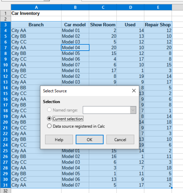
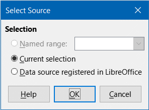
Calc displays the Select Source dialog (Figure 2), where you can choose between using the selected data cells, a range of cells that has already been named, or a data source that has already been registered with LibreOffice.
Note
See Chapter 14, Calc as a Database, for more information about named ranges. See Chapter 12, Linking Data, for more information about linking to registered data sources.
Figure 2: Select Source dialog
Click OK on the Select Source dialog to display the Pivot Table Layout dialog, which is described in the next section.
The pivot table's functionality is controlled in two main areas: the Pivot Table Layout dialog and direct manipulations of the resulting table within the spreadsheet. This section provides a detailed explanation of the Pivot Table Layout dialog.
Tip
To access the Pivot Table Layout dialog again after initial creation of a pivot table, left-click in any cell of the pivot table. Then select Insert > Pivot Table on the Menu bar, or select Data > Pivot Table > Insert or Edit on the Menu bar, or click the Insert or Edit Pivot Table icon on the Standard toolbar, or right-click in any cell of the pivot table and select the Properties option in the context menu.
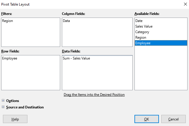
The Pivot Table Layout dialog (Figure 3) organizes the resulting pivot table into four key areas:
Filters
Column Fields
Row Fields
Data Fields
Additionally, there is an Available Fields area that lists the fields from the source data. To design the layout, simply drag fields from the Available Fields area and drop them into the desired section.
The Data Fields area must include at least one field, though advanced users can add multiple fields. Fields in this area use an aggregate function by default. For example, dragging the Sales Value field into the Data Fields area will initially display it as Sum – Sales Value.
Figure 3: Pivot Table Layout dialog
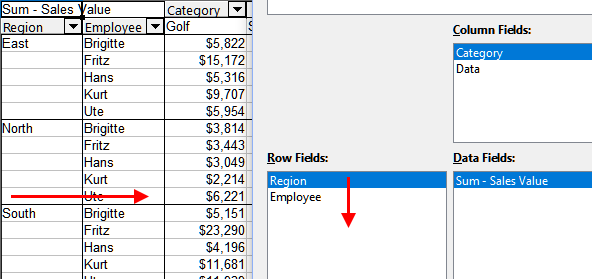
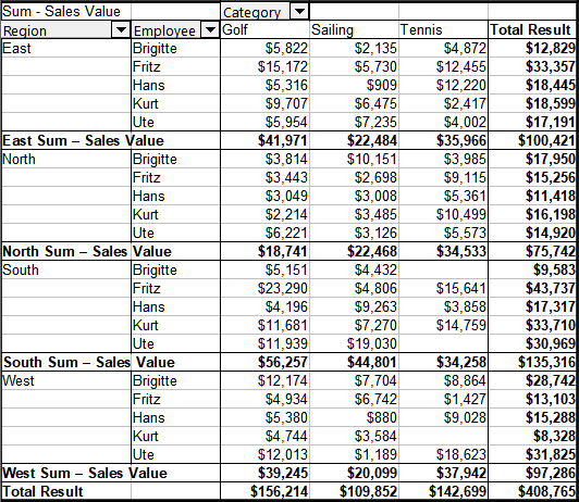
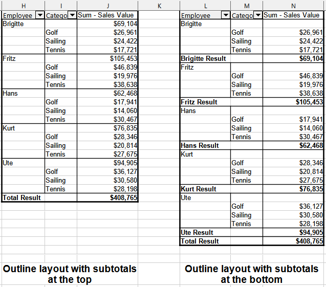
Row and column fields indicate from which groups the result will be sorted. Often more than one field is used at a time to get partial sums for rows or columns. The order of the fields gives the order of the sums from overall to specific.
For example, if you drag Region and Employee into the Row Fields area, the sum will be divided into the regions. Within the regions will be the listing for the different employees (Figure 4).
Fields that are placed into the Filters area appear at the top of the resulting pivot table as a drop-down list. The summary in the result takes into account only that part of the base data that you have selected. For example, if you include Employee in the Filters area, you can filter the result shown for each employee.
To move a field from an area, just drag it to a new area. To remove a field from the Filters, Column Fields, Row Fields, or Data Fields areas, drag it to the Available Fields area.
Tip
To rapidly move a selected field from one area of the Pivot Table Layout dialog to another, press the Alt+letter on the keyboard that corresponds to the underlined letter in the target area’s label.
Figure 4: Field order for analysis and resulting layout of pivot table
Note
By default, Calc inserts a Data field into the Column Fields area. The Data field can be moved between the Column Fields and Row Fields areas as required. Depending on its position within the list of fields in its area, the Data field may lead to a button labeled Data appearing in the results of the pivot table, affecting the layout of the results. If you do not wish to use this facility, simply place the Data field at the bottom of the list of fields in its area.
Expanding the options section of the Pivot Table Layout dialog reveals the following options for working with pivot table layouts:
Ignore empty rows
Identify categories
Total columns
Total rows
Add filter
Enable drill to details
Show expand/collapse buttons.
Each of these options is shown in Figure 5 and described in the sections that follow.
Ignore empty rows
Identify categories
Figure 5: Expanded area of the Pivot Table Layout dialog
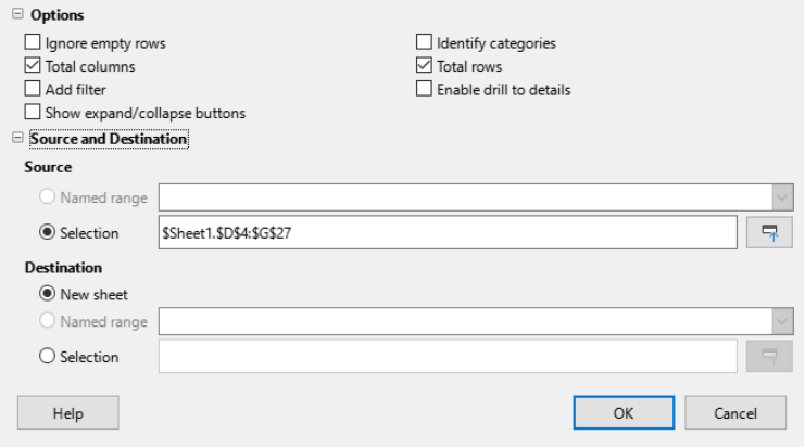
Figure 6: Example of data with missing entries in Column A
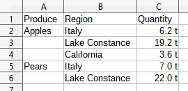
Figure 7: Pivot table result with Identify categories selected
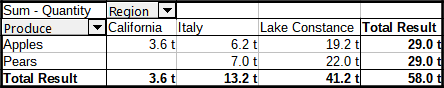
Figure 8: Pivot table result without Identify categories selected
Total columns, Total rows
Add filter
Note
The filtering provided through the Add filter option is independent of the filtering provided by including fields in the Filters area of the Pivot Table Layout dialog.
Enable drill to details
Show Expand / Collapse buttons
Expanding the Source and Destination section of the Pivot Table Layout dialog reveals fields for changing the source and destination.
Source
Destination
Tip
To display the pivot table on the same sheet as the raw data, check the Selection option in the Destination area, click the Shrink button to the right of the Selection field, click at an appropriate cell in an empty area of the sheet, click the Expand button, and click OK on the Pivot Table Layout dialog.
Settings can be changed for any field that is currently included in the pivot table layout. To change the settings, simply double click the field within the Pivot Table Layout dialog.
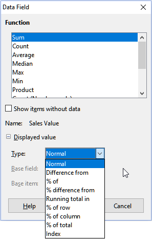
The options available for fields in the Data Fields area (Figure 9) differ from those for fields in the other three areas. In the Data Field dialog, you can select the function to be used to accumulate the values from the data source. The frequently used Sum function and other lesser used functions like standard deviation and counting function are available in the dialog.
Select the Show items without data option to include empty columns and rows in the results table.
Click the expansion symbol (plus sign or triangle) to expand the Displayed value section of the dialog.
Figure 9: Expanded dialog for a data field
In the Displayed value section, you can choose other possibilities for analysis using the aggregate function. Depending on the setting for Type, you may have to choose definitions for the Base field and Base item.
Figure 10: Example choices for Base field and Base item
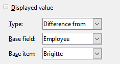
Table 1 lists the possible types of displayed value and associated base field and base item, together with notes on usage.
Table 1: Description of Displayed value options on the Data Field dialog
|
Type |
Base field |
Base item |
Analysis |
|
Normal |
— |
— |
Simple use of the chosen aggregate function (for example, Sum). |
|
Difference from |
Selection of a field from the data source of the pivot table (for example, Employee). |
Selection of an element from the selected base field (for example, Brigitte) |
The result is the difference between the result of the base field and the base item (for example, sales volume of the other employees against the sales volume of Brigitte; see Figure 11). If previous item or next item is specified as the Base item, the reference value is the result for the next visible member of the base field, in the base field’s sort order. |
|
% of |
Selection of a field from the data source of the pivot table (for example, Employee) |
Selection of an element from the selected base field (for example, Brigitte) |
The result is a percentage ratio of the value of the base field to the base item (for example, sales result of the other employees relative to the sales result of Brigitte; see Figure 12). If previous item or next item is specified as the Base item, the reference value is the result for the next visible member of the base field, in the base field’s sort order. |
|
% difference from |
Selection of a field from the data source of the pivot table (for example, Employee) |
Selection of an element from the selected base field (for example, Brigitte) |
From each result, its reference value is subtracted, and the difference is divided by the reference value (for example, sales of the other employees as a relative difference from the sales of Brigitte; see Figure 13). If previous item or next item is specified as the Base item, the reference value is the result for the next visible member of the base field, in the base field’s sort order. |
|
Running total in |
Selection of a field from the data source of the pivot table (for example, Date) |
— |
Each result is added to the sum of the results for preceding items in the base field, in the base field’s sort order, and the total sum is shown. Results are always summed, even if a different summary function was used to get each result. |
|
% of row |
— |
— |
The result is a percentage of the value of the whole row (for example, the row sum). |
|
% of column |
— |
— |
The result is a percentage of the total column value (for example, the column sum). |
|
% of total |
— |
— |
The result is a percentage of the overall result (for example, the total sum). |
|
Index |
— |
— |
(Default result x total result) / (row total x column total) |
Figure 11: Original pivot table (top) and a Difference from example (bottom)
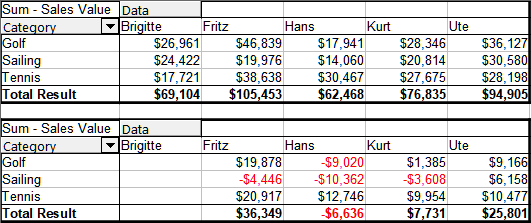
Figure 12: Example of a % of analysis
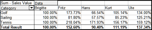
Figure 13: Example of % difference from analysis
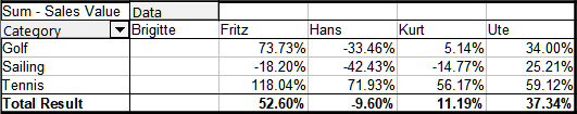
Figure 14: Data Field dialog for a row or column field
Double-click a field in the Row or Column Fields areas of the Pivot Table Layout dialog to access the Data Field dialog shown in Figure 14.
In the Data Field dialog for a row or column field, you can choose to show subtotals for each category. Subtotals are deactivated by default. Subtotals are useful only if the values in one row or column field can be divided into subtotals for another (sub)field.
Some examples are shown in Figure 15, Figure 16, and Figure 17.
Figure 15: No subdivision with only one row or column field
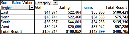
Figure 16: Division of the regions for employees (two row fields) without subtotals
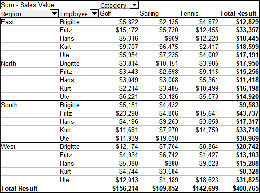
Figure 17: Division of the regions for employees with subtotals (by region)
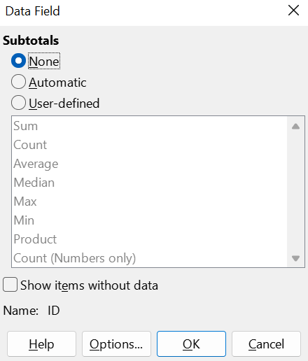
To calculate subtotals that can also be used for the data fields (see above), select the Automatic option in the Subtotals section of the Data Field dialog.
You can choose the type of subtotal to use by selecting User-defined and then clicking the type of subtotal you want to calculate from the list. Functions in this list are only available when User-defined is selected.
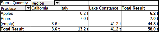
Normally, as shown in Figure 18, the pivot table excludes any rows or columns for categories that have no entries in the underlying database. However, by choosing the Show items without data option, you can force these to be displayed as shown in Figure 19
Figure 18: Default setting
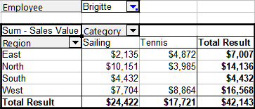
Figure 19: Setting Show items without data
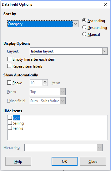
To do so, click the Options button on the Data Field dialog to access the Data Field Options dialog (Figure 20). Use this dialog to specify additional options for fields in the Column and Row Fields areas of the Pivot Table Layout dialog.
Figure 20: Data Field Options dialog
The following options are available:
Sort by: Choose the data field to sort columns or rows.
Ascending: Sorts values from lowest to highest. If the selected field is the one for which the dialog was opened, items are sorted by name. If a data field is selected, items are sorted by the resultant values of that field.
Descending: Sorts values from highest to lowest.
Manual: Sorts items alphabetically.
Display Options: Customize display settings for all row fields, except the last (innermost) row field.
Use the Layout drop-down list to select the layout mode for the field in the list box. The Layout menu provides four layout mode options that are shown in Figure 21 and Figure 22 below:
Tabular layout
Outline layout with subtotals at the top
Outline layout with subtotals at the bottom
Compact layout
Enable Empty line after each item to insert a blank row after each item’s data in the pivot table.
Use Repeat item labels to toggle whether item labels are repeated or not.
Figure 21: Pivot table layout modes – Tabular and Compact
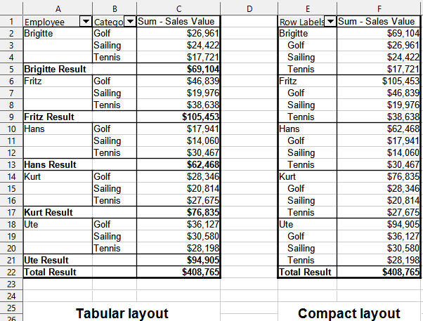
Figure 22: Pivot table layout modes – Outline with subtotals top and bottom
Show Automatically. This feature displays the top or bottom nn items when you sort by a specified field. Click the Show option to turn on the automatic show feature and enter the maximum number of items that you want to show automatically. The From drop-down list selects the top or bottom items in the specified sort order. The Using field drop-down list selects the data field by which to sort the data.
Hide Items. Use these options to select the items to hide from the calculations.
Hierarchy. For the majority of users, this field will be disabled because Calc does not provide multiple hierarchies for a single field. However, if using a pivot table data source extension, that extension could define multiple hierarchies for some fields. In that case, this setting can be used to select the hierarchy to use.
It is possible to set options for a field appearing in the filters section (Figure 3) the same way options are set for row fields and column fields. However, the options settings have no effect until that field is moved from the filters section to either the rows section or the columns section.
A pivot table can be easily restructured using the Pivot Table Layout dialog (Figure 3).
When the Pivot Table Layout dialog is open, fields can be dragged from Row Fields, Column Fields, Filters, and Data Fields areas and then dropped in a different position. Unused fields can also be added, and fields removed in error can be replaced by dragging and dropping them into the positions required.
Some manipulation can also be carried out in the results view of the pivot table. Within the results of the pivot table, drag one of the filters, column, or row fields to a different position. The mouse pointer will change shape from its starting shape (horizontal or vertical block on the arrow head) to the opposite if moving to a different field, such as from row to column, where it can be dropped.
Figure 23: Drag a column field - note the pointer shape
Figure 24: Result of dragging column field
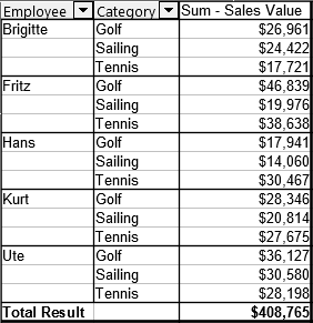
Figure 25: Drag a row field - note the pointer shape
You can remove a column, row, or filter field from the pivot table by clicking on it and dragging it out of the table. The mouse pointer changes to that shown in Figure 26. A field removed cannot be recovered, without returning to the Pivot Table Layout dialog to replace it.
Figure 26: Field dragged out of the pivot table
For many analyses, categories must be grouped into classes. Grouping can only be done on an ungrouped pivot table. To group data, select the relevant cell range and choose Data > Group and Outline > Group from the menu, or press F12 on your keyboard. The type of values you want to group (such as numbers or text) will determine how the grouping works.
Note
Before you can group, you have to produce a pivot table with ungrouped data. The time needed for creating a pivot table depends mostly on the number of columns and rows and not on the size of the basic data. Through grouping, you can produce the pivot table with a small number of rows and columns. The pivot table can contain a lot of categories, depending on your data source.
To remove grouping again, click inside the group, then choose Data > Group and Outline > Ungroup, or press Ctrl+F12.
For grouping scalar values, select a single cell in the row or column of the category to be grouped. Choose Data > Group and Outline > Group on the Menu bar or press F12 on the keyboard; Calc displays the Grouping dialog shown in Figure 27.
You can define in which value range (Start / End) the grouping should take place. The default setting is the whole range, from the smallest to the largest value. In the field Group by, you can enter the class size, also known as the interval size.
Figure 27: Grouping dialog with scalar categories
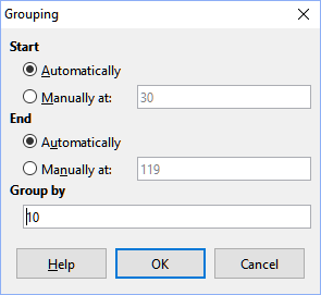
Figure 28 shows part of a pivot table created from a list containing speed measurements as a function of time. This pivot table shows the count of km/h speed measurements in the raw data.
Figure 28: Pivot table without grouping
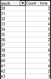
Figure 29: Pivot table with grouping
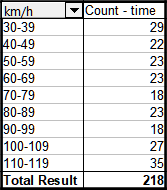
The pivot table in Figure 29 is based on the same raw data but the speed measurements have been grouped into intervals of 10 km/h.
For grouping date / time values, select a single cell in the row or column of the category to be grouped. Choose Data > Group and Outline > Group on the Menu bar or press F12 on the keyboard; Calc displays the Grouping dialog shown in Figure 30.
You can specify the value range for grouping by setting the Start and End points. By default, grouping covers the entire range, from the smallest to the largest value.
In the Group by field, you can define the class size (interval size). For time-based data, you can choose from predefined intervals like Seconds, Minutes, Hours, Days, Months, Quarters, or Years instead of manually entering the interval in days.
Figure 30: Grouping dialog for date/time categories
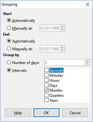
Figure 31 illustrates this, showing monthly sales for the North region.
Figure 31: Pivot table with grouping
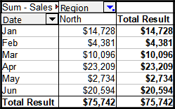
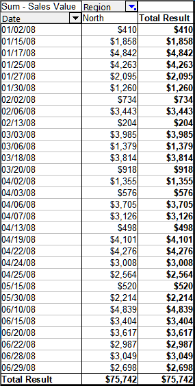
Figure 32 shows a pivot table configured to show the daily sales in the North region.
Figure 32: Pivot table without grouping
To group categories that have no intervals, such as those containing text fields, the values to group must first be defined. To do so, in the pivot table results, select the individual field values to be grouped and then use Data > Group and Outline > Group on the Menu bar, or press F12 on the keyboard, to group the selected cells.
Tip
You can select several non-contiguous cells by pressing and holding the Control key while clicking with the mouse.
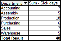
Given the input data shown in Figure 33, create a pivot table with Department in the Row Fields area and Sum – Sick days in the Data Fields area. The result should be as shown in Figure 34.
Figure 33: Database with text categories
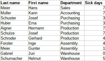
Figure 34: Pivot table with text categories
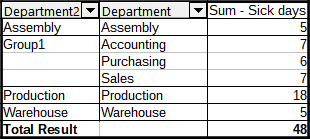
In the results of the pivot table select Accounting, Purchasing, and Sales in the Department column. Select Data > Group and Outline > Group on the Menu bar or press F12 on the keyboard. The pivot table result updates to reflect the new group, as shown in Figure 35.
Figure 35: Summary of single categories in one group
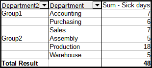
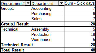
In the updated pivot table result, select Assembly, Production, and Warehouse in the Department column. Select Data > Group and Outline > Group on the Menu bar or press F12 on the keyboard. The pivot table updates again to reflect the new group, as shown in Figure 36.
You can change the default names for the groups and the newly created group field by editing the name in the input field (for example changing Group2 to Technical). The pivot table will remember these settings, even if you change the layout later on.
Figure 36: Grouping finished
To add partial sums for the groups, right-click the results of the pivot table and select the Properties option. Double-click the Department2 entry in the Row Fields area and select the Automatic option on the Data Field dialog (Figure 14). Click the two OK buttons and the pivot table is updated to include the partial sums for the groups, as shown in Figure 37.
Figure 37: Renamed group and partial results
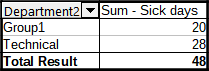
If it is not enabled already, select the Enable drill to details option on the Pivot Table Layout dialog. Double-click the Group 1 and Technical entries in the Department2 column to collapse/expand the group entries (for example, Figure 38 shows both groups collapsed).
Figure 38: Reduced to the new groups
Note
A well-structured database makes manual sorting within the pivot table obsolete. In the example shown, you could add another column with the name Department, that has the correct entry for each person based on whether the employee’s department belongs to the group Office or Technical. The mapping for this (1:n relationship) can be done easily with the VLOOKUP() function.
The results of a pivot table are by default sorted so that categories in columns and rows are presented in ascending order. There are three ways to change the sorting order:
Select a sort order in the drop-down menu on a column’s heading.
Sort manually by using drag and drop.
Select a sort order through the Data Field Options dialog for the appropriate row or column field (Figure 20).
Each of these methods are described in the sections that follow.
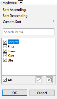
The simplest way to sort entries is to click the arrow on the right side of the column heading for a row or column field, and select one of the three sorting options (Figure 39):
Sort Ascending
Sort Descending
Custom Sort
Figure 39: Column sorting and filtering dialog
Selecting the Custom Sort option sorts according to one of the predefined custom sorts defined in Tools > Options > LibreOffice Calc > Sort Lists. See Chapter 2, Entering and Editing Data for more information about creating and using sort lists.
This dialog also provides facilities for simple filtering of the data in the pivot table. Check the required individual boxes to select the data displayed in the results of the pivot table. Options are provided to show all, show only the current item, or hide only the current item. Click OK to activate the selected filtering. Once filtering has been carried out, the color of the arrow changes to white on a blue background, and a small white square is added to the bottom right of the arrow button (Figure 40).
Figure 40: Arrow color change and indicator square on column heading
You can reorder categories in a pivot table by dragging and dropping the cells with category values. The dragged cell will be inserted before the cell where you drop it.
Note
In Calc, a cell must be fully selected (highlighted) to be moved, not just have the cursor in it. The background of a selected cell is visibly highlighted.
To select a single cell:
Click the cell, then hold Shift and click it again.
Alternatively, click and drag across two cells, then drag back to the first cell before releasing the mouse.
To select multiple cells:
Click one cell to select it.
Hold Shift or Ctrl and click additional cells to add them to the selection.
To sort automatically, right-click within the pivot table and choose Properties. This will open the Pivot Table Layout dialog (Figure 3). Double-click the row or column field you want to sort. In the Data Field dialog which opens (Figure 14), click Options to display the Data Field Options dialog (Figure 20).
For Sort by, choose either Ascending, Descending, or Manual. If the selected field is the field for which the dialog was opened, the items are sorted by name. If a data field was selected, the items are sorted by the resultant value of the selected data field. Ascending sorts the values from the lowest value to the highest value. Similarly Descending sorts the values descending from the highest value to the lowest value. Manual sorts values alphabetically.
Use drilling to show the related detailed data for a single, compressed value in the pivot table result. This facility is available only if you selected the Enable drill to details option on the Pivot Table Layout dialog.
To activate a drill, double-click on the cell or choose Data > Group and Outline > Show Details. There are two possibilities:
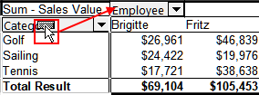
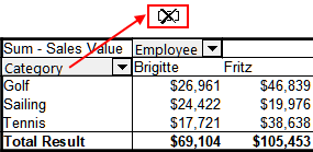
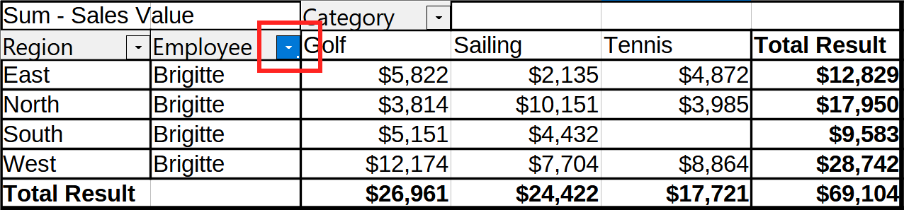
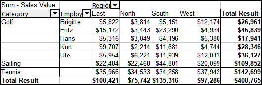
The active cell is a row or column field. In this case, drill means an additional breakdown into the categories of another field. For example, double-click on the cell with the value Golf. In this instance, the values that are aggregated within Golf can be subdivided using another field.
Figure 41: Before the drill down for Golf
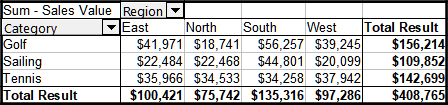
Figure 42: Selecting the field for the subdivision
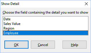
Figure 43: After the drill down
The active cell is a data field. In this case, drill-down results in a listing of all data entries of the data source that aggregate to this value.
Figure 44: New sheet after the drill down for a value in a data field
To limit the pivot table analysis to a subset of the information that is contained in the data basis, you can filter the pivot table results.
Note
An AutoFilter or Standard Filter used on the sheet containing the raw data has no effect on the pivot table analysis process. The pivot table always uses the complete list that was selected when it was started.
To do this, click the Filter button at the top left above the results, or right-click in the results and select Filter in the context menu.
Note
The Filter button is available only if the Add filter option on the Pivot Table Layout dialog is selected.
Figure 45: Filter button in the upper left area of the pivot table
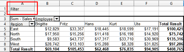
In the Filter dialog (Figure 46), you can define up to three filter options that are used in the same way as Calc’s Standard Filter. The controls in the Options section of this dialog are similar to the equivalent controls on Calc’s Standard Filter dialog – see Chapter 2, Entering and Editing Data for more information.
Figure 46: Dialog for defining the filter
The data presented in a pivot table can also be filtered using the drop-downs on the right hand side of column headings or by using filter fields. Filtering through column headings is described in “Select sort order from drop-down menus on each column heading” above.
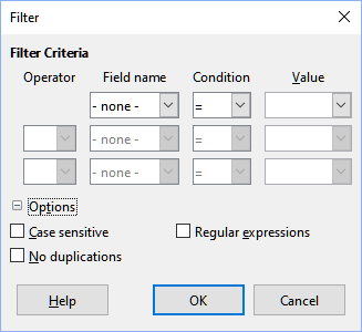
Filter fields (that is, fields that you placed in the Filters area of the Pivot Table Layout dialog) are another practical way to filter the results of the pivot table. The advantage is that the filtering criteria used are clearly visible. Click the arrow on the right side of the filter field button to access the associated filtering dialog (Figure 47).
Figure 47: Filter field filtering dialog
The text adjacent to a filter field button indicates the filtering status, that is “- all -” when nothing is filtered, “- multiple -” when multiple but not all items are filtered, or the value when only that value is not filtered.
After you have created the pivot table, changes in the source data do not cause an automatic update in the resulting table. You must update (refresh) the pivot table manually after changing any of the underlying data values.
Changes in the source data could appear in two ways:
The content of existing data sets has been changed.
You have added or deleted data sets in the original list.In this case, the change means that the pivot table has to use a different area of the spreadsheet for its analysis. If a simple addition to the list was made (for example, a new sale from a different employee was inserted), it is possible to update the pivot table by changing the range in the Selection field in the Source area of the Pivot Table Layout dialog. In the case of more complex changes to the data set collection, you must redo the pivot table from the beginning.
The cells in the results area of the pivot table are automatically formatted by Calc. You can change this formatting using all the tools in Calc. However, if you make any change in the design of the pivot table using direct formatting, the formatting will return to that applied automatically by Calc when the table is refreshed.
On creating a pivot table, six standard cell styles are added to the list of styles in the document if they are not included already. Each of these styles is applied to part of the pivot table. The customizable pivot table styles include:
Pivot Table Category
Pivot Table Corner
Pivot Table Field
Pivot Table Result
Pivot Table Title
Pivot Table Value
Tip
Use the pivot table styles to make sure that the format of your pivot table is not unexpectedly changed during updates and that all pivot tables in your document have the same appearance.
Calc applies the number format from the source list to the data field in the pivot table. For example, if the source values are in currency format, the corresponding cells in the pivot table will also use the currency format.
However, this can cause issues if the result is a fraction or percentage, as the pivot table doesn’t automatically adjust the format. Such results should either have no unit or be displayed as percentages. While you can manually fix the number format, the changes will reset after the pivot table is updated.
To delete a pivot table, left-click in any cell of the pivot table and select Data > Pivot Table > Delete on the Menu bar, or right-click in any cell of the pivot table and select Delete in the context menu.
Caution
If you delete a pivot table with an associated pivot chart, the pivot chart is also deleted. Calc opens a dialog box to confirm the pivot chart deletion.
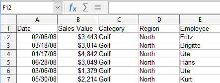
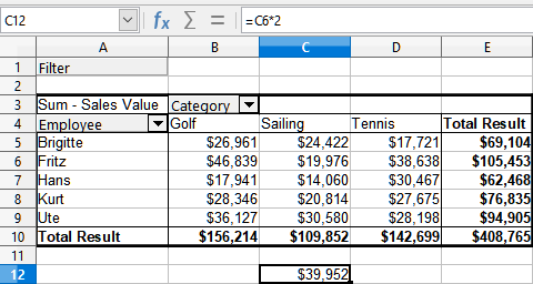
Normally, you create a reference to a value by entering the address of the cell that contains the value. For example, the formula =C6*2 creates a reference to cell C6 and returns the doubled value. If this cell is located in the results area of the pivot table, it contains the result that was calculated by referencing specific categories of the row and column fields. In Figure 48, cell C6 contains the sum of the sales values of the employee Hans in the category Sailing. The formula in cell C12 uses this value.
Figure 48: Formula reference to a cell of the pivot table
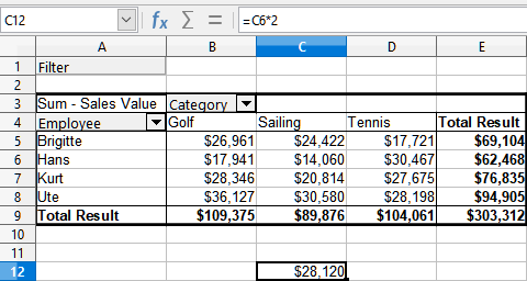
If the underlying data or the layout of the pivot table changes, then you must take into account that the sales value for Hans in the Sailing category might appear in a different cell. Your formula still references the cell C6 and therefore uses a wrong value. The correct value is in a different location. For example, in Figure 49, the location is now C7.
Figure 49: The value that you really want to use is now in a different location
Use the function GETPIVOTDATA() to have a reference to a value inside the pivot table by using the specific identifying categories for this value. This function can be used with formulas in Calc if you want to reuse the results from the pivot table elsewhere in your spreadsheet.
The syntax has two variations:
=GETPIVOTDATA(Target Field; Pivot Table[; Field 1; Item 1][; ... [Field 126; Item 126]])
=GETPIVOTDATA(Pivot Table; Constraints)
The square brackets in the first variation surround optional arguments.
The Target Field specifies which data field of the pivot table is used within the function. If your pivot table has only one data field, this entry is ignored, but you must enter it anyway.
If your pivot table has more than one data field, then you have to enter the field name from the underlying data source (for example “Sales Value”) or the field name of the data field itself (for example “Sum – Sales Value”).
The argument Pivot Table specifies the pivot table that you want to use. Your document may contain more than one pivot table. Enter here a cell reference that is inside the area of your pivot table. It might be a good idea to always use the upper left corner cell of your pivot table so that you can be sure that the cell will always be within your pivot table, even if the layout changes.
Example: =GETPIVOTDATA("Sales Value",A1)
If you enter only the first two arguments, then the function returns the total result of the pivot table (“Sum – Sales Value” entered as the field will return a value of 408,765).
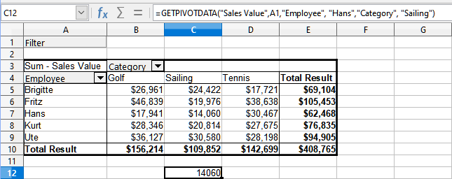
You can add more arguments as pairs with Field names and Elements to retrieve specific partial sums. In the example in Figure 50, where we want to get the partial sum of Hans for Sailing, the formula in cell C12 would look like this:
=GETPIVOTDATA("Sales Value",A1,"Employee","Hans","Category","Sailing")
Figure 50: First syntax variation
The argument Pivot Table has to be given in the same way as for the first syntax variation.
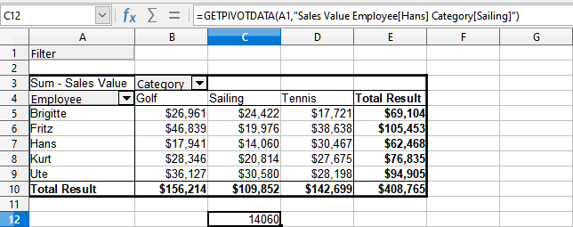
For the Constraints, enter a list separated by spaces to specify the value you want from the pivot table. This list must contain the name of the data field if there is more than one data field; otherwise, it is not required. To select a specific partial result, add more entries in the form of Field name[Element].
In the example in Figure 51, where we want to get the partial sum of Hans for Sailing, the formula in cell C12 would look like this:
=GETPIVOTDATA(A1,"Sales Value Employee[Hans] Category[Sailing]")
Figure 51: Second syntax variation
A pivot chart provides a visual representation of the information in a pivot table. You can create a pivot chart from the output of a pivot table and, if the pivot table gets changed, so does the pivot chart.
Pivot charts are a special case of the more general Calc charts described in Chapter 3, Creating Charts and Graphs. The main differences between pivot charts and other charts in Calc are as follows:
A pivot chart tracks the changes in the data issued from a pivot table and Calc automatically adjusts the data series and data range of the pivot chart accordingly.
Pivot charts include special buttons not found on Calc’s standard charts. These buttons represent the layout and fields of the underlying pivot table:
Filter field buttons: Displayed at the top of the pivot chart.
Row field buttons: Shown at the bottom of the pivot chart.
Column field buttons: Stacked in the legend on the right side of the chart.
These buttons also allow you to filter the data displayed in the pivot chart.
To create a pivot chart, click inside the pivot table and select Insert > Chart on the Menu bar or click the Insert Chart icon on the Standard toolbar.
Calc automatically detects the pivot table and opens the Chart Wizard. Through the Chart Wizard, you can select the chart type and chart elements for the pivot chart. The wizard is similar to the corresponding wizard for normal charts but for pivot charts, the steps to define data range and data series are disabled.
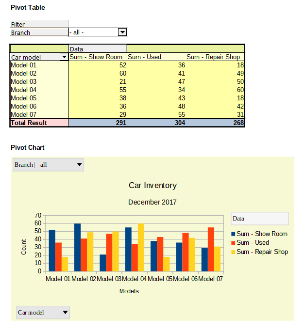
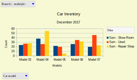
Figure 52: Sample pivot chart and associated pivot table
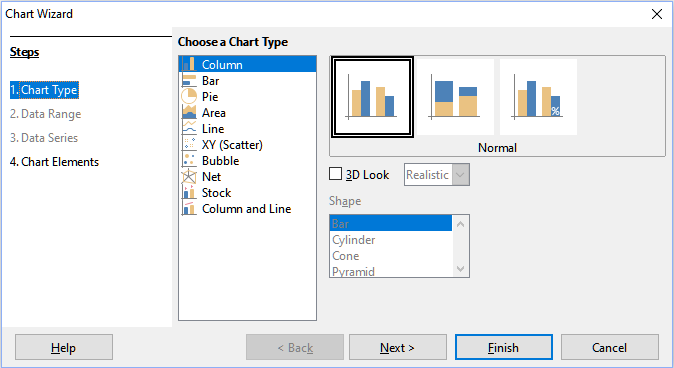
The first step in the wizard is to select the chart type and the same options are available as for a normal chart (Figure 53).
Figure 53: Select the chart type through the Chart Wizard when creating a pivot chart
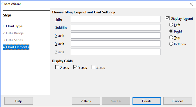
The second step is to select the chart elements and these are similar to those for normal charts (Figure 54).
Figure 54: Enter chart elements through the Chart Wizard when creating a pivot chart
Click Finish to close the wizard and create the pivot chart.
Calc provides tools for changing the chart type, chart elements, fonts, colors, and many other options. The facilities provided for pivot charts are the same as those available for normal charts; see Chapter 3, Creating Charts and Graphs.
If the source data of the pivot table changes, refresh the pivot table and the pivot chart is also updated accordingly. To refresh the pivot table (and thus the pivot chart), click in any cell within the pivot table and select Data > Pivot Table > Refresh on the Menu bar or select Refresh in the context menu.
Filters can remove unwanted data from a pivot chart, and any filters applied to the linked pivot table will automatically update the chart since both display the same data.
How to Filter Using Pivot Chart Buttons:
Filter Indicators: Pivot chart buttons have a down arrow indicating a pop-up action. If a filter is applied, the arrow turns blue.
Edit Mode: Double-click the chart to activate edit mode, indicated by a gray frame around the chart.
Using Filter Buttons on the Chart:
Top Buttons (Filter Fields): Click the filter button at the top of the chart to open a filtering dialog (similar to Figure 46). This allows you to adjust filters for both the pivot table and chart. The button's legend indicates the filter status:
"- all -": No filters applied.
"- multiple -": Some, but not all, items filtered.
A specific value: Only that value is unfiltered.
Bottom and Right Buttons (Row/Column Fields): Buttons here with a down arrow open a sorting and filtering dialog (similar to Figure 38). Use this to modify sorting and filtering for the table and chart.
Figure 55: Filtering applied to filter and row fields
To delete a pivot chart, select the chart and press Del on the keyboard.
Note
When you delete a pivot chart, the associated pivot table is not affected.
Caution
If you delete a pivot table with an associated pivot chart, the pivot chart is also deleted. Calc opens a dialog box to confirm the pivot table deletion.