Calc Guide 7.4
Chapter 3
Creating Charts and Graphs
Presenting information visually
This document is Copyright © 2022 by the LibreOffice Documentation Team. Contributors are listed below. You may distribute it and/or modify it under the terms of either the GNU General Public License (https://www.gnu.org/licenses/gpl.html), version 3 or later, or the Creative Commons Attribution License (https://creativecommons.org/licenses/by/4.0/), version 4.0 or later.
All trademarks within this guide belong to their legitimate owners.
|
Skip Masonsmith |
|
|
|
Barbara Duprey |
Christian Chenal |
Pierre-Yves Samyn |
|
Jean Hollis Weber |
Laurent Balland-Poirier |
Shelagh Manton |
|
John A Smith |
Philippe Clément |
Peter Schofield |
|
Cathy Crumbley |
Kees Kriek |
Steve Fanning |
|
Leo Moons |
Felipe Viggiano |
|
Please direct any comments or suggestions about this document to the Documentation Team’s forum at https://community.documentfoundation.org/c/documentation/loguides/ (registration is required) or send an email to: loguides@community.documentfoundation.org.
Note
Everything you post to a forum, including your email address and any other personal information that is written in the message, is publicly archived and cannot be deleted. E-mails sent to the forum are moderated.
Published October 2022. Based on LibreOffice 7.4 Community.
Other versions of LibreOffice may differ in appearance and functionality.
Some keystrokes and menu items are different on macOS from those used in Windows and Linux. The table below gives some common substitutions for the instructions in this document. For a more detailed list, see the application Help and Appendix A (Keyboard Shortcuts) to this guide.
|
Windows or Linux |
macOS equivalent |
Effect |
|
Tools > Options menu selection |
LibreOffice > Preferences |
Access setup options |
|
Right-click |
Control+click and/or right-click depending on computer setup |
Open a context menu |
|
Ctrl (Control) |
⌘ (Command) |
Used with other keys |
|
F11 |
⌘+T |
Open the Styles deck in Sidebar |
Charts and graphs can be powerful tools for conveying information and Calc offers a variety of ways to present data. They can be customized to a considerable extent, enabling information to be shown in the clearest manner.
For readers interested in effective ways to present information graphically, two excellent introductions to the topic are William S. Cleveland’s The Elements of Graphing Data, 2nd edition, Hobart Press (1994) and Edward R. Tufte’s The Visual Display of Quantitative Information, 2nd edition, Graphics Press (2001).
Use the Chart Wizard to create an initial chart using data in a spreadsheet. Then use the Chart Wizard options to change the type of chart, adjust data ranges, and edit some chart elements. Each change is immediately seen in the underlying chart.
Figure 1: Example data for creating a chart
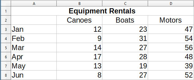
To demonstrate the process of using the Chart Wizard to create charts, the data shown in Figure 1 is used in the following sections. Here is an overview of the basic steps:
1) Select the cells containing all of the data—including names, categories, and labels—to be included in the chart. The selection can be a single block, individual cells, or groups of cells (columns or rows). In this example, it may be best to select the cell range A2:D8, which will intentionally omit the overall title “Equipment Rentals” from the chart.
Tip
When the data is in one place, the Chart Wizard can guess the range and create an initial chart even if all of the data is not selected. Before opening the Chart Wizard, just place the cursor or select a cell anywhere in the area of the data.
2) To place a chart on the spreadsheet as an object (Figure 2) and open the Chart Wizard dialog (Figure 3), do one of the following.
Go to Insert > Chart on the Menu bar.
Click the Insert Chart icon on the Standard toolbar.
3) Choose the chart type and make any other selections desired. The options are explained below.
4) Click Finish to save the selections and close the Chart Wizard.
The following sections provide further details about using the Chart Wizard.
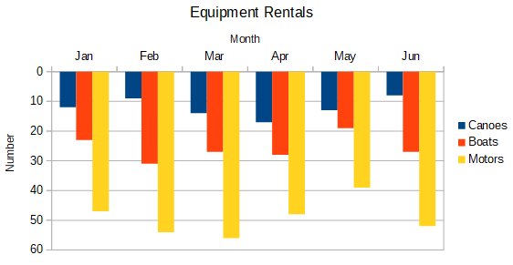
Figure 2: Example chart automatically created using the Chart Wizard

Calc offers a choice of ten basic chart types. Further options vary according to the type of chart selected. For more information about the different chart types, see “Gallery of chart types” on page 1.
Figure 3: Chart Wizard dialog – selecting chart type
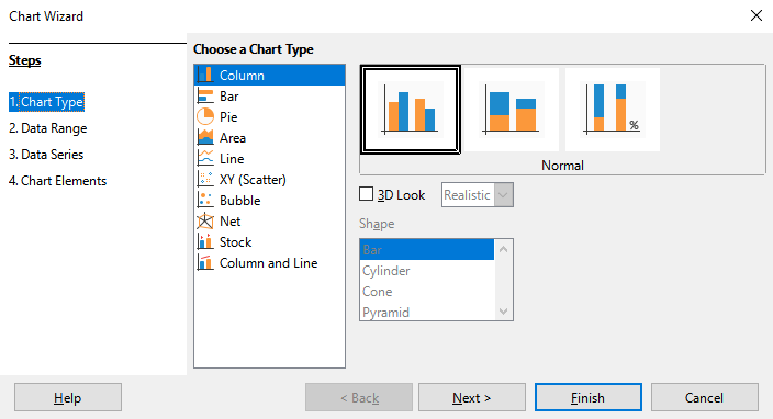
The initial chart created using the Chart Wizard is a 2D column chart. A small preview of the selected variant is highlighted with a surrounding border, as shown in Figure 3. The name of the variant (Normal in Figure 3) is shown below the preview.
To change chart types and options:
Select the type of chart from the list under Choose a Chart Type.
If needed, select a chart variant in the preview box by clicking on it. The options available depend on the type of chart selected. The chart changes instantly to reflect the selection.
To use a 3D chart, select the checkbox 3D Look and select the type of 3D view (Realistic or Simple). This option is available only for column, bar, pie, or area charts.
Click Next to make changes to data range, data series, and chart elements, explained in greater detail below.
When satisfied with the chart, click Finish to close the Chart Wizard.
Note
To recreate many of the charts shown in the following sections, select the Column chart type, Normal variant, with the 3D Look option unchecked.
The data range contains all of the cells with data (including labels and categories) that should be included in the chart. In the Data Range step of the Chart Wizard (Figure 4), manually correct any mistakes in data selection for the chart.
Figure 4: Chart Wizard dialog – selecting data range
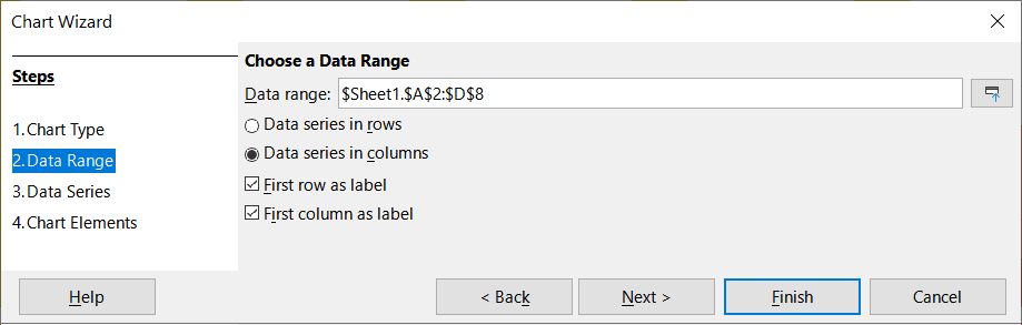
To use the Data Range page:
1) If necessary, change the rows and columns used as data for the chart by editing the cell references in the Data range text box. Edit the cell references in one of these two ways:
Directly modify the text in the Data range text box.
Click the Select data range button to the right of the Data range box. Then use the pointer to select the data range(s) on the spreadsheet.
2) Specify whether the data series are arranged in rows or in columns. In the example data, shown in Figure 1, the data series are in columns.
3) Select whether to use the first row, or first column, or both, as labels.
4) Click Next to move to making changes to the data series (Figure 5).
5) When satisfied with the chart, click Finish to close the Chart Wizard.
Note
If the syntax for a data range is not correct, Calc highlights the Data range text box to indicate the error and disables the Back, Next, and Finish buttons.
To create a complete data range from multiple cells that are not next to each other, use a delimiter between individual ranges. For example, the English (USA) locale uses a comma as a delimiter and “$Sheet1.A1:A5,$Sheet1.D1:D5” is a valid data range. A semi-colon is another commonly used delimiter.
The appropriate delimiter depends on the option selected in the Locale setting menu on the Formats section at Tools > Options > Language Settings > Languages. See or change the default delimiter for a locale at Tools > Options > LibreOffice Calc > Formula. In the Separators section, Array column shows the default delimiter.
Note
The options under Tools > Options may not be available when the chart is in edit mode. If desired, click outside the chart to leave edit mode and see the options. Click the chart twice to enter edit mode again.
To select non-adjacent data, do one of the following while in step ) above:
Manually enter the data ranges in the text box with delimiter(s) between them.
Select the data with the mouse pointer by first clicking the Select data range button to the right of the Data range box. Place the pointer at the end of the first data range in the text box (otherwise the first range is selected and then deleted) and enter the delimiter. Then drag the pointer in the spreadsheet to select the next data range.
Note
When the data is in the same document as the chart, changes to the data are instantly reflected in the chart.
Calc offers several options for linking data to external sources. This enables data (and the chart using the data) to automatically update when the external data changes. The following types of files can be linked: HTML, Calc, Base, CSV, Excel, and registered data sources. For further information, refer to Chapter 11, Linking Data.
The Data Series page of the Chart Wizard (Figure 5) enables fine tuning of the data. Each data series contains a set of data that have something in common, such as the types of rental equipment listed in Figure 1. Use the Data Series page to change the source range of each data series and to organize how the data is presented in the chart. This includes removing unnecessary data and specifying how data is plotted along the axes.
Tip
The Chart Wizard makes initial assumptions about how the data should be displayed, but the assumptions could be incorrect. If a chart does not look as expected, the first thing to check is if all data series are defined correctly.
Also, check the settings on the Data Range page that define whether the data are in rows or columns and whether the first row or first column should be considered labels.
The names of each data series appear in the Data series list box (the middle box in Figure 5). To organize the data series, select an entry in the Data series list and do one or more of the following:
To change the name of the data series, select Name in the Data ranges list on the right. Edit the cell references in the Range for Name text box below.
To change the cell references for data series categories, edit the cell references in the Categories text box below the Data ranges box.
Click Add to add another data series below the selected entry. The data ranges for the new data series will then need to be defined.
Click Remove to remove the selected entry from the Data series list.
Click the Up or Down button to move the selected entry up or down in the Data series list. This does not change the order in the data source table, but changes the arrangement in the chart.
Note
Different data series must be in separate columns or rows. Otherwise Calc will assume that they are the same data series.
To understand how Calc treats data in charts, it is important to understand the distinction between values and categories. Values are numeric data that vary continuously. By contrast, categories have no mathematical relationship with each other. For example, the categories for the chart data referred to in Figure 5 and the chart shown in Figure 2 are months of the year.
Most Calc charts require both value and category data, with values plotted along the Y axis and categories plotted along the X axis. The exceptions are XY (scatter) charts and bubble charts, which use value data along both axes.
Figure 5: Chart Wizard dialog - selecting data series
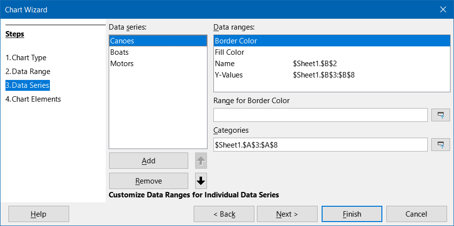
Data ranges that may be defined for a specific chart type appear in the Data ranges box on the right side of the Data Series page, shown in Figure 5. Not all data ranges may need to be filled in.
The data ranges may include:
Border Color and Fill Color
Name
Y-Values
Categories
Note
XY (scatter) and bubble charts are unlike other chart types because they use value data for their X axis rather than category data. For the XY (scatter) and bubble chart types, the Data Series page of the Chart Wizard includes a Data labels box instead of the Categories box displayed for other chart types. To create a set of data labels (one for each data point), enter the required text strings into a range of spreadsheet cells and then enter details of that cell range into the Data labels box. The labels can then be displayed on the chart by selecting the Show category option on the Data Labels dialog (see Figures 35 and 36).
Depending on the type of chart, other data ranges may need to be defined in addition to those shown in Figure 5.
On the Chart Elements page of the Chart Wizard dialog (Figure 6), add or change the title, subtitle, axes names, and grids. Use titles that draw the attention of viewers to the purpose of the chart and describe what they should focus on.
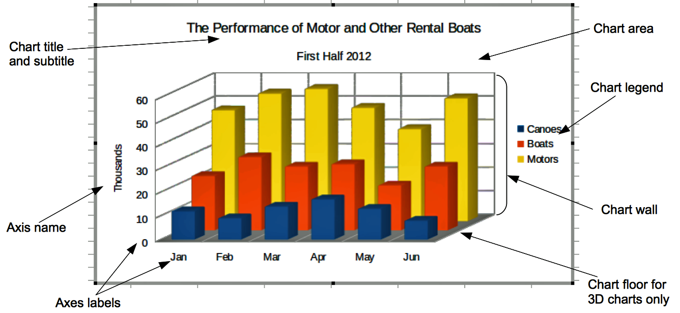
The chart elements for 2D and 3D charts are illustrated in Figure 7.
The chart wall contains the graphic displaying the data.
The chart area is the background of the entire chart.
The chart title and subtitle, chart legend, axes labels, and axes names are in the chart area.
The chart floor is only available for 3D charts.
Figure 6: Chart Wizard dialog – selecting and changing chart elements
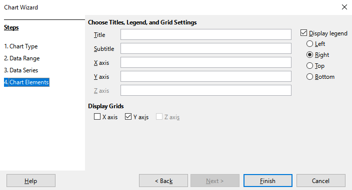
Figure 7: Chart elements
To add elements to a chart, do one or more of the following on the Chart Elements page (Figure 6):
Enter a title and subtitle (if desired) in the Title and Subtitle text boxes.
Enter names to be used in the X axis and Y axis text boxes. The Z axis text box is only active if creating a 3D chart.
Select the Display legend checkbox (turned on by default) and choose where to display the legend – Left, Right, Top, or Bottom. The names in the legend are the data series names. Specify the names in the Range for Name field on the Data Series page.
Under Display Grids, select the Y axis or X axis check boxes to display horizontal or vertical grid lines respectively. For some charts, the axis grids are displayed by default. Grids are not available for pie charts. The Z axis checkbox is only active when creating a 3D chart. For further information about grids, refer to Grids on page 1.
Note
While clicking Finish closes the Chart Wizard, the chart remains in edit mode, indicated by gray borders, and can still be modified. Click outside the chart in any cell to exit the edit mode.
The Properties deck of the Sidebar (Figure 8) makes some basic options readily available for specifying the appearance of charts. To open the Sidebar, first click outside the chart to deselect it, then go to View > Sidebar on the Menu bar or press Ctrl+F5. By default, the Sidebar opens on the right side of the screen.
Figure 8: Properties deck of the Sidebar when chart is selected (left) and when chart is in edit mode (right)
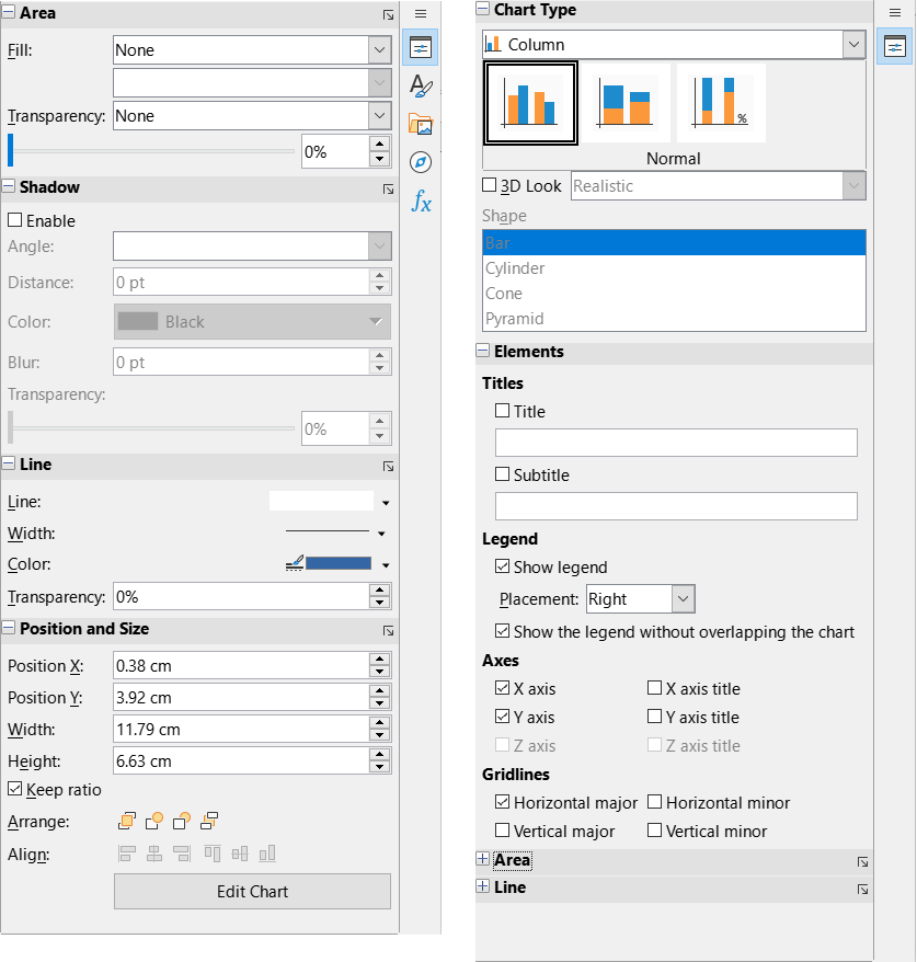
The contents of the Sidebar depend on whether the chart is selected or is in edit mode. The Sidebar on the left in Figure 8 shows the Properties deck when a chart is selected (by clicking on it once). When a chart is in edit mode (by clicking on it twice), the Properties deck on the right in Figure 8 appears.
Tip
If you follow the directions above and the Properties deck of the Sidebar does not appear, click the Properties icon on the upper right of the Sidebar.
The options available on the Properties deck of the Sidebar are also available elsewhere. They may be found in the Menu bar, the Formatting toolbar, or context menus (made available by right-clicking a chart element).
Note
The Sidebar can be quite useful. However, because the options are easy to see and are available elsewhere, further references to it are not included in this chapter.
The Chart Wizard establishes basic features of a chart. After using it, you may want to change data ranges or modify the look of the chart. Calc provides many options for formatting and fine-tuning the appearance of charts. This includes tools for editing the chart type, chart elements, data ranges, fonts, colors, and many other options.
Modify charts in one of two ways, depending on what you want to change.
Here are some general ways to modify charts in edit mode. These are discussed in greater detail in the following sections.
To add an element not already in the chart, use the Insert menu on the Menu bar. Insert titles, legends, axis labels, grids, data labels, trend lines, mean value lines, error bars, and special characters.
To move or change the size of titles, axis names, chart walls, and legends, click on them once. The pointer changes to a move icon (appearance depends on the system). Drag the element to the new location. To change the size, drag the selection handles.
Modify elements in a few basic ways. The following methods may open the appropriate dialog or menu. Not all of these methods will work for every element:
Double-click the element (see an exception below).
Select the element from the Insert menu (Figure 9) or from the Format menu (Figure 10) on the Menu bar.
Click the element once, then click on the Format Selection icon on the Formatting toolbar (Figure 11).
Select the element from the Select Chart Element drop-down list, then click the Format Selection icon next to it on the Formatting toolbar.
Right-click the element to open the context menu.
Double-click titles and axis names to change their spelling. To modify the spelling of other text, such as categories, data labels, and legend entries, change the text in the data on the spreadsheet.
Click once on a data point (such as a column or bar) to select and edit the associated data series.
With a data series selected, double-click a single data point to edit its properties (for example, a single column in a column chart).
To edit or format charts, double-click on the chart to place it in edit mode. The chart is now surrounded by a gray border. In edit mode, the Menu bar changes and the Formatting toolbar contains a number of formatting options and icons, as discussed in the following sections.
Note
The next several sections (until “Resizing, moving, and positioning charts” on page 1) require a chart to be in edit mode.
In edit mode, the Insert menu on the Menu bar displays the options shown in Figure 9.
Figure 9: Insert menu when chart is in edit mode
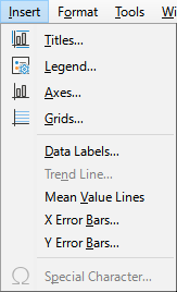
Titles
Legend
Axes
Grids
Data Labels
Trend Line
Mean Value Lines
X Error Bars and Y Error Bars
Special characters
In edit mode, these settings appear on the Format menu (Figure 10) of the Menu bar.
Figure 10: Format menu when chart is in edit mode
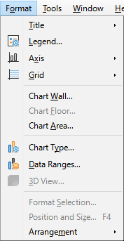
Title
Legend
Axis
Grid
Chart Wall, Chart Floor, or Chart Area
Chart Type
Data Ranges
3D View
Format Selection
Position and Size
Arrangement
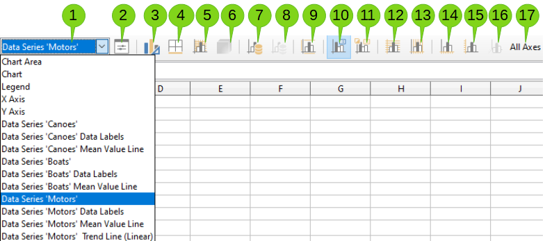
In edit mode, the Formatting bar appears as in Figure 11. Click one of the icons to open a dialog or turn an option on or off. The Insert and Format menus on the Menu bar, described above, contain the same options, with one exception.
The option Select Chart Element drop-down list does not appear elsewhere. Use it to easily select individual chart elements. It can be especially helpful when the chart is crowded or it is otherwise difficult to select elements using the pointer. Note that options such as Data Labels or Trend Line do not appear on this list unless they have already been inserted using the Insert menu.
|
|
||
|
1. Select Chart Element |
7. Data Ranges |
13. Vertical Grids |
|
2. Format Selection |
8. Data Table |
14. X Axis |
|
3. Chart Type |
9. Titles |
15. Y Axis |
|
4. Chart Area |
10. Legend On/Off |
16. Z Axis |
|
5. Chart Wall |
11. Legend |
17. All Axes |
|
6. 3D View |
12. Horizontal Grids |
|
Figure 11: Formatting toolbar when chart is in edit mode
After double-clicking on the chart to enter edit mode, select chart elements using one of the following methods:
Click once on the element in the chart (to select individual data points, click twice—but not too quickly—after clicking once on the data series).
Select the element from the Select Chart Element drop-down list that appears on the left of the Formatting toolbar, as shown in Figure 11.
When selected, the chart element will be highlighted with square selection handles.
Tip
When you hover the pointer over an element, Calc will display the element name, making it easier to select the correct element. The name of the selected element also appears in the Status Bar and it is displayed in the Select Chart Element area of the Formatting toolbar.
You may wish to move individual elements of a chart, independent of other chart elements. For example, you may wish to reposition the title or axis names. To do so:
1) Select the element as described above.
2) Keep pressing the mouse button. The pointer changes to the move icon (appearance depends on computer setup).
3) Drag the pointer to move the element.
4) Release the mouse button when the element is in the desired location.
Alternatively, use the Position and Size dialog for some elements, as described on page 1.
Individual points or data series cannot be moved, with the exception of pie charts. Individual wedges of a pie can be moved or the entire pie can be exploded. See “Pie charts“ on page 1 for information.
To move axis labels, see “Positioning axis, labels, and interval marks” on page 1. To move data labels, see “Adding and formatting data labels for a data series” on page 1.
Tip
For some chart elements (such as title, subtitle, axis name, and legend), press the arrow keys to move the object in small steps.
Note
When a 3D chart element is selected, round selection handles may appear. These handles control the 3D angle of the element. You cannot resize or reposition the element while they are showing. Click again to obtain the square selection handles that allow you to resize and reposition the 3D chart graphic.
To change the type of chart (bar, column, pie, line, and so on):
1) Select the chart by double-clicking on it to enter edit mode. The chart should now be surrounded by a gray border.
2) Open the Chart Type dialog using one of these methods:
Go to Format > Chart Type on the Menu bar.
Click the Chart Type icon on the Formatting toolbar.
Right-click on the chart and select Chart Type in the context menu.
3) Select the chart type and variant desired.
4) Click OK to close the dialog. If desired, click outside the chart to leave edit mode.
For further information about the types of charts, please refer to the “Gallery of chart types” on page 1.
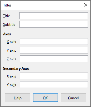
To create or change the text of a chart title, subtitle, or axis name:
1) Select the chart by double-clicking on it to enter edit mode. The chart should now be surrounded by a gray border.
2) Use one of these methods to open the Titles dialog (Figure 12):
Go to Insert > Titles on the Menu bar.
Click on the Titles icon on the Formatting toolbar.
Right-click in the chart area and select Insert Titles in the context menu.
3) Enter or edit the text in the appropriate text box.
4) Click OK to close the dialog. If desired, click outside the chart to leave edit mode.
Tip
The text of a title (but not formatting) can be modified directly. With the chart in edit mode, double-click on the text to directly change it. Use Shift+Enter at the end of the line to create an additional line that splits the text.
Figure 12: Titles insertion dialog
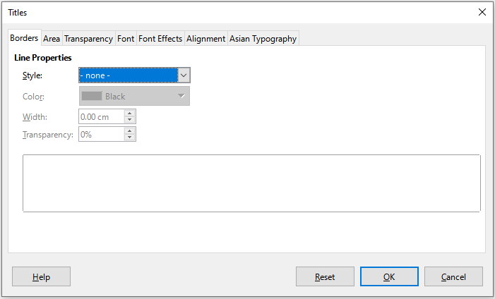
Use a more extensive Titles dialog to format the appearance of a chart title, subtitle, or axis name. To access this dialog:
1) Select the chart by double-clicking on it to enter edit mode. The chart should now be surrounded by a gray border.
2) Do one of the following to open the Titles dialog for formatting (Figure 13):
Click Format > Title and select the desired type of title or the All Titles option.
Click on the element in the chart, right-click, and select Format Title (or appropriate element) from the context menu.
Click on the element in the chart or select it in the Select Chart Element drop-down list on the Formatting toolbar. Then select Format > Format Selection on the Menu bar or click on the Format Selection icon on the Formatting toolbar.
3) Format titles or names as needed. The options are self-explanatory or easily researched.
4) Click OK to close the dialog. If desired, click outside the chart to leave edit mode.
Figure 13: Titles formatting dialog (after selecting All Titles option)
When a legend is displayed, it shows data series names along with their graphical representations, such as bars, lines, or points. It will also show trend and mean lines when those are turned on, as shown in Figure 14.
Figure 14: Example of a chart legend at the bottom of a chart

To only insert or delete a legend:
1) Enter edit mode by double-clicking the chart. The chart should now be surrounded by a gray border.
Click on the Legend On/Off icon on the Formatting toolbar. The default position for inserting a legend is on the right side of the chart.
Right-click in the chart area and select Insert Legend or Delete Legend in the context menu.
3) If desired, click outside the chart to leave edit mode.
Note
The names in the legend are the data series names. They are taken from the Name data range, discussed in “Selecting data series” on page 1. Change a legend name by changing the text in the spreadsheet.
To position a legend using the Legend dialog (Figure 15) as well as insert or delete it:
1) Enter edit mode by double-clicking the chart. The chart should now be surrounded by a gray border.
2) Go to Insert > Legend on the Menu bar to open the basic Legend dialog.
Figure 15: Legend insertion dialog
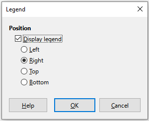
3) Select or deselect the Display legend checkbox to either display or not display the legend.
4) Select the desired location for the legend – Left, Right, Top, or Bottom.
5) Click OK to close the dialog.
6) If desired, click outside the chart to leave edit mode.
Tip
For finer positioning of the Legend, use one of the methods described in “Moving chart elements” on page 1.
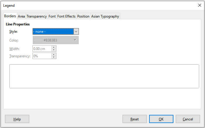
For advanced editing of a legend’s appearance, a more extensive Legend dialog (Figure 16) has several options for formatting borders, fill, fonts, transparency, and position.
1) Enter edit mode by double-clicking the chart. The chart should now be surrounded by a gray border.
2) Do one of the following to open the Legend dialog (Figure 16):
Click on the Legend icon on the Formatting toolbar.
Select Format > Legend on the Menu bar.
Right-click on the legend and select Format Legend in the context menu.
Click on Legend in the Select Chart Element drop-down list on the Formatting toolbar or click the legend in the chart to select it. Then click on the Format Selection icon on the Formatting toolbar or select Format > Format Selection.
3) Make any desired changes. The options are self-explanatory or easily researched.
4) Click OK to close the dialog. If desired, click outside the chart to leave edit mode.
Figure 16: Legend formatting dialog
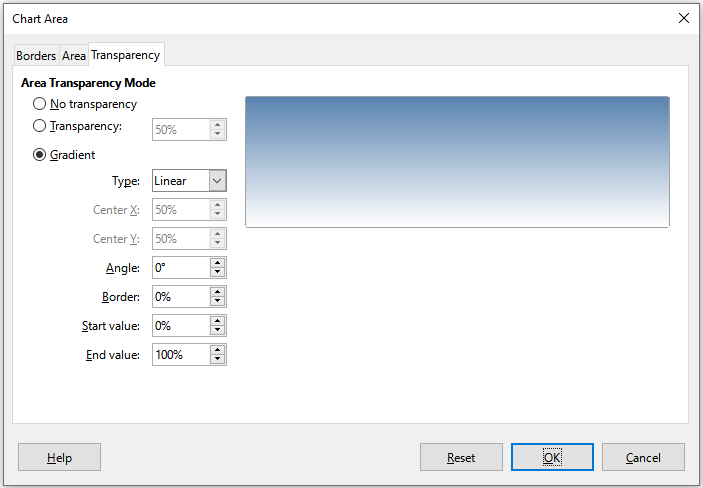
The background of a chart is divided into chart area, chart wall, and chart floor, as shown in Figure 7 above. To set border, area, and transparency options for these areas:
1) Select the chart by double-clicking on it to enter edit mode. The chart should now be surrounded by a gray border.
2) Do one of the following to open the appropriate dialog (such as Figure 17):
Go to Format on the Menu bar and select Chart Wall, Chart Floor, or Chart Area.
Right-click the chart wall, chart floor, or chart area in the chart and select Format Wall, Format Floor, or Format Chart Area in the context menu. (For help with selecting these areas, see “Selecting chart elements” on page 1.)
On the Formatting toolbar, click on the Chart Area icon or the Chart Wall icon (there is no icon for chart floor).
Click on Chart Area, Chart Wall, Chart Floor, or Chart in the Select Chart Element drop-down list on the Formatting toolbar. Then click the adjacent Format Selection icon or select Format > Format Selection.
Double-click on the chart area, chart wall, or chart floor.
3) Select the desired settings from the Borders, Area, and Transparency tabs.
4) Click OK to save the changes and close the dialog. If desired, click outside the chart to leave edit mode.
In the steps above, references to the chart floor are only applicable for 3D charts.
Figure 17: Chart Area dialog – Transparency tab
The goal of making a chart is to clearly present one or more data series and Calc provides a number of ways to define and present those data. The following sections discuss topics such as defining and changing data ranges, aligning data to a secondary Y axis, and formatting the appearance of the data series.
When data ranges change in the spreadsheet, modify the chart settings to reflect those changes. Use one of the following methods.
Note
The chart automatically reflects changes in the spreadsheet data. Thus, changing a number from 5 to 50 in the data will instantly show the new number in the chart.
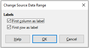
It is easy to manually replace one set of data with another set of data. Do this in the following way:
1) Use the mouse to select all of the new data.
2) Drag the data over the chart, then release the mouse. This opens the Change Source Data Range dialog shown in Figure 18.
3) Specify whether or not the first column or row contains labels, then click OK.
Figure 18: Change Source Data Range dialog
To change the data range or data series, do the following:
1) Select the chart by double-clicking on it to enter edit mode. The chart should now be surrounded by a gray border.
2) Open the Data Ranges dialog using one of these methods:
Go to Format > Data Ranges on the Menu bar.
Click on the Data Ranges icon on the Formatting toolbar.
Right-click on the chart and select Data Ranges from the context menu.
3) Edit the data range on the Data Range tab, which is similar to the Choose a Data Range area shown in Figure 4 above.
4) Edit data series on the Data Series tab, which is similar to the Customize Data Ranges for Individual Data Series area shown in Figure 5 above.
5) Click OK to save changes and close the dialog. If desired, click outside the chart to leave edit mode.
Tip
If Calc is taking a significant amount of time to process a large amount of data for a chart, try this: Select only limited data for each data series to initially organize the chart. Adjust the settings until the chart looks as desired, then select all of the data.
For further information, see “Selecting data range” on page 1 and “Selecting data series” on page 1.
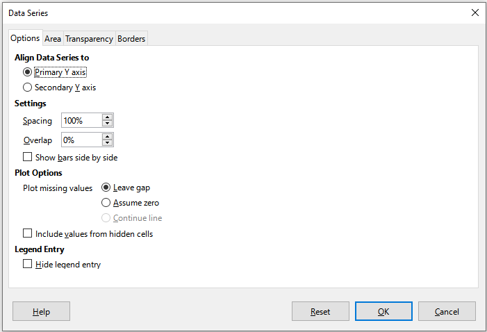
The Data Series dialog offers several options for presenting data in the chart. Note that only one data series can be selected at a time.
To open the Data Series dialog (Figure 19):
1) Select the chart by double-clicking on it to enter edit mode. The chart should now be surrounded by a gray border.
2) Do one of the following to select the data series:
Click on the data series in the chart.
Click the data series name in the Select Chart Element drop-down list on the Formatting toolbar.
3) Do one of the following to open the Data Series dialog:
Go to Format > Format Selection on the Menu bar.
Click on the Format Selection icon on the Formatting toolbar.
Right-click on the data series and select Format Data Series.
4) Click on the tab of the appropriate page to make the changes needed. The options for each page are explained below.
5) Click OK to save changes and close the dialog. If desired, click outside the chart to leave edit mode.
Figure 19: Data Series dialog – Options tab
Note
The tabs that appear on the Data Series dialog depend on the type of chart selected. Similarly the controls that appear on each tab may differ depending on the type of chart.
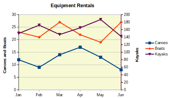
A secondary axis may be helpful when data differ in units or scale, as in Figure 20. In our example, one of the data series (kayaks) has considerably larger numbers than the others. To plot all three data series on the same chart, and keep the plotted lines close to each other, the kayak data series is aligned to a secondary Y axis, which has a wider scale. The color of the secondary Y axis and the axis titles help to show this relationship.
Note
A data series can be associated with a secondary Y axis only after the Chart Wizard has finished creating the chart.
Figure 20: Data series aligned to a secondary Y axis
To align a data series to a secondary Y axis:
1) Select the data series and open the Data Series dialog as described in the previous section.
2) On the Options tab, under Align Data Series to, select Secondary Y axis.
3) Click OK to close the dialog. If desired, click outside the chart to leave edit mode.
Aligning data series to a secondary Y axis is not possible for pie and net charts.
Data can only be aligned to a secondary Y axis, not a secondary X axis. However, it is possible to create secondary X and Y axes that duplicate the primary axes on the opposite sides of a chart. This is described in “Add or remove axis labels” on page 1. It is also possible to show different units or scales on the secondary axis (with or without aligning data to it), as described under “Defining scales” on page 1.
The Options tab of the Data Series dialog (Figure 19) contains additional settings that depend on the type of chart. These include:
Spacing
Overlap
Show bars side by side
Connection lines
Plot missing values
Include values from hidden cells
Hide legend entry
For pie or donut charts, in addition to the Include values from hidden cells option, two more are available (not shown in Figure 19):
Orientation
Starting Angle
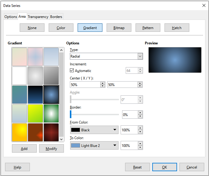
For chart types other than line and scatter, the Data Series dialog (Figure 21) contains tabs for formatting the fill and borders of graphical representations such as columns and bars. The Area tab offers options for selecting color by clicking directly on a color in a palette, adding a custom palette, specifying the RGB or Hex color codes, or by selecting a custom color using the Pick button. Other pages contain options for gradient, bitmap, pattern, hatch, transparency, and borders. The options are self-explanatory or can be readily researched.
Tip
If applying a gradient does not work as expected, do this: After selecting the desired options on the Gradient page, click Add, provide a name for the gradient (or accept the default), and click OK.
Figure 21: Data Series dialog – Area tab, Gradient page
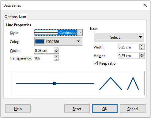
For some chart types (such as line charts and xy (scatter) charts), the Data Series dialog contains only an Options tab and a Line tab (Figure 22).
Specify style, color, width, and transparency of the line in the Line Properties section on the left side of the Line tab. In the Icon section, select an option for the symbol from the drop-down list: No Symbol, Automatic, From file, Gallery, or Symbols.
From file opens a browser for selecting the file that contains the desired symbol.
Gallery opens a list of available graphics that can be selected.
Symbols opens a list showing available symbols that can be selected.
A preview of the selection is shown in the preview box at the bottom of the dialog. Enter the desired width and height of the symbol. Select Keep ratio if the ratio of width to height of the symbol should be maintained.
Figure 22: Data Series dialog for line and scatter charts – Line tab
Colors for the display of data series can be specified in three ways: changing the default color scheme, using the Data Series dialog, or using data ranges to set colors for border and fill.
To modify the default color scheme for data series, go to Tools > Options > Charts > Default Colors to specify colors for each data series. Changes made here affect the default colors for any future chart.
As discussed in the previous section, the Data Series dialog has options for assigning colors for lines, areas, and borders. Available options depend on the type of chart.
Use the COLOR function in the Function Wizard (described in Chapter 8, Using Formulas and Functions) to specify colors with numbers based on combined RGB values. Then assign the numbers to data ranges for border and fill colors in the Data Series page of the Chart Wizard (see “Selecting data series” on page 1) or in the Data Series tab of the Data Ranges dialog (see “Changing data ranges” on page 1).
For example, using the COLOR function in the Function Wizard, enter 255 for R (red), 0 for G (green), and 255 for B (blue). The COLOR function calculates a combined RGB value of 16711935. Then, when defining data ranges, enter the RGB value(s) in the cell range for border or fill color. Optionally, include a value for the alpha channel (A) in the COLOR function. The value of A can range from 0 (fully transparent) to 255 (fully opaque).
Note
Data ranges for border color and fill can only be specified for column, bar, pie, bubble, and column and line charts.
In addition to directly assigning colors, you can use conditional formatting to define criteria for when specific colors will be used. (Conditional formatting is described in Chapter 4, Formatting Data.)
Figure 23 shows an example of using conditional formatting to specify colors. The COLOR function in the Formula Wizard was used to create the conditional formula =IF(B2>100,COLOR(240,240,0,20),COLOR(150,0,150,20))
This formula says that when the value in column B is over 100, the first RGB setting is used to color that data point in the chart. When the value in column B is 100 or less, the default color (150, 0, 150) is used. This formula is in all cells of column C. The numbers appearing in column C are the RGB values calculated using the conditional formula (with cell references changed accordingly).
Figure 23: Using the COLOR function and a conditional formula to specify colors
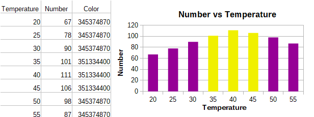
The chart on the right in Figure 23 shows how the colors change to reflect the conditional formatting.
Modify the appearance of an individual data point such as a column or bar using the Data Point dialog. For most chart types, the dialog contains the same Area, Transparency, and Borders tabs as the Data Series dialog shown in Figure 21 above. For line, scatter, net, and stock charts, the dialog contains the same options as the Line tab of the Data Series dialog shown in Figure 22 above.
To format data points:
1) Enter edit mode by double-clicking the chart. The chart should now be surrounded by a gray border.
2) Click two times (but not too quickly) on the data point to be formatted. The data point will show square selection handles.
3) To open the Data Point dialog, do one of the following:
Go to Format > Format Selection.
Right-click on the data point and select Format Data Point in the context menu.
Click the Format Selection icon on the Formatting toolbar.
4) Apply formatting options as desired.
5) Click OK to close the dialog. If desired, click outside the chart to leave edit mode.
Tip
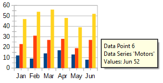
As shown in Figure 24, hover the pointer over a data point to show the number of the data point, the number of the series, and the X and Y values of the data point.
Figure 24: Tooltip showing information about a data point
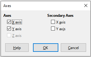
Use the Axes dialog shown in Figure 25 to add or remove axis labels, such as numbers or categories. (To change the name of an axis, see “Titles, subtitles, and axis names” on page 1).
To use the Axes dialog:
1) Enter edit mode by double-clicking the chart. The chart should now be surrounded by a gray border.
2) Open the Axes dialog by doing one of the following:
Go to Insert > Axes on the Menu bar.
Right-click on the chart and select Insert/Delete Axes in the context menu.
3) Select or deselect the check boxes for axis labels. The Z-axis checkbox is only active when editing a 3D chart.
4) Click OK to close the dialog. If desired, click outside the chart to leave edit mode.
Figure 25: Axes insertion dialog
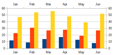
Selecting a secondary X axis or a secondary Y axis in this dialog creates duplicate labels on the opposite side of the chart, as shown in Figure 26. To specify different units or intervals for the secondary axis, use the Scale tab of the more extensive Axis dialog described in the following section.
It is also possible to align one or more data series to the secondary Y axis. Do this using the Data Series dialog, described in “Aligning data to secondary Y axis” on page 1.
Figure 26: Both secondary axes enabled
In addition to the simple dialog above, a more extensive Axis dialog contains options for grid intervals, positioning the axis, formatting the axis line and axis labels, and defining the scale, among other settings. Use a dialog for a specific axis, or use a dialog that applies to all axes. The options in the dialog depend on which axis was selected, type of chart, and whether the chart is 2D or 3D.
To open the more extensive Axis dialog:
1) Enter edit mode by double-clicking the chart. The chart should now be surrounded by a gray border.
2) Open a specific axis dialog (Figure 27) by doing one of the following (some options do not allow choosing all axes):
Go to Format > Axis on the Menu bar and select the desired axis (X Axis, Y Axis, Z Axis, Secondary X Axis, Secondary Y Axis, or All Axes).
Right-click on the desired axis in the chart to open the context menu. Then select Format Axis.
Click the axis on the chart or select the axis in the Select Chart Element drop-down list on the Formatting toolbar and click the adjacent Format Selection icon or select Format > Format Selection on the Menu bar.
Click on the icon for X Axis, Y Axis, or Z Axis on the Formatting toolbar. Or click on the All Axes option to the right of the other icons.
3) Click the tab of the appropriate page to make the changes needed. The options for each page are explained below.
4) Click OK to save changes and close the dialog. If desired, click outside the chart to leave edit mode.
Figure 27: Y Axis formatting dialog – Scale tab
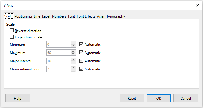
Use the Scale tab to modify the automatically generated scale for a primary axis. In addition, use the Scale tabs for secondary axes to specify scales that are different from the scales for primary axes. This can be quite useful for showing Celsius and Fahrenheit scales on the same chart, for example, or for when data are aligned to a secondary Y axis (see “Aligning data to secondary Y axis” on page 1).
The contents of the Scale tab (Figure 27) vary with chart type but may contain the following options:
Reverse direction
Figure 28: Result when direction is reversed on the Y axis
Logarithmic scale
Minimum/Maximum
Major interval
Minor interval count
For some types of charts, additional options may be available:
Type
Resolution
Tip
If the X axis is not displaying time as expected, manually entering the minimum and maximum times on the Scale tab may solve the problem.
The Positioning tab (Figure 29) controls the position of axis labels and interval marks.
Figure 29: Axis formatting dialog – Positioning tab
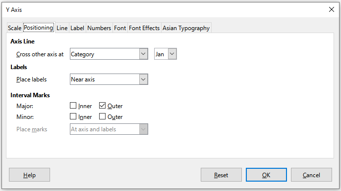
Axis Line
Figure 30: Y axis set to cross X axis at specified value
Labels
Interval Marks
Major/Minor – specifies whether interval marks are displayed for major/minor intervals. These intervals are defined on the Scale tab, described above.
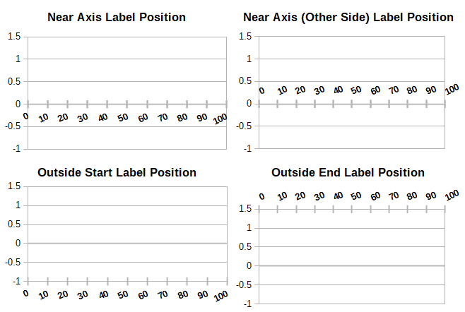
Inner/Outer – specifies whether interval marks are placed on the inner or outer side of the axis. The interval marks in Figure 31 are on both sides.
Place marks – specifies where to place the marks: At labels, At axis, or At axis and labels. (The top two charts in Figure 31 show the labels along the axes. The marks are thus both at axis and labels. The marks in the bottom two charts are located at the labels.)
Figure 31: Axis label positions
The Line tab has options for formatting the axis line style, color, width, and transparency. It has the same contents as the Line tab of the Data Series dialog shown in Figure 22 above but excluding the Icon section.
On the Label tab (Figure 32), choose whether to show or hide the labels and specify how to handle them when they do not fit neatly in the chart. The options are described below.
Figure 32: Axis formatting dialog – Label tab
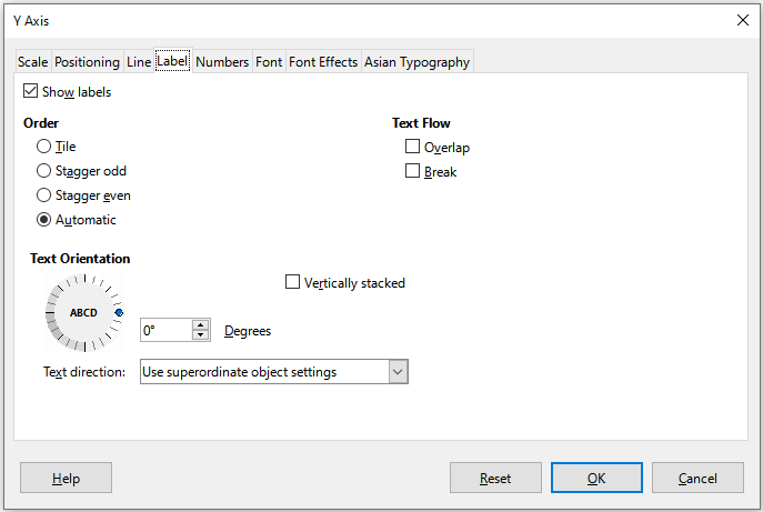
Show labels
Order
Tile – arranges labels on the axis side by side.
Stagger odd – staggers labels on the axis, with even numbers lower than odd numbers (even numbers to the left on vertical axis).
Stagger even – staggers labels, with odd numbers lower than even numbers (odd numbers to the left on vertical axis).
Automatic – automatically arranges labels on the axis.
Note
Problems may arise in displaying labels if the chart is too small. Avoid this by either enlarging the chart or decreasing the font size.
Text flow
Overlap – allows axis labels to overlap.
Break – allows text breaks, enabling text to wrap into new lines in the available space.
Text Orientation
Vertically stacked – Stacks characters vertically so that text is read from top to bottom.
ABCD wheel – Defines text orientation by clicking and dragging the indicator on the wheel. Orientation of the characters “ABCD” on the wheel corresponds to the new setting.
Degrees – Shows the orientation angle of the text as determined by the ABCD wheel or by manually entering the degrees in the spin box.
Text direction – Specifies the direction for any text that uses complex text layout (CTL). CTL is only available if Tools > Options > Language Settings > Languages > Default Languages for Documents > Complex text layout is enabled.
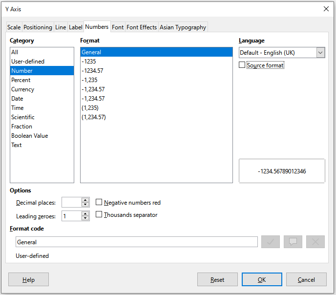
Use the Numbers tab (Figure 33) to set the attributes for any numbers used on the axis. When Source format is selected (as it is by default), numbers are formatted exactly as they are formatted on the spreadsheet. Deselect this option to change number formatting. For information about formatting numbers, see Chapter 4, Formatting Data, as well as the online Help.
Figure 33: Axis formatting dialog – Numbers tab
Use the Font and Font Effects tabs to set the font and font effects for the axis labels. These tabs are the same as the tabs for specifying fonts and font effects in cells. See Chapter 4, Formatting Data, for more information.
Sets the Asian typographic options for axis labels. This tab is the same as that for specifying Asian typographic options for cells. See Chapter 4, Formatting Data, for more information.
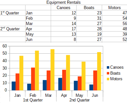
Multiple levels of categories can be displayed in a hierarchical manner along the axis of a chart. Hierarchical axes labels are created automatically if the first column or row defined as data is text (as opposed to the first column or row defined as labels). An example of hierarchical labels is shown in Figure 34. In this case, Calc automatically defines the data range for categories as the first two columns in the spreadsheet. This is reflected in the chart, which shows the hierarchical relationship between quarters and months.
Figure 34: Example of hierarchical axes labels
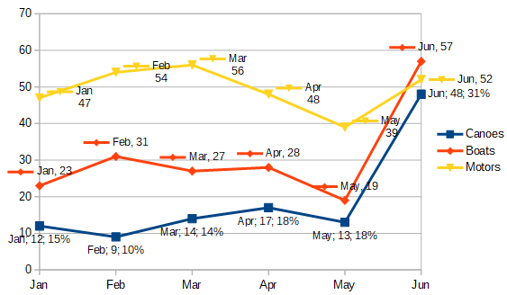
Data labels display information next to data points on the chart. They can be quite useful for highlighting specific data when presenting detailed information, but be careful not to create a chart that is too cluttered to read easily.
To add or format data labels for a data series:
1) Select the chart by double-clicking on it to enter edit mode. The chart should now be surrounded by a gray border.
2) Do one of the following to select a specific data series:
Click once somewhere in the data series.
In the Select Chart Element drop-down list of the Formatting toolbar, select the data series name.
Note
If no data series is selected, then all data series on the chart will be labeled.
3) To open the Data Labels dialog (Figure 36), do one of the following:
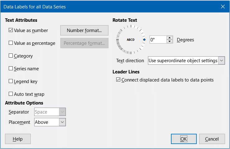
Go to Insert > Data Labels on the Menu bar. If you selected a data series, Calc displays data labels for that data series using default settings, and displays the Data Labels dialog for the selected data series. In this case, the data labels will remain displayed even if you press Cancel on the dialog. If no data series was selected, Calc displays the Data Labels for all Data Series dialog (Figure 35). The controls on this dialog are similar to those on the Data Labels tab of the Data Labels dialog, which are described below.
Right-click on the selected data series in the chart and select Insert Data Labels in the context menu. Calc displays data labels with default settings. Then right-click again and select Format Data Labels in the context menu.
Select the intended data labels on the chart or in the Select Chart Element drop-down, and then select Format > Format Selection on the Menu bar or press the Format Selection icon on the Formatting toolbar.
Figure 35: Data Labels for all Data Series dialog
4) Select the options as desired. The options are explained below.
5) Click OK to close the dialog. If desired, click outside the chart to leave edit mode.
Tip
Select a data series by clicking once on a column, bar, or other graphic representation of the data series. Select a single data point by pausing, then clicking again.
Most of the tabs in the Data Labels dialog are used in other dialogs and can be readily understood or easily researched. The exception is the Data Labels tab (Figure 36), which contains the following options:
Value as number
Number format
Figure 36: Data Labels tab of the Data Labels dialog
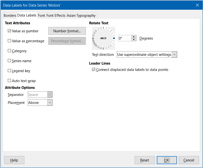
Value as percentage
Percentage format
Category
Figure 37: Examples of data label options
Series name
Legend key
Auto text wrap
Separator
Placement
Rotate Text
Text Direction
Sometimes it is appropriate to apply data labels to one or a few data points rather than all data points. This reduces clutter and highlights the most important data.
Insert a data label for a single data point in the following way:
1) Select the chart by double-clicking on it to enter edit mode. The chart should now be surrounded by a gray border.
2) Click the data point once, pause, then click again to select it. (Clicking too quickly opens the Data Series dialog.)
3) Right-click on the selected data point and select Insert Single Data Label in the context menu. The data label will have the default settings.
4) If desired, click outside the chart to leave edit mode.
To format an existing label for a single data point, follow the directions above but instead of step ), do the following to open the Label for Data Series dialog (similar to Figure 36): right-click on the data point and select Format Single Data Label from the context menu.
The options in the Label for Data Series dialog are the same as for the Data Labels dialog described above.
You can also access the Label for Data Series dialog by clicking on the data label, pausing, and then clicking on it again. Then right-click and select Format Single Data Label in the context menu.
Remove labels from a single data point, a single data series, or all data points using one of the methods below.
Before doing any of the following, first select the chart by double-clicking on it to enter edit mode. The chart should now be surrounded by a gray border. When finished, if desired, click outside the chart to leave edit mode.
Method One
Method Two
1) Do one of the following to open the Data Labels dialog (Figure 36):
Click somewhere in the data series to select it. Go to Insert > Data Labels on the Menu bar.
In the Select Chart Element drop-down list of the Formatting toolbar, select the data labels entry for the required series name or select one of the labels for the data series. Then click the adjacent Format Selection icon or select Format > Format Selection on the Menu bar.
Right-click in the data series or on the labels of the data series and select Format Data Labels in the context menu.
2) On the Data Labels tab, deselect all of the options and click OK.
1) Click once on the data point, pause, then click again to select it.
2) Right-click to open the context menu and select Delete Single Data Label.
1) Make sure that no data label or data series is selected.
2) Go to Insert > Data Labels on the Menu bar.
3) On the Data Labels for all Data Series dialog, deselect all of the options for the data labels to be removed, then click OK.
Grid lines or grids divide the intervals along axes to help estimate data point values. Major and minor grid lines are shown in Figure 38. The darker lines with numbers are major grid lines while the lighter lines between them are minor grid lines. Note that the Y-axis major grid line is activated by default.
Figure 38: Major and minor grid lines for the X and Y axes
Grids are available for all chart types with the exception of pie charts.
1) First select the chart by double-clicking on it to enter edit mode. The chart should now be surrounded by a gray border.
2) Do one of the following:
Go to Insert > Grids on the Menu bar to open the Grids dialog (Figure 39). Select/deselect the check boxes as needed. The Z axis checkbox is only active for a 3D chart. Click OK to close the dialog.
Figure 39: Basic Grids dialog
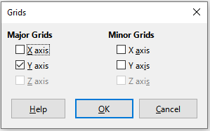
Click the Horizontal Grids icon or the Vertical Grids icon, both located on the Formatting toolbar. Clicking once turns on the major grid lines. Clicking twice turns on the minor grid lines as well. Clicking again turns off the grids.
3) If desired, click outside the chart to leave edit mode.
Note
In the Formatting toolbar, the Horizontal Grids icon and the Vertical Grids icon set grid lines for the Y axis and X axis, respectively. This can be misleading because both the Y axis and the X axis can be horizontal or vertical, depending on the type of chart. Thus, for a bar chart, click the Horizontal Grids icon to control the vertical grids.
In addition to the Grids dialog shown in Figure 39, there is another dialog for formatting grids. To open the grid formatting dialog:
1) Select the chart by double-clicking on it to enter edit mode. The chart should now be surrounded by a gray border.
2) Go to Format > Grid on the Menu bar and select the appropriate type of grid to open the Grid formatting dialog (Figure 40).
Figure 40: Grid formatting dialog
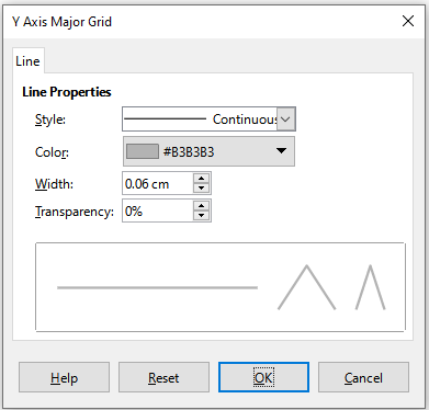
3) Set formatting options for line style, color, width, and transparency.
4) Click OK to close the dialog. If desired, click outside the chart to leave edit mode.
Note
Use the Scale tab of the Axis dialog to specify the intervals between grid lines. This is described in “Defining scales” on page 1.
Column, bar, pie, and area charts can be displayed as 3D charts. The setting to make a chart 3D is on the first page of the Chart Wizard. If the chart has already been created, do the following to give it a 3D look:
1) Select the chart by double-clicking on it to enter edit mode. The chart should now be surrounded by a gray border.
2) Do one of the following:
Go to Format > Chart Type.
Click on the Chart Type icon on the Formatting toolbar.
Right-click in the chart and select the Chart Type option in the context menu.
3) Select 3D Look in the Chart Type dialog.
4) Select the basic rendering scheme as Simple or Realistic from the adjacent drop-down.
5) For column and bar charts, select the shape as Bar, Cylinder, Cone, or Pyramid.
6) Click OK to close the dialog. If desired, click outside the chart to leave edit mode.
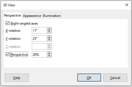
To make changes to a 3D chart, use the 3D View dialog (Figure 41).
Figure 41: 3D View dialog – Perspective tab
Use the 3D View dialog to change the 3D settings, including perspective, appearance, and illumination. Note that the chart must already be set to show a 3D look, as described above. To open the 3D View dialog:
1) Select the chart by double-clicking on it to enter edit mode. The chart should now be surrounded by a gray border.
2) Do one of the following:
Right-click on the chart and select 3D View in the context menu.
Go to Format > 3D View.
Click on the 3D View icon on the Formatting toolbar.
3) Make any changes required.
4) Click OK to close the dialog. If desired, click outside the chart to leave edit mode.
This dialog has three tabs, which are explained below.
Some hints for using the Perspective tab (Figure 41) to rotate a 3D chart or change its perspective view:
Set all angles to 0 degrees for a front view of the chart. Pie charts and donut charts are shown as circles.
With Right-angled axes enabled, the chart can be rotated only in the X and Y direction; that is, parallel to the chart borders.
An X value of 90 degrees, with Y and Z set to 0 degrees, provides a view from the top of the chart. With X set to –90 degrees, the view is from the bottom of the chart.
Rotation is applied in the following order: X axis first, then Y axis, and Z axis last.
When shading is enabled (see below) and the chart is rotated, the lights are rotated as if they are fixed to the chart.
The rotation axes always relate to the page, not to the axes of the chart. This is different from some other chart programs.
Select the Perspective option to view the chart in central perspective as through a camera lens (as opposed to using a parallel projection). Set the focal length with the spin box or type a number in the box. With a 100% setting, a far edge in the chart looks approximately half as big as a near edge.
In addition to using the Perspective tab of the 3D View dialog, rotate 3D charts interactively in the following way:
1) Select the chart by double-clicking on it to enter edit mode. The chart should now be surrounded by a gray border.
2) Click once on the chart wall to select it, causing round selection handles to appear. The pointer changes to a rotation icon.
3) Press and hold the left mouse button while dragging in the desired direction. A dashed outline of the chart is visible to help see how the result will look.
4) Release the mouse button when satisfied.
5) Click outside the chart to exit edit mode.
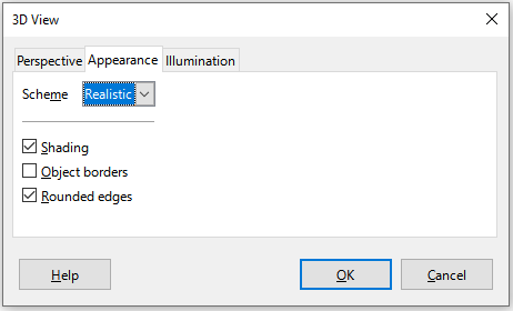
Use the Appearance tab of the 3D View dialog (Figure 42) to modify some aspects of the appearance of the data in a 3D chart.
First select a rendering scheme from the Scheme drop-down list – Realistic (default) or Simple. The scheme selected sets the options and light sources. Depending on the scheme selected, not all options may be available. To create a custom scheme, select or deselect a combination of Shading, Object borders, and Rounded edges.
Some hints:
Select Shading to use the Gouraud method for rendering the surface. Otherwise, a flat method is used. The flat method sets a single color and brightness for each polygon. The edges are visible but soft gradients and spotlights are not possible. The Gouraud method applies gradients for a smoother, more realistic look. See the Draw Guide for more information on the use of shading.
Select Object borders to draw lines along the edges.
Select Rounded edges to smooth the edges of box shapes.
Figure 42: 3D View dialog – Appearance tab
Use the Illumination tab (Figure 43) of the 3D View dialog to control light sources for the 3D view.
Figure 43: 3D View dialog – Illumination tab
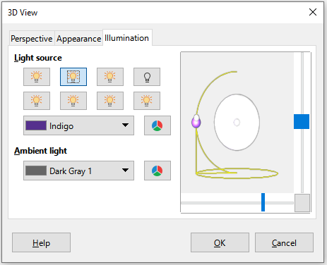
Here are the options with some hints:
Click any of the eight buttons to switch a directed light source on or off.
The first light source projects a specular light with highlights.
By default, the second light source is switched on. It is the first of seven normal, uniform light sources. To activate the others sources, click twice on their respective button.
For the selected light source, select a color from the first drop-down list below the eight light source buttons. Alternatively press the adjacent button to select a color using the Pick a Color dialog. Note that the brightness values of all lights are added together, so use dark colors when enabling multiple lights.
The small preview in the dialog shows the effect of repositioning the light source.
Each selected light source appears as a small colored sphere in the specified color. The sphere is larger when the light source is actively selected.
Each light source always points at the middle of the object initially. Move the vertical slider to adjust the lighting angle. The horizontal slider rotates the light around the object. In addition, click the light source and drag it to the desired location.
Click the button in the bottom right corner of the preview to switch the internal illumination model between a sphere and a cuboid.
Use the Ambient light drop-down list to define the ambient light, which shines with a uniform intensity from all directions. Alternatively press the adjacent button to select a color using the Pick a Color dialog.
See the Draw Guide for more information on setting the illumination.
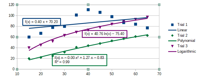
Trend lines help show the relationships among scattered data points of a data series. Calc has a good selection of regression types for creating trend lines: linear, logarithmic, exponential, power, polynomial, and moving average. Choose the type that comes closest to passing through all of the points in a data series.
Trend lines can be added to all 2D chart types except for pie, net, bubble, and stock charts. When inserted in the chart, representations of the trend lines are automatically shown in the chart legend.
Note
For chart types that use categories for the X axis, such as column, bar, or line charts, the numbers 1, 2, 3… are used as values for calculating trend lines. By contrast, XY (scatter) chart types show data rather than categories along the X axis. Thus, only XY (scatter) chart types can show meaningful regression equations.
Trend lines can only be added to one data series at a time. To add a trend line to a data series:
1) Double-click on the chart to enter edit mode. The chart should now be surrounded by a gray border.
2) Select the data series by doing one of the following:
Click once on a data series representation such as a bar, column, line, or point.
Select the data series from the Select Chart Element drop-down list on the Formatting toolbar.
3) Do one of the following to open the Trend Lines dialog (Figure 44):
Go to Insert > Trend Line on the Menu bar.
Right-click on the data series and select Insert Trend Line in the context menu.
4) Select the type of regression and choose the desired options. These are explained below.
5) Click OK to close the dialog and place the trend line in the chart. If desired, click outside the chart to leave edit mode.
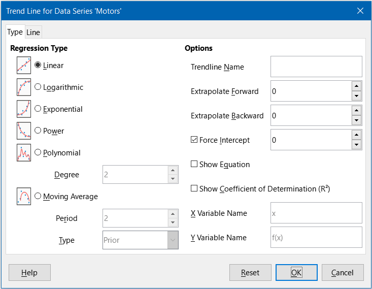
Figure 44: Trend Line dialog – Type tab
By default, x is used for the abscissa variable and f(x) for the ordinate variable. Change the names under X Variable Name and Y Variable Name on the Trend Line dialog.
Logarithmic
Exponential
Power
Tip
It is possible to add multiple trend lines to a single data series. This could be useful when you want to compare different regression types for your data.
Search for the term “Trend Lines” in the index of the Help system for more information about these regression types.
Trendline Name
Extrapolate Forward/Backward
Force Intercept
Show Equation
Show Coefficient of Determination (R2)
X and Y Variable Names
Figure 45: Trend lines showing various equations
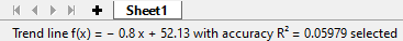
Select a trend line to display information about it in the Status bar, as shown in Figure 46. The Status bar is normally located at the bottom of the spreadsheet.
Figure 46: Equation information displayed in the Status bar
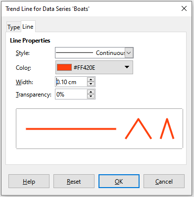
When originally inserted, a trend line has the same color as the corresponding data series. To change the style, color, width, or transparency of a trend line, use the Line tab of the Trend Line dialog (Figure 47). The options are easily understood or researched.
Figure 47: Trend Line dialog – Line tab
Display the equation in the chart by selecting Show Equation on the Type tab of the Trend Line dialog (Figure 44). Options for the trend line equation include formatting the border around the equation, area fill, transparency, font, and alignment. The number style can also be specified—this may be quite useful, especially for specifying the number of decimal places.
To format trend line equations:
1) Select the chart by double-clicking on it to enter edit mode. The chart should now be surrounded by a gray border.
2) Do one of the following to open the Equation dialog:
Select the equation on the Select Chart Element drop-down list and then click the Format Selection icon on the Formatting toolbar or select Format > Format Selection on the Menu bar.
Click once on the equation to select it then click the Format Selection icon on the Formatting toolbar or select Format > Format Selection on the Menu bar.
Right-click on the equation and select Format Trend Line Equation in the context menu.
3) Select the desired options on the dialog. The options are self-explanatory or easily researched. The Numbers tab has the same options as the Numbers tab of the Axis dialog, Figure 33 above.
4) Click OK to close the dialog.
5) If desired, click outside the chart to leave edit mode.
1) Select the chart by double-clicking on it to enter edit mode. The chart should now be surrounded by a gray border.
2) Do one of the following:
Select the trend line and press the Delete key.
Right-click on the trend line and select Delete Trend Line in the context menu.
3) If desired, click outside the chart to leave edit mode.
Mean value lines are a special type of trend line. To create one, Calc calculates the average of a data series and places a colored line at that value in the chart, as shown in Figure 48. They can only be created for 2D charts and cannot be created for pie, bubble, net, or stock charts.
Figure 48: Mean value lines
For all data series (if no data series is selected, mean value lines are inserted for all data series):
1) Select the chart by double-clicking on it to enter edit mode. The chart should now be surrounded by a gray border.
2) Go to Insert > Mean Value Lines on the Menu bar.
3) If desired, click outside the chart to leave edit mode.
For a single data series:
1) Select the chart by double-clicking on it to enter edit mode. The chart should now be surrounded by a gray border.
2) Select a data series by doing one of the following:
Click once somewhere in the data series.
Select the data series from the Select Chart Element drop-down list on the Formatting toolbar.
3) Add the mean value line by doing one of the following:
Go to Insert > Mean Value Lines on the Menu bar.
Right-click on the data series and select Insert Mean Value Line in the context menu.
4) If desired, click outside the chart to leave edit mode.
When inserted, a mean value line has the same color as the corresponding data series. To modify the style, color, width, and transparency of a mean value line:
1) Double-click on the chart to enter edit mode. The chart should now be surrounded by a gray border.
2) Do one of the following to open the Mean Value Line dialog (the dialog has the same options as the Line tab of the Trend Line dialog in Figure 47):
Right-click on the mean value line and select Format Mean Value Line in the context menu.
Left-click on the mean value line or select the appropriate mean value line from the Select Chart Element drop-down list on the Formatting toolbar, then click the Format Selection icon in the Formatting toolbar, or select Format > Format Selection.
3) Make the desired changes.
4) Click OK to close the dialog. If desired, click outside the chart to leave edit mode.
1) Select the chart by double-clicking on it to enter edit mode. The chart should now be surrounded by a gray border.
2) Do one of the following:
Left-click on the mean value line or select the appropriate mean value line from the Select Chart Element drop-down list on the Formatting toolbar and then press the Delete key.
Right-click on the data series and select Delete Mean Value Line in the context menu.
3) If desired, click outside the chart to leave edit mode.
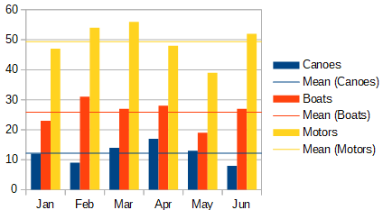
Figure 49: Error bars showing variance (Canoes), standard deviation (Boats), and standard error (Motors)
Error bars, shown in Figure 49, can be useful for presenting data that has a known possibility of error, such as social surveys using a particular sampling method, or for showing the measuring accuracy of the tool used. They can be created for 2D charts only and cannot be created for pie, bubble, net, or stock charts.
If no data series is selected, X or Y error bars are inserted for all data series. To add error bars for all data series:
1) Select the chart by double-clicking on it to enter edit mode. The chart should now be surrounded by a gray border.
2) Go to Insert > X Error Bars or Insert > Y Error Bars on the Menu bar to open the Error Bars dialog (Figure 50). The Line tab is not present if you are inserting error bars for all data series; in this circumstance, an extra None option appears in the Error Category area.
3) Select the desired options. See below for more information about the options.
4) Click OK to close the dialog and add the error bars to the chart. If desired, click outside the chart to leave edit mode.
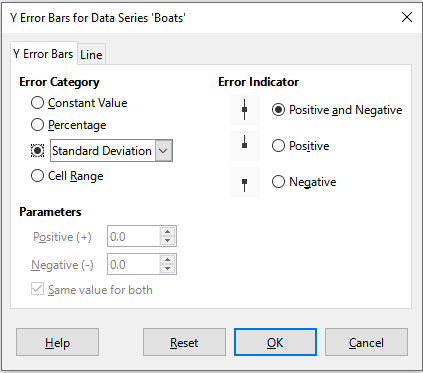
Figure 50: Error Bars dialog – Error Bars tab
To insert error bars for a single data series:
1) Select the chart by double-clicking on it to enter edit mode. The chart should now be surrounded by a gray border.
2) Do one of the following to select the data series:
Click once on a bar, column, line, or other graphical representation in the data series.
Select the data series from the Select Chart Element drop-down list on the Formatting Toolbar.
3) Do one of the following to open the Error Bars dialog (Figure 50):
Go to Insert > X Error Bars or Insert > Y Error Bars on the Menu bar.
Right-click on the data series and select Insert X Error Bars or Insert Y Error Bars in the context menu.
4) Select the desired options. See below for more information about these options.
5) Click OK to close the dialog and add the error bars to the chart. If desired, click outside the chart to leave edit mode.
Under Error Category, only one of the following options can be selected at a time.
Standard Error
Standard Deviation
Variance
Error Margin – uses the value for the error margin that is specified in the Parameters section.
Under Parameters, specify positive and negative values or ranges for the error bars. Constant Value, Percentage, Error Margin, or Cell Range must be checked for these options to be active.
Under Error Indicator, select whether the error graphic shows both positive and negative errors, only positive errors, or only negative errors.
On the Line tab you can adjust the line style, color, width, and transparency for the error bars.
Error bars can only be changed one data series at a time, using the Error Bars dialog (Figure 50). Do one of the following to open the Error Bars dialog:
1) Select the chart by double-clicking on it to enter edit mode. The chart should now be surrounded by a gray border.
2) Do one of the following to open the Error Bars dialog:
Click once on the data series to select it, then go to Insert > X Error Bars or Insert > Y Error Bars on the Menu bar.
Select the error bars for the specific data series from the Select Chart Element drop-down list on the Formatting toolbar. Then go to Format > Format Selection or click the Format Selection icon on the Formatting toolbar.
Right-click on the data series and select Format X Error Bars or Format Y Error Bars in the context menu.
3) Select the desired options on the Error Bars and Line tabs of the Error Bars dialog.
4) Click OK to close the dialog and update the error bars for the selected series. If desired, click outside the chart to leave edit mode.
To delete X or Y error bars for all data series:
1) Select the chart by double-clicking on it to enter edit mode. The chart should now be surrounded by a gray border.
2) With no data series selected, go to Insert > X Error Bars or Insert > Y Error Bars on the Menu bar to open the Error Bars dialog (Figure 50).
3) Select None.
4) Click OK to close the dialog and delete the error bars.
5) If desired, click outside the chart to leave edit mode.
To delete error bars for a single data series, follow the same steps as above but instead of steps ) to ), right-click on the data series and select Delete X Error Bars or Delete Y Error Bars in the context menu.
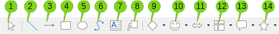
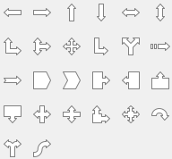
Use the Drawing toolbar to add shapes such as lines, rectangles, circles, text objects, or more complex shapes such as symbols or block arrows. Use additional shapes to add explanatory notes, highlight points of interest on a chart, or even hide certain data or text.
Open the Drawing toolbar by going to View > Toolbars > Drawing. Note that it can be moved around the workspace as needed. For more information on using the Drawing toolbar and drawing shapes, see Chapter 6, Using Images and Graphics, as well as the Draw Guide.
The Drawing toolbar (Figure 51) appears when the chart is in edit mode (by clicking on it twice).
Tip
To place arrows, text, or other drawing objects in a chart, be sure that the chart is in edit mode. Otherwise, an object will not be connected to the chart and will not be moved with it.
|
|
||
|
1. Select |
6. Freeform Line |
11. Block Arrows |
|
2. Insert Line |
7. Insert Text Box |
12. Flowchart |
|
3. Line Ends with Arrow |
8. Callouts |
13. Callouts |
|
4. Insert Rectangle |
9. Basic Shapes |
14. Stars and Banners |
|
5. Insert Ellipse |
10. Symbol Shapes |
|
Figure 51: Drawing toolbar when chart is placed in edit mode
Most of these options are self-evident or can be readily researched, especially by referring to the Draw Guide. Clicking on the icon for an option changes the pointer’s appearance, depending on the option. Click and drag the pointer to create the desired drawing object in the chart. Information that may be helpful for charts follows.
Insert Line
Note
If you draw a line in the spreadsheet (outside any chart), you can hold down Shift while dragging to constrain angles of the line to multiples of 45 degrees. This facility is not applicable when inserting a line on a chart.
Insert Text Box
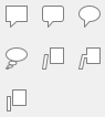
Callouts
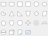
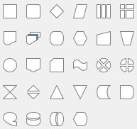
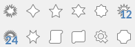
Clicking the down arrows next to the last six options on the right of the Drawing toolbar (Figure 51) opens tool palettes similar to those shown in Figure 52.
|
Basic Shapes |
Symbol Shapes |
Block Arrows |
|
|
|
|
|
Flowcharts |
Callouts |
Stars and Banners |
|
|
|
|
Figure 52: Tool palettes that can be opened from the Drawing toolbar
To resize or move a chart, click it once to put it in selection mode. Resize or move a chart in two ways: interactively, or by using the Position and Size dialog. Combining both methods may be useful. Position a chart interactively for quick and easy changes, then use the Position and Size dialog for precise sizing and positioning.
To resize a chart interactively:
1) Click once on the chart to select it. Square selection handles appear around the border of the chart.
2) Click and drag one of the selection handles. The pointer indicates the direction to increase or decrease the chart size. Clicking and dragging a corner handle preserves the horizontal to vertical size ratio.
3) When finished, click outside the chart to leave selection mode.
Move a chart interactively using one of two methods:
For small moves
1) Click once on the chart to select it. Square selection handles appear around the border of the chart.
2) Press an arrow key to move the chart a few pixels at a time, or press Alt + an arrow key to move the chart one pixel at a time.
3) When finished, click outside the chart to leave selection mode.
For larger moves
1) Click once on the chart to select it. Square selection handles appear around the border of the chart.
2) Hover the pointer anywhere over the chart until it changes to a move pointer (shape depends on computer setup).
3) Click and drag the chart to its new location.
4) Release the mouse button when the chart is in the required position.
5) When finished, click outside the chart to leave selection mode.
The Position and Size dialog contains options for defining the position of the chart on the page, specifying its size, rotating it, and slanting it.
Note
In addition to charts, the Position and Size dialog can also be used to modify and position other graphic elements, such as those available on the Drawing toolbar.
To resize or move a chart using the Position and Size dialog:
1) Right-click on the chart and select Position and Size in the context menu to open the Position and Size dialog (Figure 53).
2) Select the desired options on the Position and Size, Rotation, and Slant & Corner Radius tabs on this dialog. See below for further information about the options on these tabs.
3) Click OK to close the dialog and save changes.
4) When finished, click outside the chart to leave selection mode.
When positioning or resizing, click one of the points in the Base point graphic corresponding to the location to use for anchoring either the position of the chart or its size.
Note that either the position or the size can be protected from unwanted changes by clicking the appropriate box in the Protect section. Either or both option(s) selected will remain active after the dialog is closed. By contrast, Calc resets the base point to the default position after the dialog is closed.
Figure 53: Position and Size dialog — Position and Size tab
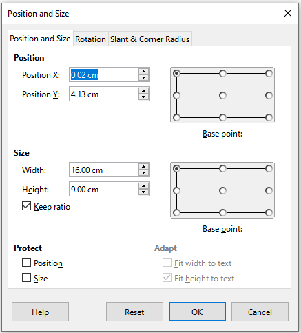
The options available on the Position and Size tab (Figure 53) are as follows:
Position
Position X – specifies the horizontal location of the chart relative to the base point.
Position Y – specifies the vertical location of the chart relative to the base point.
Base point – specifies a temporary base point for the chart.
Size
Width – sets a width for the selected object.
Height – sets a height for the selected object.
Keep ratio – maintains proportions between width and height when resizing the chart.
Base point – determines the directions in which the chart size will be increased or decreased.
Protect
Position – prevents unintentionally moving the chart.
Size – prevents unintentionally resizing the chart.
Adapt
The options for the Rotation tab (Figure 54) are as follows:
Figure 54: Position and size dialog – Rotation tab
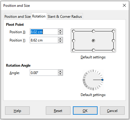
Pivot Point
Position X – specifies the horizontal distance from the left edge of the page to the pivot point.
Position Y – specifies the vertical distance from the top edge of the page to the pivot point.
Default settings – sets the location of the pivot point in a visual approach. The pivot point can be temporarily changed. However, when the dialog is opened again, the pivot point will return to its default location and the X and Y positions will reflect the default location.
Rotation Angle
Angle – shows the number of degrees of rotation (in the range 0 to 359 degrees). The number can be entered directly or it can be set using the indicator labeled Default settings.
Default settings – graphically shows the rotation angle. The angle can be set by clicking and dragging the indicator. The number of degrees rotated is shown in the Angle box.
The options for the Slant & Corner Radius tab (Figure 55) are as follows:
Corner Radius
Slant
Control Points
Figure 55: Position and Size dialog – Slant and Corner Radius tab
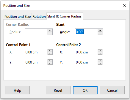
Select multiple charts by clicking once on the first chart then pressing Shift while clicking on additional charts. An invisible selection rectangle covers all of the selected charts and selection handles appear at the corners and midway between corners. The multiple charts are now treated as a single object and actions such as the following can be conducted.
Cut and paste or drag them to new locations.
Use the Position and Size dialog described in the previous section.
Use the Drawing Object Properties toolbar to align all of the charts, format the outer borders, or anchor the charts to the same cell or page.
When a chart is selected (by clicking on it once) it can be formatted as an object. The Drawing Object Properties toolbar (Figure 56) usually appears below the Standard toolbar (but the location depends on setup) and shows tools available for all objects, including charts.
Most of the options are self-evident or can be easily researched. Please refer to Chapter 6, Using Images and Graphics, and the Draw Guide for further information. Following are a few tips for using these tools with charts.
Anchor
Align Objects
Bring to Front/Forward One/Back One/Send to Back
|
|
||
|
1. Anchor |
7. To Foreground |
13. Fill Color |
|
2. Align Objects |
8. To Background |
14. Arrow Style |
|
3. Bring to Front |
9. Line Style |
15. Rotate |
|
4. Forward One |
10. Line Width |
16. Points |
|
5. Back One |
11. Line Color |
17. Group |
|
6. Send to Back |
12. Area Style/Filling |
|
Figure 56: Drawing Object Properties toolbar that appears when chart is selected
To Foreground/To Background
Line Style/Line Width/Line Color
Area Style/Filling and Fill Color
Arrow Style
Rotate
Points
Group
When a chart is copied, it retains a connection to the source data it is built on as long as it is in the same document. This means that changes made to the source data will be reflected in the chart.
Copying and pasting the chart is easy. Just click the chart once to select it, then either press Ctrl+C, or right-click on the chart and select Copy in the context menu, or click the Copy icon on the Standard toolbar, or select Edit > Copy on the Menu bar. To paste the chart in the desired location, press Ctrl+V, or right-click and select Paste in the context menu, or click the Paste icon in the Standard toolbar, or select Edit > Paste on the Menu bar.
When a chart is copied and pasted into another LibreOffice document, any connection to the data it is based on is lost. The data is kept with the chart and is now called a data table rather than a data range. Figure 57 shows an example of this internal data table.
Note
A copied chart links to or retains its data only when pasted into a LibreOffice document. To retain data or links outside LibreOffice, use embedding or linking, as explained in Chapter 11, Linking Data.
If the goal is to use the original data for the chart, follow the same procedure as above to copy and paste the chart to another document. Nothing more needs to be done.
If the original data for the chart needs to be modified, do the following:
1) Select the copied chart by double-clicking on it to enter edit mode. The chart should now be surrounded by a gray border.
2) Right-click on the chart and select Data Table to open the Data Table dialog shown in Figure 57.
3) Modify the data as desired. In addition to changing numbers in the data, use options to insert, move, or delete columns and rows.
4) Click Close to close the dialog.
5) If desired, click outside the chart to leave edit mode.
Figure 57: Data Table dialog when a chart is copied into another document
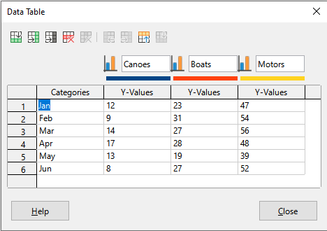
If the chart is still in Calc and replacement data is in the same spreadsheet, select and drag the new data onto the chart. This is described in “Replacing data by dragging” on page 1.
Note
Calc does not provide a direct way to save chart settings for creating another chart in LibreOffice. Here are three options for using the same chart settings: 1) copy and paste the chart into another file; 2) save the file containing the chart as a new file; and 3) save the chart in a template. Depending on the method used, create a new chart by modifying either the data range or the data table.
Charts can be exported in a variety of image formats for use in other documents. File types include BMP, EMF, EPS, GIF, JPEG, PDF, PNG, SVG, SVM, TIFF, and WMF.
To export a chart in an image format:
1) Right-click on the selected chart and select Export as Image in the context menu to open the Save as Image dialog.
2) In the dialog, type a name for the graphic file, select the location for saving the file, and select the desired graphic format.
3) Click Save and an image of the chart will be exported to the location specified.
To delete a chart, click it once to select it. Square selection handles appear on the borders of the chart. Then press Delete.
While data can be presented using a variety of charts, focus on the message of the chart to determine which type of chart to use. The following sections present examples of the chart types that Calc provides, with some notes on the uses of each one.
A column chart shows vertical bars, with the height of each bar proportional to its value. The X axis shows categories and the Y axis shows the value for each category.
Column charts are commonly used for data that show trends over time. They are best for a relatively small number of data points. It is the default chart type provided by Calc, as it is one of the most useful and easy to understand. For a larger time series, a line chart would be more appropriate.
The column chart type has three variants, with a preview pane for each variant as shown in Figure 58.
Figure 58: Chart Type dialog – Column
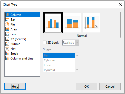
When a preview is clicked, its borders are highlighted and the name appears below. The 2D variants are:
Normal
Stacked
Percent stacked
Additional options for creating column charts are:
3D Look
Realistic – tries to give the best 3D look.
Simple – tries to mimic the chart view of other products.
Shape
A bar chart is like a column chart that has been shifted 90 degrees. It shows horizontal bars rather than vertical columns. In contrast to some other chart types, the Y axis is horizontal and the X axis is vertical. The Chart Type dialog for a bar chart is essentially the same as for a column chart, which was described above, with the previews modified to show horizontal bars.
Bar charts can have an immediate visual impact when time is not an important factor — for example, when comparing the popularity of a few products in a marketplace. They may be preferred to column charts when the category names are long or there are a significant number of categories.
In the examples in Figure 59 below:
To make the first chart, after using the Chart Wizard enter the edit mode and go to Insert > Grids, deselect Y axis, and choose Insert > Mean Value Lines. Right-click each mean value line and select Format Mean Value Line to increase the width of the lines. Create rectangles from the Drawing toolbar to cover the mean value line entries in the legend. Make them white by right-clicking and selecting Line and then Area.
The second chart is a 3D chart created with a simple border and cylinder shape. The chart area is rotated (described under “Rotation and perspective” on page 1).
The third chart eliminates the legend by using labels with the names of the companies on the Y axis. Whereas the first two charts treat the data as separate data series, this chart treats the data as one data series in order to have category labels for the X axis. Rather than colors, a colored hatch pattern is used for the bars.
Figure 59: Bar chart examples
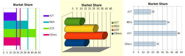
A pie chart shows values as circular sections of a circle. The area of each section is proportional to its value.
Pie charts are excellent for comparing proportions — comparisons of departmental spending, for example. They work best with smaller numbers of values, up to about half a dozen; more than this and the visual impact begins to fade.
Figure 60: Chart Type dialog - Pie
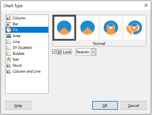
Pie variant options, shown in Figure 60, are:
Normal
Exploded Pie
Donut
Exploded Donut
The Chart Wizard initially guesses how the data should be presented in the chart. Adjust this on the Data Range and Data Series pages of the Chart Wizard or by using the Data Ranges dialog.
You can do some interesting things with a pie chart, especially if you make it into a 3D chart. It can be tilted, given shadows, and generally turned into a work of art. Just do not clutter it so much that the message is lost, and be careful that tilting does not distort the relative sizes of the segments.
You can choose in the Chart Wizard to use the exploded pie variant, but this option explodes all of the pieces (contrary to the preview graphic in Figure 60). If the aim is to accentuate just one piece of the pie, separate out a piece by carefully highlighting it and dragging it out of the group. After this, the chart area may need to be enlarged to regain the original size of the pieces.
Figure 61: Pie chart examples
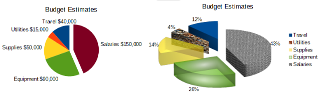
The effects achieved in Figure 61 are explained below.
2D pie chart with one section of the pie exploded
3D pie chart, exploded variant, with realistic schema and various fill effects
Donut and exploded donut variants, shown in Figure 62, are used to display two sets of related information, such as two years of financial data. This variant can be misleading for comparing numeric data, since inner circles are necessarily smaller. For more variety, use a 3D look.
Figure 62: Donut chart examples
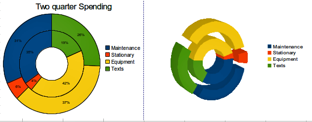
Like a line or column chart, an area chart shows values as points on the Y axis and categories on the X axis. The Y values of each data series are connected by lines and the areas below the lines are colored.
Area charts emphasize volumes of change from one category to the next. They have greater visual impact than line charts, but the data used will make a difference.
Figure 63: Chart Type dialog - 2D and 3D Area
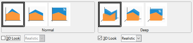
Area chart variants, shown in Figure 63 are:
Normal
Deep
Stacked
Percent Stacked
Figure 64: Area chart examples
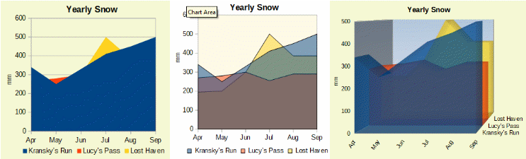
Area charts are sometimes tricky to create. Using transparency values may be helpful. To create the charts in Figure 64, first set up the basic chart using the Chart Wizard. The chart on the left shows the result. Because of the data overlap, some of it is missing behind the first data series. This is probably not desirable. The other examples are better solutions.
To create the chart in the center:
To create the chart on the right:
Other ways of visualizing the same data series are the stacked area chart and the percentage stacked area chart (Figure 65). In the first example, each point in a data series is added to the other data series to show the total area. The second example shows a percentage stacked chart, showing each value in the series as a percentage of the whole.
Figure 65: Stacked and percentage stacked area charts
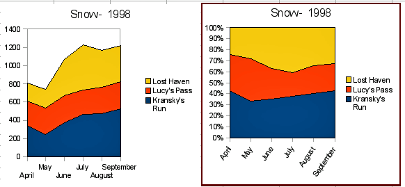
A line chart is useful for showing trends or changes over time when you want to emphasize continuity. Values are shown as points on the Y axis and the X axis shows categories—often time series data. The Y values of each data series may be connected by a line.
Note
The difference between line charts, described in this section, and XY (scatter) charts, described in the next section, is this: line charts show categories along the X axis while XY (scatter) charts show values along the X axis.
As shown in Figure 66, four variants are available:
Points Only
Points and Lines
Lines Only
3D Lines
When Stack series is selected, it shows cumulative Y values above each other. The options are:
On top – places the value of each data series above the others. The Y values no longer represent absolute values, except for the first data series, which appears at the bottom of the chart. This is the default setting.
Percent – scales the Y values as percentages of the category total.
Figure 66: Chart Type dialog – Line
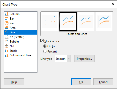
The Line type drop-down list has three options that determine how the data points are connected:
Straight
Smooth
Figure 67: Smooth Lines dialog
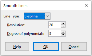
Stepped
Figure 68: Stepped Lines dialog
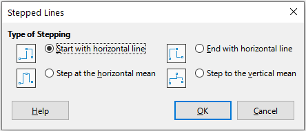
Things to do with lines: thicken them, smooth the contours, just use points, or make them 3D. However, 3D lines can confuse the viewer, so just using a thicker line often works better. Figure 69 shows some examples of line charts.
Figure 69: Line chart examples
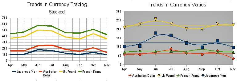
In contrast to line, column, and bar charts, which contain numeric values on the Y axis and categories on the X axis, scatter or XY charts contain values along both axes. They are quite useful, especially for understanding relationships among data that are precise and complex. An XY chart may contain more than one data series and can perform many tasks, such as generating a parameter curve or drawing the graph of a function.
Tip
When plotting time on the X axis, make sure that it is not text and is written in the correct format for your locale. For example, instead of January, use a format such as 1/1/2022. Check locale formats at Tools > Options> Language Settings > Languages > Date acceptance patterns.
XY charts are most frequently used to explore the statistical associations among quantitative variables. There is often a constant value against which to compare the data — for example, weather data, reactions under different acidity levels, or conditions at various altitudes.
Tip
By custom, if one of the variables is either controlled by an experimenter or it changes consistently (such as time) it is considered an independent variable and plotted on the X axis.
Figure 70: Chart Type dialog – XY (Scatter)
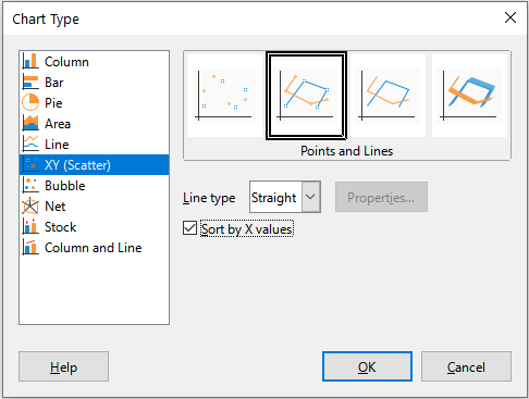
As shown in Figure 70, when the XY (Scatter) chart type is selected, the following variants are available:
Points Only
Points and Lines
Lines Only
3D Lines
The following options are available:
Sort by X values
Line type – Straight
Line type – Smooth
Cubic spline interpolates the data points with polynomials of degree 3. The transitions between the polynomial pieces are smooth, having the same slope and curvature.
B-spline uses parametric, interpolating B-spline curves. The curves are built from polynomials.
Resolution determines how many line segments are calculated to draw a piece of polynomial between two data points. A value in the range 1 to 100. Click any data point to see the intermediate points.
Degree of polynomials (only for B-spline line type) sets the degree of these polynomials. A value in the range 1 to 15.
Line type – Stepped
After a scatter chart is created, its default settings can be changed in ways such as the following. Be sure to first double-click the chart to enter edit mode. Depending on the option, a data point or data series may also need to be double-clicked.
Line styles and icons – double-click or right-click on a data series in the chart to open the Data Series dialog. See “Lines, areas, and data point icons” on page 1 for further information.
Error bars – For 2D charts, select Insert > Y Error Bars or X Error Bars to enable the display of error bars. See “Error bars” on page 1 for further information.
Mean Value Lines and Trend Lines – Enable the display of mean value lines and trend lines with commands on the Insert menu. See “Trend and mean value lines” on page 1 for further information.
By default, the first column or row of data (depending on whether the data is arranged in columns or rows) is represented on the X axis. The rest of the rows of data are then compared against the first row of data.
Scatter charts may surprise those unfamiliar with how they work. This can be seen in examples using the following data (Figure 71), which is organized with data series in rows.
The data range for the chart on the left in Figure 71 includes the cells containing the months. However, the months do not appear on the chart because only values can be used in XY (scatter) charts and Calc substitutes them for cardinal numbers.
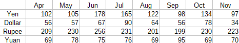
The data range for the chart on the right does not include the cells containing the months. Calc assumes that the first row (or column) of data contains values for the X axis. The Y values of the other data series are paired with each of those X values. This means that there are no data points for the Japanese yen but each of the other currencies are shown in comparison to the yen, since it supplies the X values.
Figure 71: XY (Scatter) chart examples
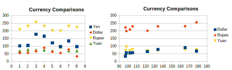
A bubble chart is a variation of a scatter chart that can show three variables in two dimensions. The data points are shown with bubbles. Two variables are plotted along the X and Y axes, while the third variable is represented by the relative size of the bubbles. These charts are often used to present financial data or social/demographic data.
One or more data series can be included in a single chart. The data series dialog for a bubble chart has an entry to define the data range that determines the size of the bubbles.
It may be necessary to build a bubble chart manually in the data series page of the Chart Wizard. Figure 72 shows how the data ranges can be set for a bubble chart.
Figure 72: Data series entries for a bubble chart
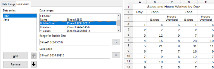
The chart in Figure 73 is based on the data in Figure 72. To format the chart, the data series are 50% transparent with a radial gradient. The data labels are formatted to be numbers in the center of the data points (bubbles).
Note
Remember that bubble charts require numeric data. If the data series for the X axis contains text (or dates not formatted as numbers) cardinal numbers will be used for axis labels.
Figure 73: Bubble chart example
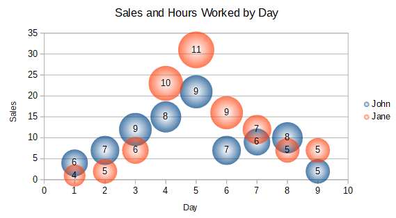
Net charts are also known as spider, polar, or radar charts. They display data values as points on radial spokes, with each spoke representing a variable. They compare data that are not time series, but show different circumstances, such as variables in a scientific experiment. They are especially useful for displaying clusters and outliers.
Figure 74 shows an example of a simple net chart. The radial spokes of the net chart are equivalent to the Y-axes of other charts. All data values are shown with the same scale, so all data values should have about the same magnitude.
Figure 74: Simple net chart example
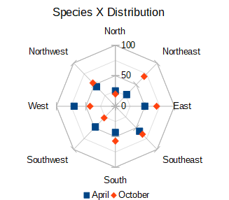
Generally, between three and eight axes are best; any more and this type of chart becomes confusing. Before and after values can be plotted on the same chart, or perhaps expected and real results, so that differences can be compared.
Figure 75 shows the options for creating a net chart. These are similar to those for area and line charts, described above. However, keep in mind that area increases as the square of the distance along the linear spokes. Therefore, net charts can distort the areas representing the data. Be especially careful about choosing to stack data series. In this case, successive data series show increasingly large areas that are not proportional to their values.
Figure 75: Chart Type dialog - Net
Figure 76 shows examples of two types of net charts.
The example on the left is a filled net chart. The color of one of the data series is 50% transparent. Partial transparency is often best for showing all of the series.
The example on the right is a net chart with lines and points. The data point icons are taken from the Gallery and have a 3D look.
Figure 76: Filled net chart and net chart with 3D data point icons
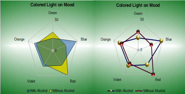
A stock chart illustrates the market trends for stock and shares by giving opening price, bottom price, top price, and closing price. The transaction volume can also be shown and the X axis usually represents a time series.
When setting up a stock chart in the Chart Wizard, the data should be arranged as shown in Figure 77. It specifies which columns should be the opening, low, high, and closing prices of the stock as well as the transaction volume. However, manual adjustments may still be needed when defining the data series.
Figure 77: Example data arrangement for stock charts
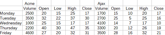
A stock chart organizes data series in two basic ways. The first way is not used in other chart types. In this case, the open, low, high, and closing values of a row create one data unit in the chart and one data series consists of several rows containing such data units. The columns containing transaction volumes are the second way used to organize data series. This is the familiar way used in other chart types.
Figure 77 shows the data for four data series: 1) the price data for Acme, which contains columns for open, low, high, and closing prices, 2) the price data for Ajax, which contains columns for open, low, high, and closing prices, 3) the Acme transaction volume, which is one column, and 4) the Ajax transaction volume, which is one column.
The Chart Wizard offers four stock chart variants, as shown in Figure 78. Note that some of them do not use all of the data columns.
Figure 78: Chart Type dialog - Stock
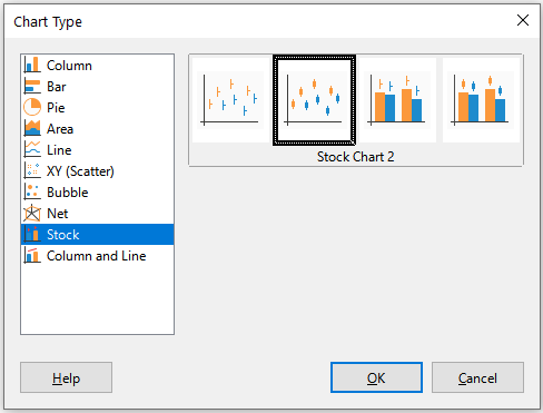
The data table in Figure 77 is used to illustrate the variants, which are as follows.
Stock Chart 1
Stock Chart 2
Stock Chart 3
Note
Variants 3 and 4 automatically align data to the secondary Y axis. For more information about a secondary Y axis, see “Aligning data to secondary Y axis” on page 1.
Stock Chart 4
Figure 79: Stock chart variant 1 showing low, high, and closing prices
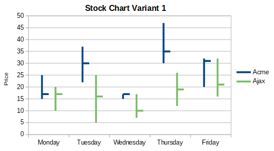
Figure 80: Stock chart variant 2 showing low and high prices as well as the range between opening and closing prices
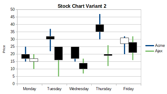
Figure 81: Stock chart variant 3 showing low, high, and closing prices as well as transaction volumes
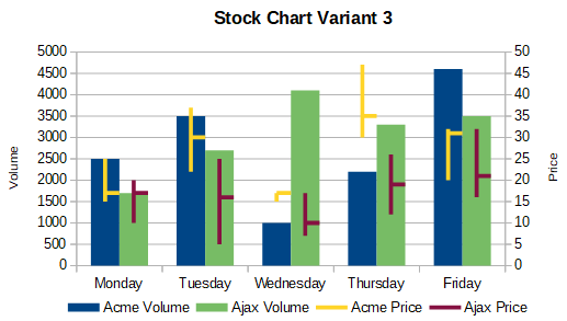
Figure 82: Stock chart variant 4 showing opening, low, high, and closing prices as well as transaction volumes.
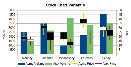
A column and line chart is useful for displaying two or more distinct but related data series, such as sales over time (columns) and profit margin trends (lines). It could also show constant minimum and maximum lines, such as used in medical testing or quality control.
Specify in the Chart Type dialog the number of lines. By default, the first column or row of data is categories and the last columns or rows of data are lines.
Choose between two variants:
Columns and Lines
Figure 83: Column and line chart with secondary Y axis
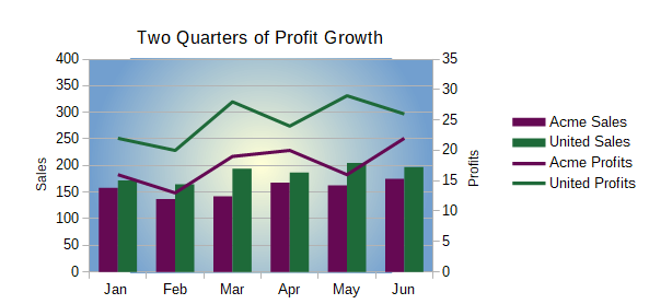
Stacked Columns and Lines
The charts in Figures 83 and 84 show sales and profit data for two firms over a period of time. Note that when first created, the lines were different colors than the columns for the same company. To reflect the company relationships, change the line colors individually by clicking on a line, right-clicking, selecting Format Data Series, and formatting the line color and size on the Line page.
For the background, right-click the chart wall, select Format Wall, and select desired options on the Gradient page of the Area tab. To align the two data series to the secondary Y axis, see “Aligning data to secondary Y axis” on page 1.
Figure 84: Column and line chart with stacked columns
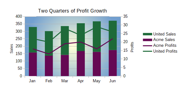
Pivot tables are special types of data tables that simplify the manipulation and analysis of data. They are widely used, especially for processing large amounts of data. Pivot charts are based on pivot tables and are created by selecting Insert > Chart, or clicking the Insert Chart icon in the Standard toolbar, after left-clicking a cell inside a pivot table. Pivot charts inherit many properties of the other chart types described in this chapter but also have other characteristics that are described in Chapter 9, Using Pivot Tables.
Calc does not currently have the option of creating a data series as a box plot. However, it is possible to convert the minimum, 1st quartile, median, 3rd quartile, and maximum of a stacked column chart with the data series in rows and without a legend into a box plot with whiskers.
The conversion of this stacked column chart to a box plot with whiskers is done by replacing the stacks in the chart with:
Minimum of the data series
The difference between the first quartile and the minimum of the data series.
The difference between the median and the first quartile of the data series.
The difference between the third quartile and the median of the data series.
The difference between the maximum and the third quartile of the data series.
When calculating the differences of the first and third quartiles, it is important whether the data series contains an even or an odd amount of data. For an even amount of data, the function QUARTILE.EXC (range, parameter) should be used and for an odd amount of data use the function QUARTILE.INC (range, parameter) (Figure 85).
The MIN (range), MEDIAN (range), and MAX (range) functions can be used to calculate the minimum, median, and maximum, respectively.
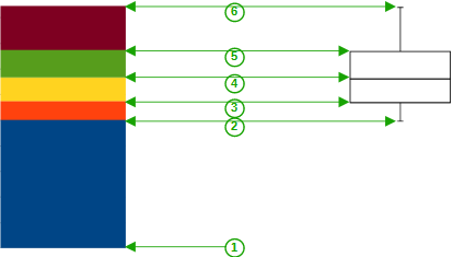
|
1 |
Minimum of the data series |
|
2 |
The first quartile of the data series |
|
3 |
Bottom of the box to be formed |
|
4 |
The median of the data series |
|
5 |
The third quartile of the data series is also the top of the shapes box |
|
6 |
The maximum of the data series |
Figure 85: Stacked column chart in rows of minimum, 1st quartile, median, 3rd quartile, maximum with no legend and box plot with whiskers constructed from that column chart
You can convert a column char to box plot with whiskers by following the next steps:
1) Remove or apply the color white to the bottom stack with Format Data Series in the context menu.
2) While in edit mode, right-click on the chart and select Insert Y Error Bars from the context menu.
3) Set the style in the Line Properties section of the Line tab in the Data Series Y Error Bars dialog box to Continuous and the width to 0.03 cm.
4) On the Y Error Bars tab, select Cell Range and in the Error Indicator section choose Negative. In the now opened Negative (-) box insert the difference between the 1st quartile and the minimum.
5) Remove or apply the color white to the top stack with Format Data Series in the context menu.
6) Set the configuration of the top whisker by performing steps similar to the described above.
The box consists of the middle stack and the stack above it with the median separating the two stacks. Both stacks should be framed with borders by selecting Format Data Series from the context menu. On the Borders tab of the dialog, the Style should be set to Continuous and the thickness to 0.03 cm. If desired, you can remove or whiten the background on the Plane tab.
For more detailed instructions about making a boxplot, see https://wiki.documentfoundation.org/Documentation/HowTo/Calc/BoxplotWithWhiskers.
Sparklines are small, simple, cell-sized charts meant to convey the general shape of data variation within a data set. Typically, sparklines are used to show variation over time and are drawn without axes or coordinates.
Figure 86: A simple sparkline example
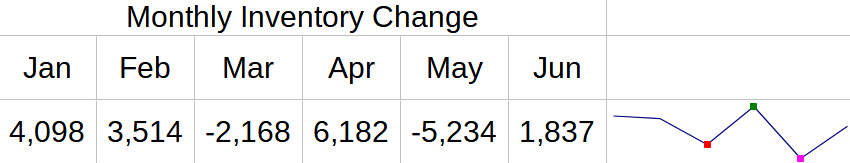
Tip
Calc’s sparklines are compatible with Excel’s version of sparklines and can both be imported from and exported to Excel.
To create a sparkline, select the row or column of source data and then do one of the following:
Right-click on the selected data and from the context menu choose Sparklines > Insert Sparkline
Go to Insert > Insert Sparkline on the Menu bar
Then complete the Sparkline Properties dialog and click OK to complete the creation of your sparkline:
Data
Input Range – Data range for the sparkline. This will be auto-populated if you selected a data range before creating the sparkline.
Output Range – The cell where the sparkline will be placed.
Properties
Type – Select the sparkline type: Line, Column or Stacked (see Types of sparklines below).
Line width – Set the line width for Line sparklines.
Display empty cells as – Gap – skips the missing data and shows a gap in the sequence. Zero – displays the missing data as zero, Span – skips the missing data and draws a line to the next value.
Display hidden – Check to show data in the selected Input Range in the sparkline. If unchecked, hidden data will be ignored.
Right-to-left – By default, the data in the sparkline will display the data from left to right for rows and top to bottom for columns. Checking this box will reverse the display.
Colors –
Set the main color for the Series of values and check and select colors for various values types to display in the sparkline. Marker will set the default color for the data points in Line sparklines only
Axes
Display X axis – Check to show an X axis in the sparkline
Vertical minimum, Vertical maximum – set the minimum and maximum values for the Y axis based on the Individual sparkline, the Group of sparklines (see Creating multiple sparklines below) or set Custom minimum and maximum values.
Figure 87: Sparkline creation dialog
Note
A sparkline is limited to one cell. To increase the size of display, increase the size of the cell. If the sparkline is merged into other cells it will remain the same size as the original cell and will lose the option to modify the sparkline formatting until it is unmerged.
There are three types of sparklines: Line, Column and Stacked.
Line
Figure 88: Line sparkline example
Column
Figure 89: Column sparkline example

Stacked
Figure 90: Stacked sparkline example

Create multiple sparklines at once by selecting multiple rows or columns for the Input Range. Then select an equal number of cells as the Output Range as there are rows or columns in the Input Range.
Then set the properties of the sparklines and click OK to create them. They will appear in the Output Range cells in the same order as the rows or columns selected in the Input Range.
These sparklines will all share the same formatting and the same sparkline group (see Sparkline groups below).
When setting the Vertical minimum or Vertical maximum to Group, each associated sparkline Y axis will enlarge to include the lowest (for minimum) or highest (for maximum) value from all of the data in the associated sparklines.
Tip
If the OK button in the Sparkline Properties dialog is unavailable to click (appears dimmed) it is because the number of cells in the Output Range does not match the number of rows or columns selected in the Input Range. Update these to match and the OK button will become available.
To update a sparkline’s data range, right-click on the sparkline and choose Sparklines > Edit Sparkline, update the Data range, and click OK.
Figure 91: Sparkline Data Range dialog
Once created, each sparkline is associated to one sparkline group. A sparkline group contains sparkline formatting information and can be associated with more than one sparkline. If multiple sparklines are created at once, they will all have the same sparkline group. Any change to a sparkline group will affect all related sparklines.
To update a sparkline group, open the Sparkline Properties dialog with one of these methods:
Right-click on a sparkline in the group to be modified and choose: Sparklines > Edit Sparkline Group
Select a cell containing a sparkline in the group to be modified and from the Menu Bar select: Format > Sparklines > Edit Sparkline Group
The properties can then be updated and applied by clicking OK.
Figure 92: Edit Sparkline Group Properties dialog
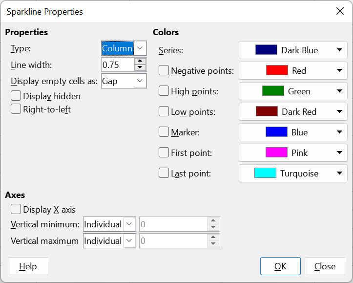
To group sparklines so that they share the same formatting:
1) Select the sparkline with the group formatting to be applied to other sparklines.
2) Select other sparklines to add to the group
3) Then select one of these methods to finish the grouping:
Right-click one of the selected cells and choose: Sparklines > Group Sparklines
From the Menu Bar, select Format > Sparklines > Group Sparklines
To ungroup sparklines so that they can be formatted separately, select the sparklines to be removed from the sparkline group and do one of the following:
Right-click one of the selected cells and choose: Sparklines > Ungroup Sparklines
From the Menu Bar, select Format > Sparklines > Ungroup Sparklines
The sparklines that were ungrouped will now each have their own sparkline group.
To delete a sparkline, simply select the sparkline and press Delete.