

Impress Guide 7.2
Chapter 3
Adding and Formatting Text
This document is Copyright © 2021 by the LibreOffice Documentation Team. Contributors are listed below. This document maybe distributed and/or modified under the terms of either the GNU General Public License (https://www.gnu.org/licenses/gpl.html), version 3 or later, or the Creative Commons Attribution License (https://creativecommons.org/licenses/by/4.0/), version 4.0 or later.
All trademarks within this guide belong to their legitimate owners.
|
Peter Schofield |
Vasudev Narayanan |
Rachel Kartch |
|
Peter Schofield |
Samantha Hamilton |
Michele Zarri |
|
Jean Hollis Weber |
T. Elliot Turner |
Low Song Chuan |
Please direct any comments or suggestions about this document to the Documentation Team’s mailing list: documentation@global.libreoffice.org
Note
Everything sent to a mailing list, including email addresses and any other personal information that is written in the message, is publicly archived and cannot be deleted.
Published October 2021. Based on LibreOffice 7.2 Community. Other versions of LibreOffice may differ in appearance and functionality.
Some keystrokes and menu items are different on macOS from those used in Windows and Linux. The table below gives some common substitutions for the instructions in this document. For a detailed list, see the application Help.
|
Windows or Linux |
macOS equivalent |
Effect |
|
Tools > Options |
LibreOffice > Preferences |
Access setup options |
|
Right-click |
Control+click or right-click depending on computer setup |
Open a context menu |
|
Ctrl (Control) |
⌘ (Command) |
Used with other keys |
|
F11 |
⌘+T |
Open the Styles deck in the Sidebar |
Any text used in slides is contained in text boxes and this chapter describes the following:
How to create, modify, use, and delete text boxes.
How to create, modify and format the various types of text that can be inserted.
How to insert special forms of text such as ordered (numbered) or unordered (bulleted) lists, tables, fields, and hyperlinks.
Adding text boxes to slides is carried out using one of the following methods:
Use a predefined Impress layout which includes AutoLayout text boxes.
Create a text box using the Insert Text Box for a horizontally aligned text box on the Standard toolbar (Figure 1) or the Drawing toolbar (Figure 2).
Create a text box using the Insert Vertical Text for a vertically aligned text box on the Standard toolbar or the Drawing toolbar.
Use the keyboard shortcut F2 to insert a horizontally aligned text box.
Figure 1: Standard toolbar

Figure 2: Drawing toolbar

Note
The Insert Vertical Text tool for creating a vertical text box and inserting vertical text is only available when Asian and Complex text layout (CTL) options are enabled. Go to Tools > Options > Language Settings > Languages on the Menu bar to select these options for vertical text.
AutoLayout text boxes are automatically created when one of the slide layouts available is selected in Impress.
1) Select a slide layout using one of the following methods:
Open the Layouts panel in the Properties deck on the Sidebar (Figure 3)
Go to Slide > Layout on the Menu bar to open a context menu (Figure 4).
Figure 3: Layouts panel in Properties deck on Sidebar
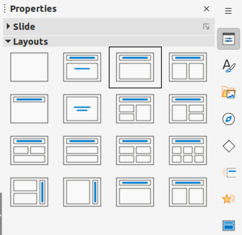
Figure 4: Slide layout options on Menu bar
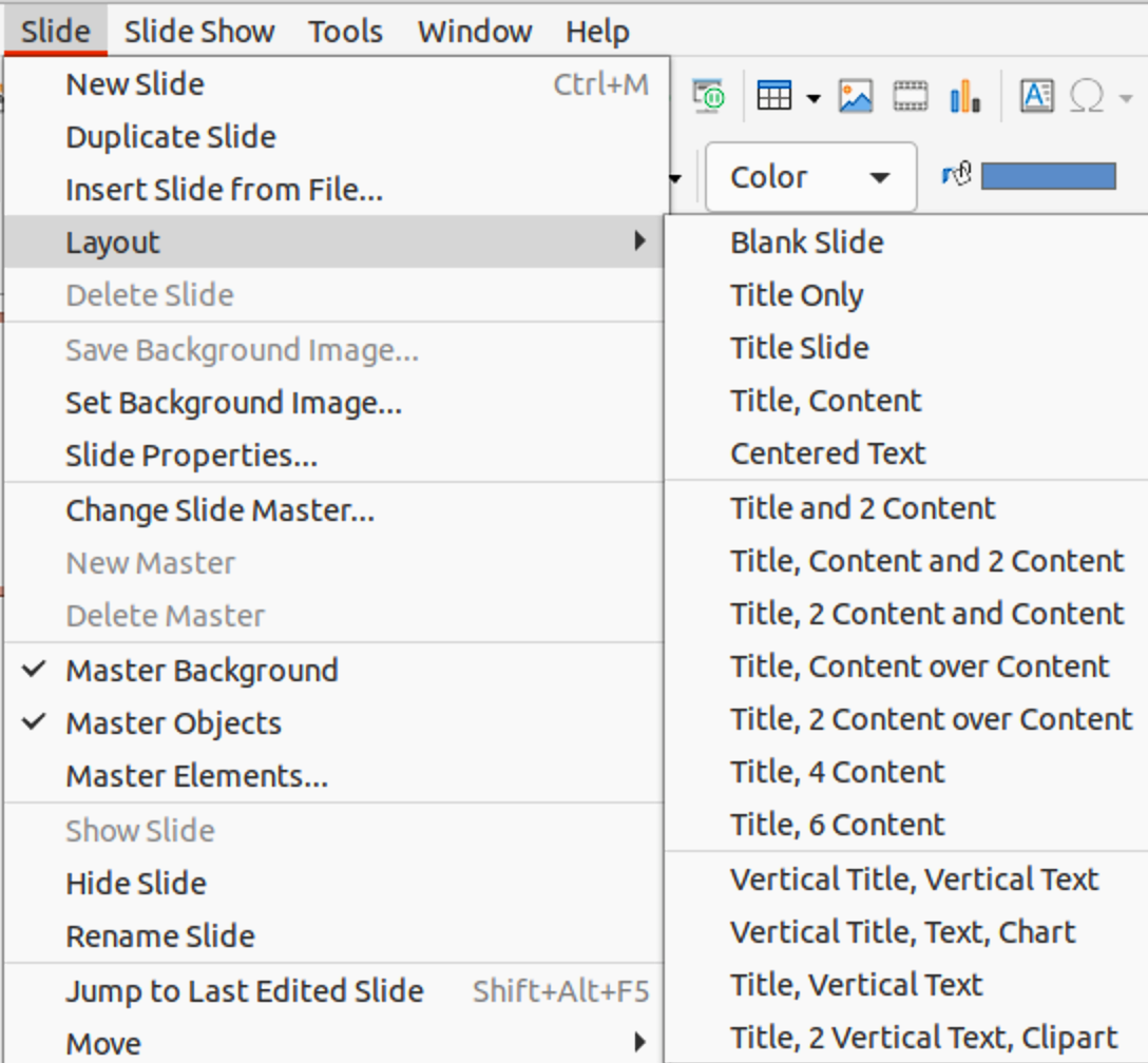
Figure 5: Text Formatting toolbar

2) Click on Click to add Title or Click to add Text. This text automatically disappears and is replaced by a flashing text cursor. The Text Formatting toolbar (Figure 5) automatically opens replacing the Line and Filling toolbar.
3) Type or paste text into the AutoLayout text box and, if necessary, format the text to the presentation requirements using the information in this chapter.
4) If necessary, copy, resize and/or reposition the AutoLayout text box using the information in this chapter.
5) Click outside the AutoLayout text box to deselect it.
Note
AutoLayout text boxes can be moved, resized and deleted in the same way as text boxes. See “Moving text boxes with mouse”, “Text positioning”, and “Deleting text boxes” for more information.
1) For horizontal text, click on Insert Text Box, or for vertical text, click on Insert Vertical Text on the Standard toolbar or the Drawing toolbar. The Text Formatting toolbar automatically opens, replacing the Line and Filling toolbar.
2) Create a horizontal text box using one of the following methods:
Click on the slide and a text box is automatically created with the text cursor flashing in the text box. The text box increases in width as text is entered in a single line. The text box height does not change. To create multiple lines and increase the height, use the Enter key to create new single line paragraphs.
Click and drag the cursor on the slide to set the width of the text box. As text is entered, the height of a text box automatically increases as text wraps creating multiple lines in the text box.
3) Create a vertical text box using one of the following methods:
Click on the slide and a text box is automatically created with the text cursor flashing in the text box. The text box increases in height as text is entered in a single line. The text box width does not change. To create multiple lines and increase the width, use the Enter key to create new single line paragraphs.
Click and drag the cursor on the slide to set the height of the text box. As text is entered, the width of a text box automatically increases as text wraps creating multiple lines in the text box.
4) Type or paste the text into the text box.
5) Click outside the text box to deselect it.
By default, when an AutoLayout text box or a text box is created, the borders of the text box are only displayed when the text box is selected. Use one of the following methods to create a visible border around the text box.
Note
When creating a text box border, if the properties of the line style selected are changed, for example, in the Line dialog, then the properties are also changed in the Line and Filling toolbar, and the Line panel in the Properties deck on the Sidebar.
1) Click on a text box to select it so that the border is displayed indicating that the text box is in edit mode.
2) In Line Style on the Line and Filling toolbar, select a line style from the drop-down list to use as a text box border. If the Line and Filling toolbar is not visible, go to View > Toolbars > Line and Filling on the Menu bar.
3) In Line Width on the Line and Filling toolbar, enter a width for the line style selected for the text box border.
4) In Line Color on the Line and Filling toolbar, select a color from one of the available color palettes, or create a custom color.
5) Click outside the text box to exit edit mode.
1) Click on a text box to select it so that the border is displayed indicating that the text box is in edit mode.
2) Open the Line dialog (Figure 6) using one of the following methods:
Right-click on the text box border and select Line from the context menu.
Go to Format > Object and Shape > Line on the Menu bar.
3) Click on Line to open the Line page.
4) In Style, select a line style from the drop-down list to use as a text box border.
5) In Color, select a color for the line style from one of the available color palettes, or create a custom color.
6) In Width, enter a width for the line style selected.
7) If necessary, in Transparency, enter a percentage value for the line style.
8) If necessary, in Corner Style, select the type of corner style from the options in the drop‑down list.
9) Click OK to save the changes and close the Line dialog.
10) Click outside the text box to exit edit mode.
Note
For a corner style to be clearly visible in a text box border, it is recommended to set the line width at a thickness above 0.35cm, as shown by the example in Figure 7.
Figure 6: Line dialog - Line page for creating text box border

The quick brown fox jumped over the lazy dog.
Figure 7: Example of a text box border with bevelled corners
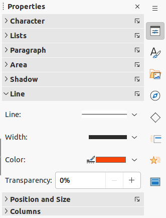
Figure 8: Line panel in Properties deck on Sidebar
1) Click on a text box to select it so that the border is displayed indicating that the text box is in edit mode.
2) Click on Properties to open the Properties in the Sidebar, then click on Line to open the Line panel (Figure 8).
3) In Line, select a line style from the drop-down list to use as a text box border.
4) In Width, enter a width for the line style selected.
5) In Color, select a color for the line style from one of the available color palettes, or create a custom color.
6) If necessary, in Transparency, enter a percentage value for the line style.
7) Click outside the text box to exit edit mode.
1) Click in the text box to select it so that the border is displayed indicating that the text box is in edit mode.
2) Move the cursor over the border and the cursor changes shape to the move cursor for the computer operating system (for example, a hand).
3) Click and drag on the border to move the text box. A dashed outline of the text box shows where the text box will be placed as shown in Figure 9.
4) Release the mouse button when the text box is in the required position.
5) Click outside the text box to exit edit mode.
1) Click in the text box to select it so that the selection handles are displayed indicating that the text box is in edit mode.
2) Move the cursor over a selection handle and the cursor changes shape indicating the direction the text box will be resized.
Figure 9: Moving text boxes
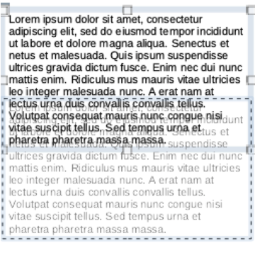
Figure 10: Resizing text boxes
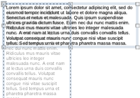
3) Click and drag on a selection handle to resize the text box. A dashed outline appears indicating the new size of the text box as it is being resized, as shown in Figure 10. The selection handles are used to resize the text box as follows:
Corner handles change the width and height of the text box simultaneously.
Top and bottom selection handles change the height of the text box.
Right and left selection handles change the width of the text box.
4) Release the mouse button when the text box is at the required size.
5) Click outside the text box to exit edit mode.
Note
To maintain the proportions of a text box while resizing, press and hold the Shift key, then click and drag a selection handle. Make sure to release the mouse button before releasing the Shift key.
For more accurate control over the size and position of an AutoLayout text box or text box, it is recommended to use the Position and Size dialog (Figure 11).
1) Click in the text box to select it so that the selection handles are displayed indicating that the text box is in edit mode.
2) Open the Position and Size dialog using one of the following methods:
Go to Format > Object and Shape > Position and Size on the Menu bar.
Right-click on the text box border and select Position and Size from the context menu.
Use the keyboard shortcut F4.
3) Click on Position and Size to open the Position and Size page.
Figure 11: Position and Size dialog
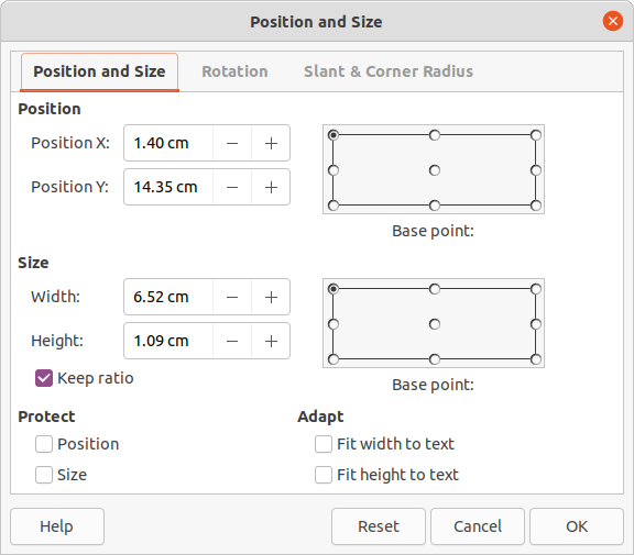
4) Use the various options available on the Position and Size page to position the text box.
5) Click OK to save the changes and close the Position and Size dialog.
6) Click outside the text box to exit edit mode.
The options available on the Position and Size page are as follows:
Position
Position X (horizontal) and Position Y (vertical) – specify position of the text box. The position values of the text box represent the distance of the Base point to the top left corner of the slide.
Base point – position the text box by selecting one of the nine available positions. By default, the Base point is the top left corner of the text box.
Size
Width and Height – specify size of the text box. To maintain the width/height ratio of the text box, select Keep ratio. The size values represent the distance of the Base point relative to the top left corner of the slide.
Base point – position the text box by selecting one of the nine available positions. By default, the Base point is the top left corner of the text box.
Protect – prevent accidental modification of the position or size of the text box by selecting Position and/or Size options.
Adapt – allow the text box to adjust its height and/or width as text is entered by selecting Fit width to text and/or Fit height to text.
For more accurate control over the size and position of a text box, the Position and Size panel in the Properties deck on the Sidebar (Figure 12) can also be used. However, there are fewer options available in the Position and Size panel on the Sidebar than in the Position and Size dialog.
1) Click in the text box to select it so that the selection handles are displayed indicating that the text box is in edit mode.
2) Click on Properties on the Sidebar to open the Properties deck, then click on Position and Size to open the Position and Size panel.
Figure 12: Position and Size panel in Properties on Sidebar
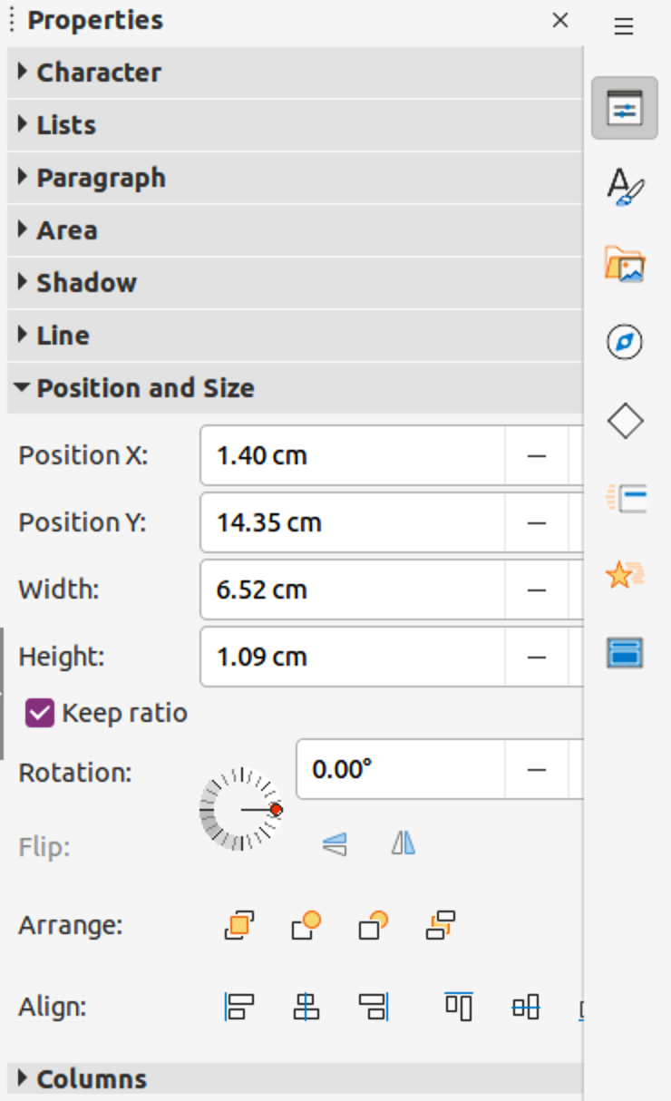
3) Specify measurement values in the Position X (horizontal) and Position Y (vertical) boxes to position of the text box on the slide. The position values of the text box represent the distance between the top left of text box to the top left corner of the slide.
4) Specify measurement values in the Width and Height boxes to adjust the size of the text box. To maintain the width/height ratio of the text box, select Keep ratio.
5) When satisfied with the changes, click outside the text box to save the changes and exit edit mode.
1) Click in the text box border to select it so that the selection handles are displayed indicating that the text box is in edit mode.
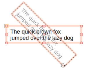
2) Click again on the text box border and the selection handles change shape and color, as shown by the example in Figure 13. A rotation center appears in the center of the text box.
3) Move the cursor over a corner selection handle and the cursor changes shape to indicate rotation.
4) Click and drag the text to rotate it. A ghosted image of the text box appears as the text box is being rotated.
5) Release the mouse button when the text box has reached the desired rotation angle.
6) If necessary, click and drag the rotation center to a different position to change the rotation angle. The rotation center can be positioned outside of the text box.
7) Click outside the text box to exit edit mode.
Figure 13: Text box in rotation mode
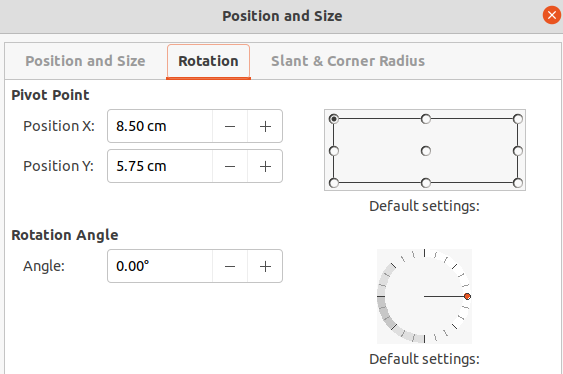
For more accurate control over the size and position of an AutoLayout text box or text box, it is recommended to use the options available on the Rotation page of the Position and Size dialog (Figure 14).
1) Click in the text box to select it so that the selection handles are displayed indicating that the text box is in edit mode.
Figure 14: Position and Size dialog - Rotation page
2) Open the Position and Size dialog using one of the following methods:
Go to Format > Object and Shape > Position and Size on the Menu bar.
Right-click on the text box border and select Position and Size from the context menu.
Use the keyboard shortcut F4.
3) Click on Rotation to open the Rotation page.
4) If necessary, in Pivot Point, enter a measurement for Position X and Position Y to move the position of the pivot point.
5) Alternatively, select a pivot point from one of the 9 positions in Default settings.
6) In Rotation Angle, enter the number of degrees for rotation in the Angle text box.
7) Alternatively, in Default settings, click on the rotation angle indicator and drag it to a new angle. The angle of rotation is displayed in the Angle text box
8) Click OK to save the changes and to close the Position and Size dialog.
9) Click outside the text box to exit edit mode.
1) Click in the text box to select it so that the selection handles are displayed indicating that the text box is in edit mode.
2) Click on Properties on the Sidebar to open the Properties deck, then click on Position and Size to open the Position and Size panel (Figure 12).
3) In Rotation, enter the number of degrees for rotation in the text box.
4) Alternatively, in Rotation, click on the rotation angle indicator and drag it to a new angle. The angle of rotation is displayed in the text box.
5) Click outside the text box to exit edit mode.
Figure 15: Position and Size dialog - Slant & Corner Radius page

The Corner Radius option in the Slant & Corner Radius page of the Position and Size dialog (Figure 15) is only available when a text box has a border. See “Text box borders” for more information on creating text box borders.
Note
The options Slant, Corner Point 1, and Corner Point 2 on the Slant & Corner Radius page of the Position and Size dialog are not available for text box borders.
1) Click in the text box to select it so that the selection handles are displayed indicating that the text box is in edit mode.
2) Make sure that the text box has a visible border.
3) Open the Position and Size dialog using one of the following methods:
Go to Format > Object and Shape > Position and Size on the Menu bar.
Right-click on the text box border and select Position and Size from the context menu.
Use the keyboard shortcut F4.
4) Click on Slant & Corner Radius to open the Slant & Corner Radius page.
5) In Corner Radius, enter a measurement in the Radius text box to change the radius of the corners on the text box.
6) Click OK to save the changes and to close the Position and Size dialog.
7) Click outside the text box to exit edit mode.
Text can be repositioned within an AutoLayout text box or a text box as follows:
1) Click in the text box to select it so that the selection handles are displayed indicating that the text box is in edit mode.
2) Right-click in the text box and select Text Attributes from the context menu to open the Text dialog (Figure 16).
3) Use the various options on the Text page to position the text within the text box.
4) Click OK to save the changes and close the dialog.
5) Click outside the text box to deselect it.
Figure 16: Text dialog - Text page
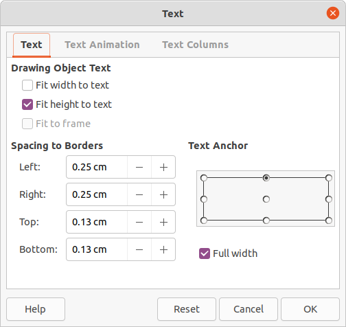
The options available in the Text dialog are as follows:
Drawing Object Text
Fit width to text – width of the text box is automatically adjusted to the width of the text.
Fit height to text – height of the text box is automatically adjusted to the height of the text.
Fit to frame – the text width and height is adjusted to the width and height of the text box.
Spacing to Borders – creates margins around the text within the text box.
Text Anchor – sets the anchor point for the text within the text box. When the Full width option is selected, the text is automatically positioned in the center of the text box.
Text within an AutoLayout text box or a text box can be animated using the options available in the Text Animation page in the Text dialog. For more information on the text animation effects, see Chapter 9, Slide Shows.
Figure 17: Text dialog - Text Columns page
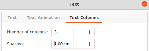
Figure 18: Columns panel in Properties deck on Sidebar
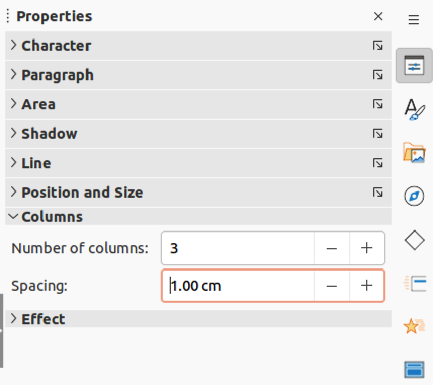
Text within an AutoLayout text box or a text box can be placed into columns using the options available in the Text Columns page in the Text dialog (Figure 17), or the Columns panel in Properties deck on the Sidebar (Figure 18).
1) Click in the text box to select it so that the selection handles are displayed indicating that the text box is in edit mode.
2) Right-click in the text box and select Text Attributes from the context menu to open the Text dialog.
3) Click on the Text Columns tab to open the Text Columns page in the Text dialog, or click on Columns in Properties on the Sidebar to open the Columns panel.
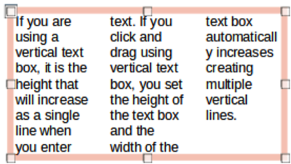
4) Set the number of columns required in the Number of columns box and the required spacing between the columns in the Spacing box. An example of columns in a text box is shown in Figure 19.
Figure 19: Example of columns in a text box
5) Save the changes and deselect the text box using one of the following methods:
On the Text dialog, click OK to save the changes and close the dialog, then click outside the text box to deselect it.
On the Columns panel in the Properties deck on the Sidebar, click outside the text box to deselect it and save the changes.
1) Click in the text box to select it so that the border and selection handles are displayed indicating that the text box is in edit mode.
2) Press the Delete or Backspace key to delete the text box.
Tip
If there is more than one text box to delete, it is quicker to drag a selection marquee around the text boxes and then press Delete or Backspace. Take care to avoid selecting and accidentally deleting any text boxes or shapes still required.
Text can be inserted into an AutoLayout or normal text box by copying from another document and pasting into Impress. However, the text will probably not match the formatting of the surrounding text or that of the other slides in the presentation. This may be what is required on some occasions. However, it is recommended, for a professional look, to make sure that the presentation style is consistent and does not become a patchwork of different styles, font types, bullet points, and so on.
It is good practice to paste text without formatting and apply the formatting later, reducing the risk of errors in a presentation.
1) Highlight and copy the text in another document or slide.
2) Create a text box on your slide and make sure the text cursor is flashing in the text box. See “Working with text boxes” on page 1 for more information.
3) Paste unformatted text at the cursor position in a text box using one of the following methods.
Go to Edit > Paste Special > Paste Unformatted Text on the Menu bar.
Click on the small triangle ▼to the right of Paste on the Standard toolbar and select Unformatted Text from the context menu.
Use the keyboard shortcut Ctrl+Shift+V and select Unformatted text from the Paste Special dialog that opens.
Use the keyboard shortcut Ctrl+Alt+Shift+V and unformatted text is pasted into a text box.
4) Format the text to the presentation requirements using the tools on the Text Formatting toolbar or the options in Format on the Menu bar. Alternatively, and for text boxes only, apply a Drawing Style to the text. See Chapter 2, Master Slides, Styles and Templates for more information.
Note
A Presentation Style used in AutoLayout text boxes cannot be changed by selecting another Presentation Style. Make sure the AutoLayout text box uses the Presentation Style required. See Chapter 2, Master Slides, Styles and Templates for more information. Outline levels and outline styles are changed using the Tab key or Shift+Tab key combination.
Pasting formatted text into a text box or AutoLayout text box will overwrite any formatting and replace the text box style.
1) Highlight and copy the text in another document or slide.
2) Create a text box on your slide and make sure the text cursor is flashing in the text box. See “Working with text boxes” for more information.
3) Paste formatted text into the text box. Text is pasted at the cursor position in the text box and the text formatting of the pasted text overwrites any style formatting of the text box.
Go to Edit > Paste on the Menu bar.
Click on Paste on the Standard toolbar.
Use the keyboard shortcut Ctrl+V.
4) If necessary, format the text to to the presentation requirements using the various tools on the Text Formatting toolbar or the options available in Format on the Menu bar.
5) To clear any formatting of the pasted text and use the text box style, go to Format > Clear Direct Formatting on the Menu bar. See Chapter 2, Master Slides, Styles and Templates for more information.
Note
Drawing Styles can be created in Impress. These Drawing Styles are only available for the Impress presentation which is being created and saved. Also, templates can be created to include any Drawing Styles created and the template then used to create more presentations.
Figure 20: Special Characters dialog
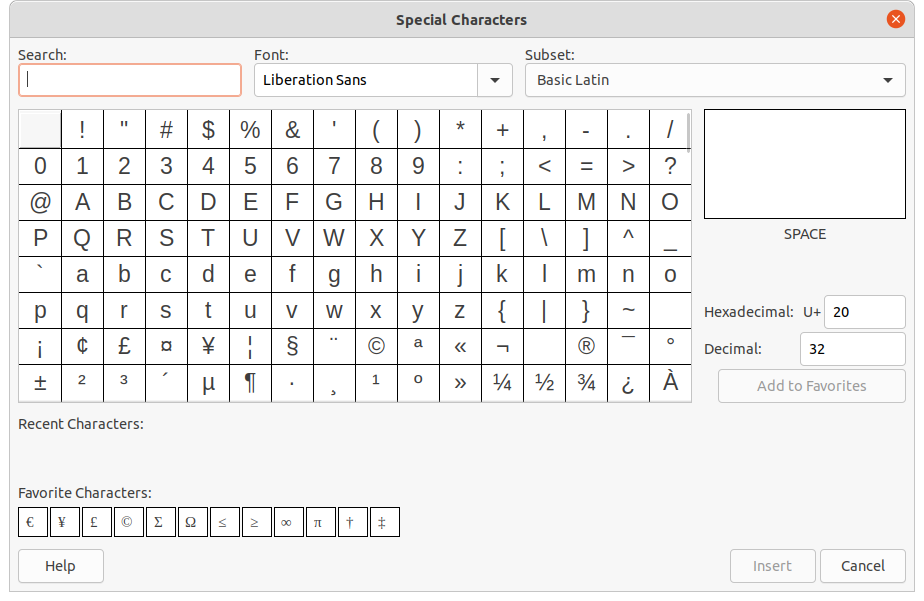
Special characters can be inserted into text, for example copyright, mathematical, geometric, or monetary symbols.
1) Click at the position in the text where the special character is to be inserted.
2) Go to Insert > Special Character on the Menu bar to open the Special Characters dialog (Figure 20).
3) Select the font and character subset from the Font and Subset drop-down lists.
4) Locate and select the special character from the special characters available. The selected special character appears in the preview box and its name is displayed below the preview box.
5) Alternatively, select the special character from the display of Recent Characters or Favorite Characters. The selected special character appears in the preview box and its name is displayed below the preview box.
6) Click on Insert to close the dialog and insert the special character at the cursor position in the text.
7) Alternatively, double-click on the selected special character to insert the special character at the cursor position in the text. This also closes the dialog.
8) If the special character is frequently used, click on Add to Favorites and the special character is added to the display of Favorite Characters.
Figure 21: Inserting formatting marks
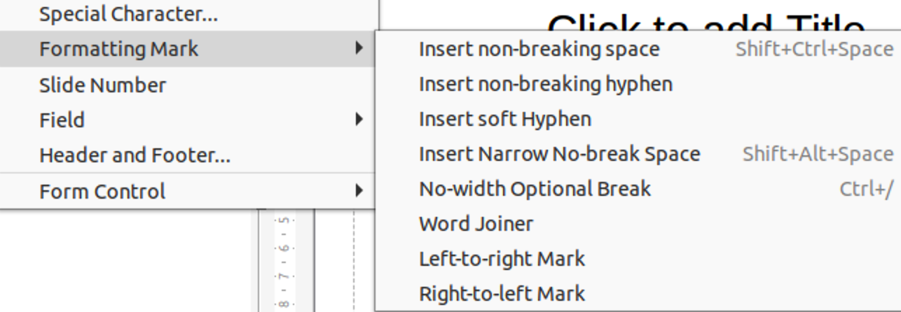
Formatting marks are special characters that can be inserted into text to correct the formatting. For example, it may not be desirable for words that are separated by a space or a hyphen to span over two lines. The solution is to insert a non-breaking space or non-breaking hyphen.
1) Click at the position where the formatting mark is to be inserted into the text.
2) Go to Insert > Formatting Mark on the Menu bar to open a submenu (Figure 21).
3) Select the formatting mark required and it is inserted into the text at the cursor position.
The formatting marks that are available in Impress are as follows:
Non-breaking space – inserts a space that keeps two adjacent words or characters together on line breaks (keyboard shortcut Ctrl+Shift+Space).
Non-breaking hyphen – inserts a hyphen that keeps two adjacent characters together on line breaks (keyboard shortcut Ctrl+Shift+Hyphen).
Soft hyphen – inserts an invisible hyphen within a word that will appear and create a line break once it becomes the last character in a line (keyboard shortcut Ctrl+Hyphen).
Narrow no break space – inserts a narrow space that keeps two adjacent words or characters together on line breaks. A narrow space has a width that is about 70% of a normal space. It is used to represent the narrow space occurring around punctuation characters and can also be used as a numeric group separator.
No-width optional break – inserts an invisible space within a word that will insert a line break once it becomes the last character in a line (keyboard shortcut Ctrl+Forward Slash).
Word Joiner – inserts a special character preventing hyphenation of a word keeping the word together at the end of a line.
Left-to-right mark – inserts a text direction mark that affects the text direction of any text following the mark. Only available when Complex text layout (CTL) is enabled.
Right-to-left mark – inserts a text direction mark that affects the text direction of any text following the mark. Only available when Complex text layout (CTL) is enabled.
Text formatting can give a presentation a consistent look and a dynamic feel. Understanding of an audience is enhanced by preventing any distracting elements in a presentation. Text formatting can be applied (for example color, alignment, bullet types) to characters, words, sentences, paragraphs, and lists.
To quickly increase or decrease font size of selected text use the tools Increase Font Size (Ctrl+]) and Decrease Font Size (Ctrl+[) on the Text Formatting toolbar. The amount by which the font size changes depends on the standard sizes available for the font in use.
Note
AutoLayout text boxes automatically adjust font size of any text inserted into the AutoLayout text box. For example, when a long piece of text is inserted into an AutoLayout text box, the font size may decrease in size to fit into the box.
Text must be selected before it can be formatted using one of the following methods. Any formatting changes applies only to the selected text.
To format all the text in a text box, click once on the border of the text box to display the selection handles. Any formatting changes applies to all text in the text box.
To format only part of the text, select text using one of the following methods:
Click in the text and drag the cursor over the text to highlight the text.
Double-click on text to select a complete word or triple click to select a whole paragraph.
Click in the text, then press and hold the Shift key and use the keyboard arrow keys to select text.
When text is entered, either in an AutoLayout text box or in a text box, it is formatted with a set of predefined attributes known as a style. The style used depends on the type of text box being used. For more information on using, modifying and updating styles, see Chapter 2, Master Slides, Styles and Templates.
Sometimes it is quicker and more efficient to apply manual or direct formatting. However, in situations where the same formatting is required in many different parts of a presentation, the use of styles is recommended. This creates a consistent look to a presentation and reduces the possibility of any errors. Impress has two categories of styles – Presentation Styles and Drawing Styles.
Presentation styles are used in AutoLayout text boxes, master slide backgrounds, and master slide background objects.
The style applied to the text depends on the type of AutoLayout text box. These styles cannot be deleted, renamed or changed for another presentation style to change the formatting of the text. For example, to change an outline style for another outline style, the outline level has to be changed using the keyboard shortcuts Tab or Shift+Tab.
Presentation styles can be modified to change the text formatting or updated to change the style after formatting the text.
Note
Unlike LibreOffice Writer, where it is recommended to use styles whenever possible, manual or direct formatting has to be used more often in LibreOffice Impress. The reason is that Presentation Styles in Impress are restricted. For example, it is not possible to have two different Outline 1 levels using different types of bullet points for the same outline level. Also, the lack of support for character styles forces the use of manual or direct formatting to format sections of text when necessary.
Drawing styles are used for text in text boxes and any graphic object placed on a slide. For information on formatting graphic objects, see Chapter 6, Formatting Graphic Objects.
When text is entered into a text box, the Default Drawing Style is applied to the text. This style can be changed by selecting another style from the text group of Drawing Styles.
These styles cannot be deleted or renamed, but can be modified to change the text formatting or updated to change the style after formatting the text.. Also, custom drawing styles can be created, but are only available for the presentation being created.
Direct or manual text formatting can be applied directly to characters, words, sentences, and paragraphs. Direct formatting overrides any formatting that has been applied to text when using styles.
1) Select the text for formatting. See “Selecting text” for more information.
2) Format text using one of the following methods. Any formatting applied to text is immediate.
Use the formatting tools on the Text Formatting toolbar.
Go to Format on the Menu bar. Selecting a formatting option opens a submenu or dialog where further formatting options can be selected to apply to text.
Use the options available in the Paragraph and Character dialogs.
Use the options available in the Paragraph and Character panels in the Properties deck on the Sidebar.
3) Click outside the text box to deselect the text.
1) Select text in a paragraph or the whole paragraph. See “Selecting text” for more information
Figure 22: Paragraph dialog - Indents & Spacing page
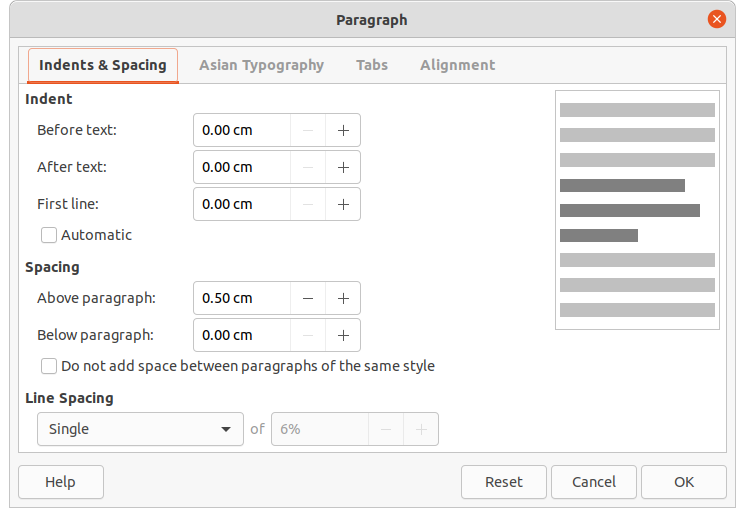
2) Use one of the following methods and open the Paragraph dialog (Figure Figure 22). Any formatting applied to a paragraph is immediate.
Right click on the selected text and select Paragraph from the context menu.
Go to Format > Paragraph on the Menu bar.
3) Use the various options available on the tabbed pages of the Paragraph dialog to format the text.
4) Click OK to save the changes and close the dialog.
5) Click outside the text box to deselect the text.
The Indents & Spacing page in the Paragraph dialog has three main sections as follows:
Indent – specifies the amount of space to leave between the left and the right page margins and the paragraph.
Before text – enter the amount of space to indent the paragraph from the page margin. If the paragraph is to extend into the page margin, enter a negative number.
After text – enter the amount of space to indent the paragraph from the page margin. If the paragraph is to extend into the page margin, enter a negative number.
First line – indents the first line of a paragraph by the amount entered. To create a negative hanging indent, enter a positive value for Before text and a negative value for First line. To create a positive hanging indent enter a positive value for Before text and a larger positive value for First line.
Automatic – when selected, automatically indents a paragraph according to the font size and the line spacing. The setting value for First line is ignored.
Spacing – specifies the amount of space to leave between paragraphs.
Above paragraph – enter the amount of space to leave above a paragraph.
Below paragraph – enter the amount of space to leave below a paragraph.
Do not add space between paragraphs of the same style – when selected, only the spacing below a paragraph is applied when the preceding and following paragraphs are of the same paragraph style.
Line spacing – specifies the amount of space to leave between lines of text in a paragraph. The options available from the drop-down list are as follows:
Single – applies single line spacing to a paragraph. This is the default setting.
1.15 Lines – sets the line spacing to 1.15 lines.
1.5 Lines – sets the line spacing to 1.5 lines.
Double – sets the line spacing to two lines.
Proportional – select this option and then enter a percentage value in the box, where 100% corresponds to single line spacing.
At Least – sets the minimum line spacing to the value entered in the box. If different font sizes are used within a paragraph, the line spacing is automatically adjusted to the largest font size. To have identical spacing for all lines, specify a value that corresponds to the largest font size.
Leading – sets the vertical space height that is inserted between two lines.
Fixed – enter a fixed value to be used for line spacing.
Tip
Setting the line spacing to less than 100% is a good method to place a lot of text into a text box when space is limited. However, care must be taken as too small a value makes the text hard to read.
Tip
To change the default unit of measurement go to Tools > Options > LibreOffice Impress > General on the Menu bar.
The Asian Typography page (Figure Figure 23) is only available when Asian and Complex Text Layout (CTL) options are enabled in Tools > Options > Language Settings > Languages on the Menu bar. The Line Change options are as follows:
Apply list of forbidden characters to the beginning and end of lines – prevents the characters in the list from starting or ending a line. The characters are relocated to either the previous line or the next line. To edit the list of restricted characters that start or end a line, go to Tools > Options > LibreOffice > Language Settings > Asian Layout on the Menu bar.
Allow hanging punctuation – prevents commas and periods from breaking the line. Instead, these characters are added to the end of the line, even in the page margin.
Apply spacing between Asian and non-Asian text – inserts a space between Asian and non-Asian characters.
Figure 23: Paragraph dialog - Asian Typography page

Figure 24: Paragraph dialog - Tabs page
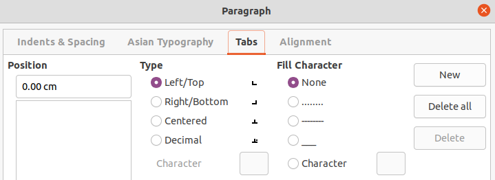
Use the Tabs page (Figure Figure 24) to determine the tab stops in an AutoLayout text box or text box:
Position – enter a measurement in the text box to set the position of a tab in a text box. Any tabs already created are listed in the preview box below the measurement setting.
Type – determines the type of tab used.
Left – aligns the left edge of the text to the tab stop and extends the text to the right. If Asian language support is enabled in LibreOffice Preferences, this tab stop is called Left/Top.
Right – aligns the right edge of the text to the tab stop and extends the text to the left of the tab stop. If Asian language support is enabled in LibreOffice Preferences, this tab stop is called Right/Bottom.
Center – aligns the center of the text to the tab stop.
Decimal – aligns the decimal point of a number to the center of the tab stop. The numbers to the left of the decimal point are aligned to the left of the tab. The numbers to the right of the decimal point are aligned to the right of the tab.
Character – enter a character to use as a decimal separator when using decimal tabs.
Fill character – specifies the type of character inserted between the tab insertion point and the tab stop.
None – no fill characters are inserted between the tab insertion point and the tab stop. It also removes any existing fill characters between the tab insertion point and the tab stop.
Dots...... – inserts dots between the tab insertion point and the tab stop.
Dashes----- – inserts dashes between the tab insertion point and the tab stop.
Line______ – draws a line between the tab insertion point and the tab stop.
Character – specify a character for insertion between the tab insertion point and the tab stop.
Note
To create tabs and use the same settings for tabs in more than one text box, it is recommended to modify, update or create a custom drawing style and apply the style to the text. See Chapter 2, Master Slides, Styles and Templates for more information.
1) Select the text box so that the selection handles and border are displayed.
2) Right click on the selected text box and select Paragraph from the context menu or go to Format > Paragraph on the Menu bar to open the Paragraph dialog.
3) Click on Tabs to open the Tabs page in the Paragraph dialog.
4) Enter the position measurement for the tab stop in the Position text box.
5) Select the type of tab from the options in Type.
Note
If Decimal is set as the tab type, the default character used is the character used for decimal points in the computer setup. If required, specify the character to be used as the decimal point in the Character box.
6) Select the type of Fill Character. The fill character is inserted between the tab insertion point and the tab stop.
7) Click on New to create the new tab stop in the text box. The new tab stop appears in the Position preview box.
8) Click OK to save the changes and close the dialog.
9) To use the new tab stop in more than one text paragraph in a text box or in another text box:
Modify or update the presentation or drawing style used for the text.
Create a custom drawing style and apply it to the text.
1) Select the text box so that the selection handles and border are displayed.
2) Right-click on the selected text box and select Paragraph from the context menu or go to Format > Paragraph on the Menu bar to open the Paragraph dialog.
3) Click on Tabs to open the Tabs page in the Paragraph dialog.
4) Select a tab for editing in the Position preview box.
5) Select the Type and/or Fill Character for the selected tab stop.
6) Click OK to save the changes and close the dialog.
7) If necessary, update the style used for the text.
Note
To change the tab position, delete the selected tab first, then create a new tab with the necessary changes.
1) Select the text box so that the selection handles and border are displayed.
2) Right-click on the selected text box and select Paragraph from the context menu or go to Format > Paragraph on the Menu bar to open the Paragraph dialog.
3) Click on Tabs to open the Tabs page in the Paragraph dialog.
4) Select the tab for deletion in the Position preview box.
5) Click on Delete to delete the selected tab, or click Delete All to delete all the tab stops that are set for the selected text box.
6) Click OK to save the changes and close the dialog.
Use the Alignment page (Figure Figure 25) to determine the text alignment in text boxes as follows.
Options
Left – aligns text to the left margin of the text box. If Asian language support is enabled, this option is named Left/Top.
Figure 25: Paragraph dialog - Alignment page
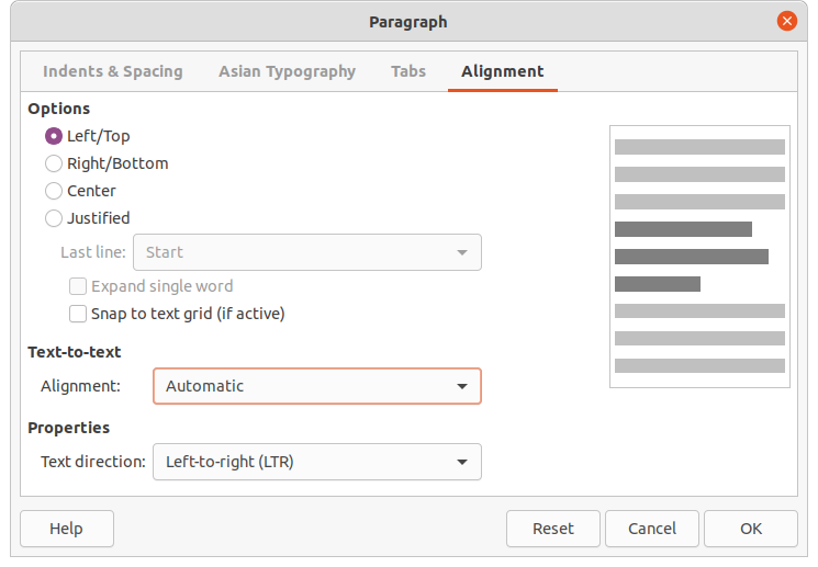
Right – aligns text to the right margin of the text box. If Asian language support is enabled, this option is named Right/Bottom.
Center – aligns the text to the center of in the text box.
Justified – aligns the text to the left and to the right margins of the text box.
Text-to-text
Alignment – provides alignment options for oversized or undersized characters in the text relative to the rest of the text.
Properties
Text direction – specifies the text direction for text that uses Complex Text Layout (CTL) and is only available if complex text layout support is enabled.
Preview field – displays a preview of how the text appears in the text box.
An alternative method of formatting paragraphs is to use the Paragraph panel (Figure Figure 26) in the Properties deck on the Sidebar. The formatting options available are limited, but are similar in use to the formatting options available in the various pages of the Paragraph dialog.
1) Select the text box so that the selection handles and border are displayed.
2) On the Sidebar, click on Properties to open the Properties deck.
3) Click on Paragraph to open the Paragraph panel.
Figure 26: Paragraph panel in Properties deck on Sidebar
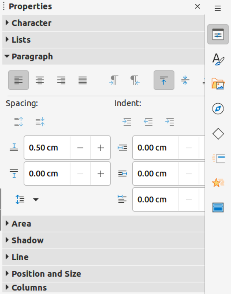
4) Format the text using the various tools available in the Paragraph panel. See “Paragraph dialog” for more information on formatting options.
5) If necessary, click on More Options on the right of the title bar to open the Paragraph dialog to format text.
The text formatting options available in the Paragraph panel are as follows:
Align Left, Align Center, Alight Right, Align Justified – determines how text is aligned to the text box margins. These tools are also available on the Text Formatting toolbar.
Left-To-Right, Right-To-Left – only available when Asian and Complex Text Layout (CTL) options have been selected in Tools > Options > Language Settings > Languages. These tools are also available on the Text Formatting toolbar.
Align Top, Center Vertically, Align Bottom – aligns text to the top, center or bottom of a text box. This is similar to vertical alignment of data within a table cell. These tools are also available on the Text Formatting toolbar.
Increase Paragraph Spacing, Decrease Paragraph Spacing – increases or decreases the spacing above and below the selected text. These tools are also available on the Text Formatting toolbar.
Above Paragraph Spacing, Below Paragraph Spacing – increases or decreases the spacing either above or below selected text. Enter the amount of spacing required in the text box.
Set Line Spacing – adjusts the spacing between the lines of selected text. Click on the small triangle ▼ to the right of the icon and select the type of line spacing required from the drop-down list. This tool is also available on the Text Formatting toolbar.
Increase Indent, Decrease Indent – each click increases or decreases the indent level of selected text by the default value for Impress. To specify an indent measurement, enter a value in the Before text, After text or First line boxes.
Hanging Indent – sets a different indent for the first line of text to the indent set for a whole paragraph of text as follows:
Enter a negative value in the First line box to reduce the indent of the first line of text.
Enter a positive value in the First line box to increase the indent of the first line of text.
First click sets a negative hanging indent and a second click sets a positive hanging indent.
Only active when a Before text indent has been set for the paragraph of text.
To remove a hanging indent, set the value in the First line box to zero.
Direct or manual character formatting can be applied directly to individual characters and words. Direct character formatting overrides any formatting that has been applied using direct text formatting and presentation or drawing styles.
1) Select the characters for formatting. See “Selecting text” for more information.
2) Format characters using one of the following methods. Formatting applied to character(s) is immediate.
Use various formatting tools on the Text Formatting toolbar.
Go to Format on the Menu bar. Selecting an option either opens a context menu or a dialog where formatting options can be selected to apply to the selected text.
Use the options available in the Character dialog.
Use the options available in the Character panel on the Sidebar.
3) Click outside the text box to deselect the text.
1) Open the Character dialog (Figure 27) using one of the following methods:
Right-click on the selected text box and select Character from the context menu.
Go to Format > Character on the Menu bar.
2) Select the characters or words in the text box for formatting.
3) Use the various options available on the tabbed pages of the Character dialog to format the selected characters.
4) Click OK to save the changes and close the dialog.
5) Click outside the text box to deselect it.
Figure 27: Character dialog - Fonts page
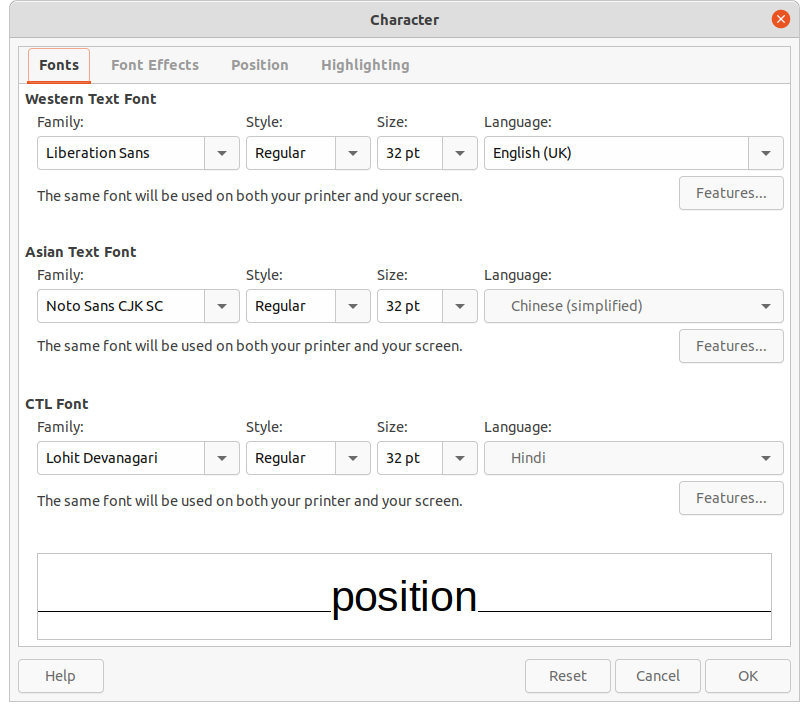
Use the Font page in the Character dialog (Figure 27) to select the font family, typeface or style (Italic, Bold, and so on), size, and language. A sample of the font is displayed in the preview box in the lower part of the dialog.
If support for Asian language and Complex Text Layout (CTL) has been enabled in Tools > Options > Language Settings > Languages, then formatting options are also available for Asian and CTL fonts in the Character dialog.
Note
The number of typefaces available changes depending on the font family that is selected.
Tip
When creating a presentation in multiple languages, use the language setting to create styles that only differ in the language in formatting attributes. This allows spelling checking of all of the presentation contents without affecting appearance.
The options on the Font Effects page (Figure 28) in the Character dialog applies font color, text decoration and effects to the selected text or characters. A sample of the font effect is displayed in the preview box in the lower part of the dialog.
Font Color
Font color – sets the color for the selected text. Select a color from one of the available palettes. If Automatic is selected, the text color is set to black for light backgrounds and to white for dark backgrounds.
Transparency – sets the transparency of the selected text. Enter a value in the text box. 100% entirely transparent, 0% no transparency.
Text Decoration
Overlining – select the overlining style from the drop-down list and the overlining color from one of the available palettes. If Automatic is selected, the text color is set to black for light backgrounds and to white for dark backgrounds.
Strikethrough – select a strikethrough style for the selected text.
Underlining – select the underlining style from the drop-down list and the underlining color from one of the available palettes. If Automatic is selected, the text color is set to black for light backgrounds and to white for dark backgrounds.
Individual words – when selected, any over lining or underlining is applied to words only and spaces are ignored.
Effects
Case – select a capitalization effect from the drop-down list.
Relief – select a relief effect for the selected text. Embossed relief makes the characters appear as if they are raised above the page. Engraved relief makes the characters appear as if they are pressed into the page.
Figure 28: Character dialog - Font Effects page
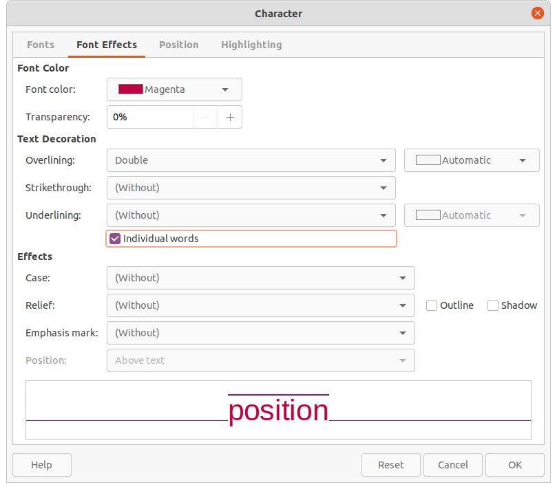
Emphasis mark – select a character to display over or below the entire length of the selected text.
Position – specifies where to display the emphasis marks, either above or below the text.
The options on the Position page (Figure 29) allows positioning, scaling and spacing of selected text to be set.
Position – sets the subscript or superscript options for a character.
Normal – removes superscript or subscript formatting.
Superscript – reduces the font size of the selected text and raises the text above the baseline.
Subscript – reduces the font size of the selected text and lowers the text below the baseline.
Raise/lower by – enter the amount to raise or to lower the selected text in relation to the baseline. 100% is equal to the height of the font.
Relative font size – enter the amount to reduce the font size of the selected text.
Automatic – sets the amount by which the selected text is automatically raised or lowered in relation to the baseline.
Scaling
Scale width – enter a percentage of the font width to horizontally stretch or compress the selected text.
Spacing – specifies the spacing between individual characters.
Character spacing – specifies the spacing between the characters of the selected text. Enter the amount to expand or condense the text in the text box. To increase spacing, set a positive value; to reduce spacing, set a negative value.
Pair kerning – automatically adjusts the character spacing for specific letter combinations. Kerning is only available for certain font types and requires printer support for this option. Spacing between characters is also known as kerning.
Figure 29: Character dialog - Position page
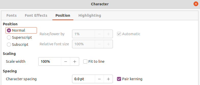
Figure 30: Character dialog - Highlighting page
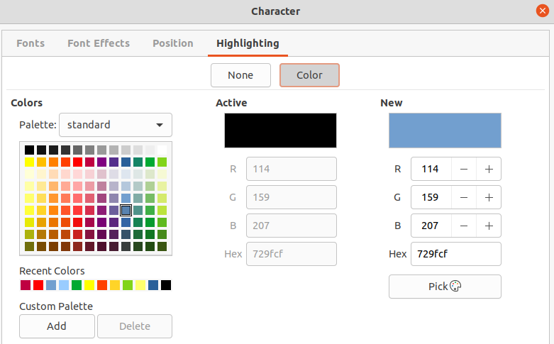
The Highlighting page (Figure 30) provides options to highlight text so that the characters are a different color to the rest of the text in the text box.
Colors – select a highlight color from one of the available palettes.
Active – shows the present color of the text and the Red, Green and Blue (RGB) settings for the present color.
New – shows the highlight color of the text that has been selected in Colors and the Red, Green and Blue (RGB) settings for the new color. The color can also be selected by changing the values in the RGB boxes or using the Pick a Color dialog after clicking on Pick.
An alternative method of formatting text is to use the Character panel (Figure 31) in the Properties deck on the Sidebar. The formatting options available in the Character panel are limited, but are similar in use to the formatting options available in the various pages of the Character dialog.
1) Select a text box so that the selection handles and border are displayed.
2) On the Sidebar, click on Properties to open the Properties deck.
3) Click on Character to open the Character panel.
4) Format the text using the various tools available in the Character panel. See “Character dialog” for more information on formatting options.
5) If necessary, click on More Options on the right of the title bar to open the Character dialog to format text.
Figure 31: Character panel in Properties deck on Sidebar
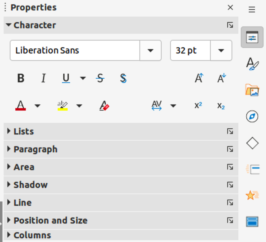
The text formatting options available in the Character panel in the Properties deck on the Sidebar are as follows:
Font Name and Font Size – select the font family and size that from the drop-down lists. These tools are also available on the Text Formatting toolbar.
Bold and Italic – applies a bold or italic typeface to the selected text. These tools are also available on the Text Formatting toolbar.
Underline – underlines the selected text. Click on the small triangle ▼ to the right and select the type of underlining from the drop-down list. Click More Options at the bottom of this drop-down list to open the Character dialog.
Strikethrough – draws a line through the selected text. This tool is also available on the Text Formatting toolbar.
Shadow – adds a shadow to the selected text. This tool is also available on the Text Formatting toolbar.
Increase Font Size and Decrease Font Size – each click increases or reduces the size of the selected characters by the same amount. Actual size depends on the computer setup. These tools are also available on the Text Formatting toolbar.
Font Color and Highlight Color – click on the small triangle ▼ to the right of these icons and select a color from the available palettes. These tools are also available on the Text Formatting toolbar.
Clear Direct Formatting – removes any direct formatting and formatting by character styles from the selected text. Direct formatting is formatting that applied without using styles, for example, setting bold typeface by clicking on Bold. This tool is also available on the Text Formatting toolbar.
Set Character Spacing – click on the small triangle ▼ to the right of this tool and select the type of spacing between characters. Spacing between characters is also known as kerning. A custom value for character spacing can also be set.
Superscript – reduces the font size of the selected text and raises the text above the baseline. This tool is also available on the Text Formatting toolbar.
Subscript – reduces the font size of the selected text and lowers the text below the baseline. This tool is also available on the Text Formatting toolbar.
The procedure to create an unordered (bulleted) or ordered (numbered) list varies depending on the type of text box used. The tools to manage and format a list are the same.
In AutoLayout text boxes and by default, the outline styles available are unordered lists. An example of these outline styles is shown in Figure 32. These outline styles are presentation styles and cannot be deleted, but can be modified or updated to the presentation requirements. See Chapter 2, Master Slides, Styles and Templates for more information on styles.
By default, the list created in an AutoLayout text box is an unordered list. To customize the list appearance or to change from unordered to ordered or ordered to unordered, see “Formatting lists” for more information.
1) Create a new presentation and go to View > Normal on the Menu bar.
Figure 32: Example of outline unordered list
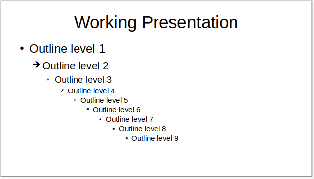
Figure 33: Outline toolbar

2) Select a layout for the slide using one of the following methods:
Right-click in a blank area on the slide and select a layout type from the context menu that opens.
Go to Slide > Layout on the Menu bar and select a layout from the drop-down list.
Select a layout from the layouts displayed in the Layouts panel in the Properties deck on the Sidebar.
3) Click on the text Click to add Text and start typing the first list item.
4) When the first list point is finished, click on Enter to create a new list point.
5) Use the keyboard combination Shift+Enter to start a new line without creating a new list point. This new line has the same indentation as the text in the list point.
6) To demote the outline level of a list point, use one of the following methods:
Click on the Tab key.
Use the keyboard shortcut Shift+Alt+Right Arrow.
Click on Demote on the Outline toolbar (Figure 33).
Click on Demote on the Lists panel in the Properties deck on the Sidebar.
Go to Format > Lists on the Menu bar and select Demote from the submenu.
7) To promote the outline level of a list point, use one of the following methods:
Use the keyboard shortcut Shift+Tab.
Use the keyboard shortcut Shift+Alt+Left Arrow.
Click on Promote on the Outline toolbar.
Click on Promote on the Lists panel in the Properties deck on the Sidebar.
Go to Format > Lists on the Menu bar and select Promote from the submenu.
8) To move a list point lower in the list order without changing the outline level, use one of the following methods:
Click on Move Down on the Outline toolbar.
Click on Move Down on the Lists panel in the Properties deck on the Sidebar.
Go to Format > Lists on the Menu bar and select Move Down from the submenu.
Use the keyboard shortcut Shift+Alt+Down Arrow.
9) To move a list point higher in the list order without changing the outline level, use one of the following methods:
Click on Move Up on the Outline toolbar.
Click on Move Up on the Lists panel in the Properties deck on the Sidebar.
Go to Format > Lists on the Menu bar and select Move Up from the submenu.
Use the keyboard shortcut Shift+Alt+Up Arrow.
10) To change the type and appearance of a list, see “Formatting lists” for more information.
Note
Do not try to change the outline style of a list point by selecting the list point and then selecting another outline style. In Impress it is not possible to change presentation styles used for outline levels in this way.
Note
In AutoLayout text boxes, promoting or demoting an item in a list changes the presentation style to match the outline level. For example, second outline level corresponds to Outline 2 style, third outline level to Outline 3 style, and so on. This change of outline level may change the formatting of the list point (for example font size, bullet type, and so on).
1) Create a text box on a slide and make sure the cursor is flashing in the text box. See “Working with text boxes” on how to create a text box.
2) Create a list using one of the following methods:
Click on Toggle Unordered List or Toggle Ordered List in the Text Formatting toolbar.
Click on Toggle Unordered List or Toggle Ordered List in the Lists panel in the Properties deck on the Sidebar.
Go to Format > Lists on the Menu bar and select Unordered List or Ordered List from the submenu.
3) When the first list point is finished, click on Enter to create a new list point.
4) Use the keyboard combination Shift+Enter to start a new line without creating a new list point. This new line has the same indentation as the text in the list point.
5) To increase the indent level of a list point, use one of the following methods:
Click on the Tab key.
Use the keyboard shortcut Shift+Alt+Right Arrow.
Click on Demote on the Outline toolbar.
Click on Demote on the Lists panel in the Properties deck on the Sidebar.
Go to Format > Lists on the Menu bar and select Demote from the submenu.
6) To decrease the indent level of a list point, use one of the following methods:
Use the keyboard shortcut Shift+Tab.
Use the keyboard shortcut Shift+Alt+Left Arrow.
Click on Promote on the Outline toolbar.
Click on Promote on the Lists panel in the Properties deck on the Sidebar.
Go to Format > Lists on the Menu bar and select Promote from the submenu.
7) To move a list point lower in the list order without changing the indent level, use one of the following methods:
Click on Move Down on the Outline toolbar.
Click on Move Down on the Lists panel in the Properties deck on the Sidebar.
Go to Format > Lists on the Menu bar and select Move Down from the submenu.
Use the keyboard shortcut Shift+Alt+Down Arrow.
8) To move a list point higher in the list order without changing the indent level, use one of the following methods:
Click on Move Up on the Outline toolbar.
Click on Move Up on the Lists panel in the Properties deck on the Sidebar.
Go to Format > Lists on the Menu bar and select Move Up from the submenu.
Use the keyboard shortcut Shift+Alt+Up Arrow.
9) To change the type and appearance of a list, see “Formatting lists” below for more information.
Format the appearance of a list using the following methods:
Change the list type, properties, size, position, and scope for the entire list or for a single list point using the Bullets and Numbering dialog (Figure 34).
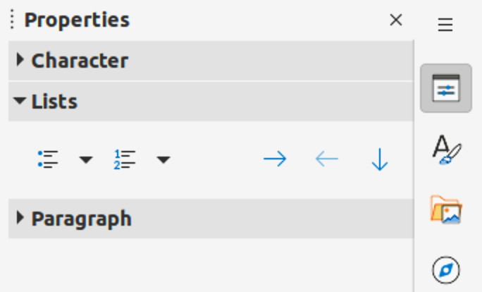
Change the list type, promote or demote a list point, or move a list point up or down in the list order using the Lists panel in the Properties deck on the Sidebar (Figure 35).
Promote or demote a list point, or move a list point up or down in the list order using the Outline toolbar.
Change the list type using the tools on the Text Formatting toolbar.
Format the text used in the list. See “Formatting text” for more information.
The Bullets and Numbering dialog provides better control of how a list will look on a slide.
Level – select the level(s) to define the formatting. The selected level(s) is highlighted in the preview.
Properties
Type – select the numbering style for the list indicator from the options in the drop‑down list. When Graphics is selected as Type, select an image from a file or the Gallery.
Color – select a color for the list indicator from the available color palettes.
Start at – enter a starting number for the selected level. Default is 1.
Figure 34: Bullets and Numbering dialog
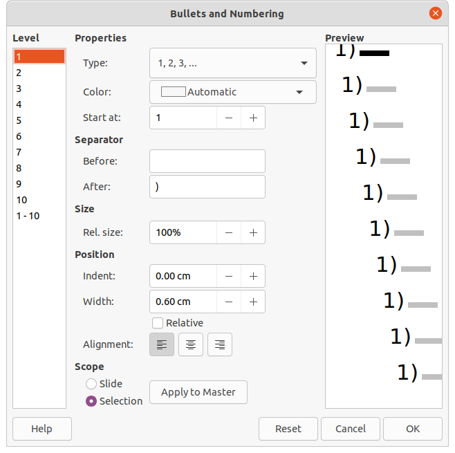
Figure 35: Lists panel in Properties deck on Sidebar
Separator
Before – enter a character or text to display in front of the number in the list. For example, to create a list that uses the style "[a", enter "[" in this box.
After – enter a character or text to display behind the number in the list. For example, to create a list that uses the style "1.)", enter ".)" in this box.
Size
Rel. Size – enter a percentage amount to resize the list indicator in relation to the font height of the current list.
Width – only available when Graphics is selected as Type. Enter a width for the graphic.
Height – only available when Graphics is selected as Type. Enter a height for the graphic.
Keep ratio – only available when Graphics is selected as Type. Maintains the size proportions of the graphic.
Position
Indent – set the indent measurement for the list point(s).
Width – set the indent measurement of the text from the list indicator. For example, this makes sure there is enough room for the list indicator when large numbers used.
Relative – select this option to measure the indent value relative to the previous level and not from the margin.
Alignment – sets the paragraph alignment for the list indicator.
Scope
Slide – applies the changes to the slide.
Selection – applies the changes only to the selected text.
Apply to Master – applies the changes to the master slide being used.
The Bullets and Numbering dialog can be opened using one of the following methods after selecting text or a text box:
Go to Format > Bullets and Numbering on the Menu bar.
Right-click on the selected text and select Bullets and Numbering from the context menu.
Click on More Options on the right side of Lists panel in the Properties deck on the Sidebar.
Click on More Bullets or More Numbering after clicking on the small triangle ▼ on the right of Toggle Unordered List or Toggle Ordered List on the Lists panel in the Properties deck on the Sidebar.
Click on More Bullets or More Numbering after clicking on the small triangle ▼ on the right of Toggle Unordered List or Toggle Ordered List on the Text Formatting toolbar.
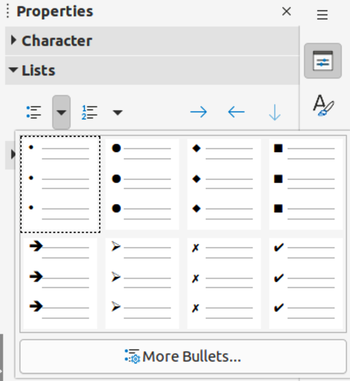
Figure 36: More bullet types
Text or a text box must be selected for the options in the Lists panel in the Properties deck on the Sidebar to become available.
Toggle Unordered List – this tool is also available on the Text Formatting toolbar and is accessed using one of the following methods:
After selecting text, click on Toggle Unordered List to create a bulleted list. Click again to revert back to normal text.
Click on the small triangle ▼ on the right to open a selection of bulleted list types (Figure 36).
Click on More Bullets to open the Bullets and Numbering dialog.
Toggle Ordered List – this tool is also available on the Text Formatting toolbar and is accessed using one of the following methods:
After selecting text, click on Toggle Ordered List create a numbered list. Click again to revert back to normal text.
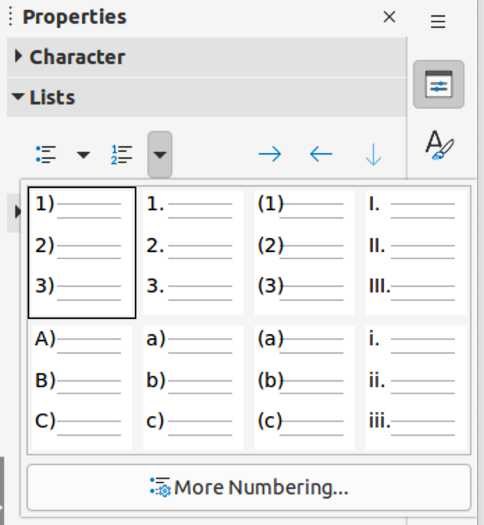
Click on the small triangle ▼ on the right to open a selection of numbered list types (Figure 37).
Click on More Numbering to open the Bullets and Numbering dialog.
Demote – this tool is also available on the Outline toolbar. Click on this tool to increase the indent level of a list point.
Promote – this tool is also available on the Outline toolbar. Click on this tool to decrease the indent level of a list point.
Move Down – this tool is also available on the Outline toolbar. Click on this tool move a list point lower in the list order without changing the indent level.
Figure 37: More numbering types
Move Up – this tool is also available on the Outline toolbar. Click on this tool move a list point higher in the list order without changing the indent level.
More Options – click on this icon in the Lists panel title bar to open the Bullets and Numbering dialog for access to a more detailed selection of options for formatting lists.
Tables are a powerful mechanism to convey structured information quickly when used in a presentation. Tables can be created directly in a presentation, eliminating the need to embed a Calc spreadsheet or a Writer text table. However, in some circumstances, it makes sense to embed a table into a presentation, especially when greater functionality is required in the table. The tables provided by Impress do have limited functionality.
Several predefined table designs are available in the Table Design panel in the Properties deck on the Sidebar (Figure 38). The Table Design panel is only available when a table is selected in a slide.
When working with tables in Impress, the Table toolbar (Figure 39) automatically opens, providing tools for creating and formatting a table.
When inserting a table into a slide, it is useful to know the number of rows and columns required as well as an approximate idea of how the table will look. The table can then be formatted after creation should it be necessary.
Figure 38: Table Design panel in Properties deck on Sidebar
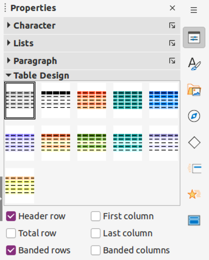
Figure 39: Table toolbar

Note
When a table is inserted into a slide, the table is created inside a text box at the center of the slide with the default style and settings already applied. The text box is the same size as the rows and columns of the table. Currently the default settings are hard coded into LibreOffice. A table can be formatted to the presentation requirements using the tools and options available.
Figure 40: Insert Table dialog
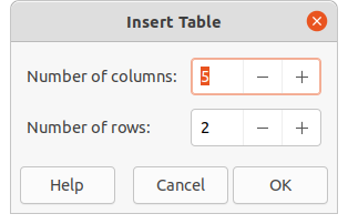
Figure 41: Table graphic
1) Select the slide which will contain the table and, if necessary, modify the slide layout to create space for the table.
2) Go to Insert > Table on the Menu bar to open the Insert Table dialog (Figure 40).
3) Specify the Number of columns and Number of rows in the text boxes.
4) Click OK to insert the table in the slide and close the dialog.
1) Select the slide which will contain the table and, if necessary, modify the slide layout to create space for the table.
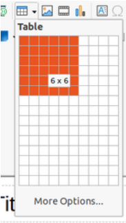
2) Click on Table on the Standard toolbar or the Table toolbar to open the Table graphic (Figure 41).
3) Drag the cursor across and down in the table graphic to create the required number of rows and columns.
4) Release the mouse button to insert the table in the slide and close the Table graphic.
5) Alternatively, click on More Options in the Table graphic to open the Insert Table dialog and create the rows and columns required.
1) Insert a table into a slide or select a table in a slide.
2) Click on Table Design in the Properties deck on the Sidebar to open the Table Design panel and display the available designs.
3) Select a design for the table and the types of rows and columns from the available options.
The following options for rows and columns are available in the Table Design panel:
Header row – selected by default. In a table, the first row is normally a header row and is displayed with a different background from the rest of the table.
Total row – if selected, it changes the background of the last row to make it stand out from the other rows.
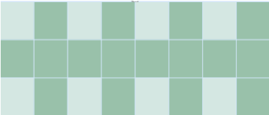
Banded rows – selected by default. Alternate rows have different backgrounds making it easier to read data entered into the rows. An example of banded rows is shown in Figure 42.
First column – when selected, highlights the first column of the table using a darker background.
Last column – when selected, highlights the last column of the table using a darker background.
Banded columns – when selected, alternate columns are highlighted with dark and light colors. An example of banded columns is shown in Figure 42.
Figure 42: Example table with banded rows and columns
When a table is selected, the Table toolbar is displayed. If the Table toolbar is not displayed when a table is selected, go to View > Toolbars > Table on the Menu bar. The Table toolbar contains the majority of the tools required to format a table.
Table – inserts a new table in the selected slide.
Border Style – opens a drop-down selection of available border styles. Select cells in a table, then apply a border style. If the required border style is not available, use the Borders page in the Table Properties dialog.
Border Color – select a color from the available color palettes for the borders that are used for selected cells. If the required border color is not available, use the Borders page in the Table Properties dialog.
Borders – opens a drop-down menu where a predefined border configuration can be selected for cells. If the required border pattern is not available, use the Borders page in the Table Properties dialog.
Area Style/Filling – opens a drop-down menu to apply an area style fill to selected cells: None, Color, Gradient, Hatching, Bitmap or Pattern. Depending on area style selected, the second drop-down list shows the available fillings for the each area style selected. Refer to Chapter 6, Formatting Graphic Objects for more information.
Merge Cells – merges the selected cells into one cell. The contents of merged cells are also merged. Alternatively, right-click on selected cells and select Merge Cells from the context menu, or go to Format > Table > Merge Cells on the Menu bar.
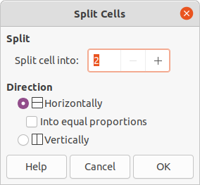
Split Cells – splits a selected cell into multiple cells either horizontally, in equal proportions, or vertically. Make sure that the cursor is positioned in the cell for splitting, then click on Split Cells to open the Split Cells dialog (Figure 43).
Alternatively, right-click on the selected cell and select Split Cells from the context menu, or go to Format > Table > Split Cells on the Menu bar.
In the Split Cells dialog, select the number of cells required when splitting a cell and whether to split the cell Horizontally or Vertically. When splitting horizontally, the selected cells can be split using Into equal proportions to create cells of equal size. The contents of the split cell are kept in the original cell (left or top cell).
Figure 43: Split Cells dialog
Optimize – evenly distributes the selected rows and columns in a table either horizontally or vertically. Selecting Optimize opens the Optimize toolbar (Figure 44) and contains the following tools. Alternatively, right-click in selected cells and select from the context menu the appropriate Optimize tool.
Minimal Column Width – defines the minimal column width for selected columns and depends on the shortest entry within a column.
Minimal Row Height – determines the minimal row height for selected rows and depends on the font size of the smallest character in the row.
Optimal Column Width – defines the optimal column width for selected columns and depends on the longest entry within a column.
Figure 44: Optimize toolbar

Optimal Row Height – determines the optimal row height for selected rows and depends on the font size of the largest character in the row.
Distribute Columns Evenly – adjusts the width of the selected columns to match the width of the widest column in the selection. The total width of the table cannot exceed the width of the page.
Distribute Rows Equally – adjusts the height of the selected rows to match the height of the tallest row in the selection.
Align Top, Center Vertically, Align Bottom – selects vertical alignment of text in selected cells.
Alternatively, right-click in selected cells and select Align from the context menu or go to Format > Align Text on the Menu bar, then select the required alignment.
Insert Row Above, Insert Row Below, Insert Column Before, Insert Column After – select a row or column then click on one of these tool to insert a row or column.
Alternatively, right-click in a selected cell and select Insert from the context menu, then select one of the insert options from the second context menu.
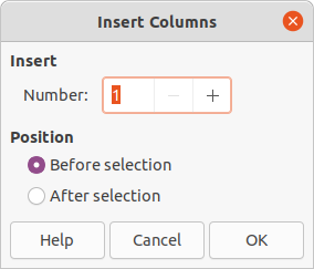
Alternatively, go to Format > Table > Insert Rows or Insert Columns on the Menu bar to open the Insert Row dialog (Figure 45) or Insert Column dialog (Figure 46). Select number of rows or columns and the insertion position then click OK to insert.
Figure 45: Insert Rows dialog
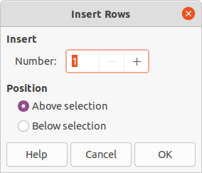
Figure 46: Insert Columns dialog
Delete Row, Delete Column, Delete Table – after selecting a cell, clicking on these tools deletes a single row, a single column, or the complete table. To delete more than one row or column, highlight cells across the number of rows or columns as required, then click on Delete Row or Delete Column.
Alternatively, right-click in the selected cells and select Delete > Delete Row, Delete Column, or Delete Table from the context menu.
Alternatively, after selecting a cell, go to Format > Table on the Menu bar and select Delete Row, Delete Column, or Delete Table from the submenu.
Select Table, Select Column, Select Rows – these tools select a complete table, or columns/rows where cells are selected.
By default these tools are not displayed on the Table toolbar. To display these tools, right‑click in a blank area on the toolbar and select Visible Buttons from the context menu. Click on the tool required from the Visible Buttons list to add it to the toolbar.
Table Design – click on this tool to open the Table Design panel in the Properties deck on the Sidebar. See “Sidebar Table Design panel” for more information.
Table Properties – click on this tool to open the Table Properties dialog.
Figure 47: Table Properties dialog - Font page
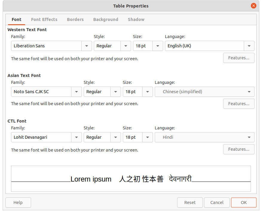
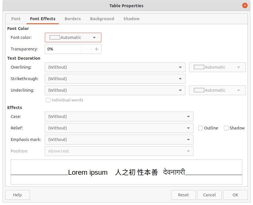
Figure 48: Table Properties dialog - Font Effects page
The Table Properties dialog (Figure 47) has five tabbed pages that provide formatting options for Font, Font Effects, Borders, Background, and Shadow. The Table Properties dialog is opened using one of the following methods:
Right-click in a table and select Table Properties from the context menu.
Go to Format > Table > Properties on the Menu bar.
Click on Table Properties in the Table toolbar.
The formatting options available on each dialog page are as follows:
Font (Figure 47) – select Family, Typeface or Style (Italic, Bold, etc.), Size and Language for text in the table. A sample of the font selected is displayed in the preview box. See “Fonts” for more information.
Font Effects (Figure 48) – select the required Font Color, Text Decoration and Effects for the text in the table. A sample of the font effects applied to the text is displayed in the preview box. See “Font Effects” for more information.
Borders (Figure 49) – select a border configuration from the options available in Line Arrangement, Line, and Padding. Refer to Chapter 6, Formatting Graphic Objects for more information.
Figure 49: Table Properties dialog - Borders page
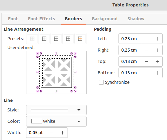
Figure 50: Table Properties dialog - Background page
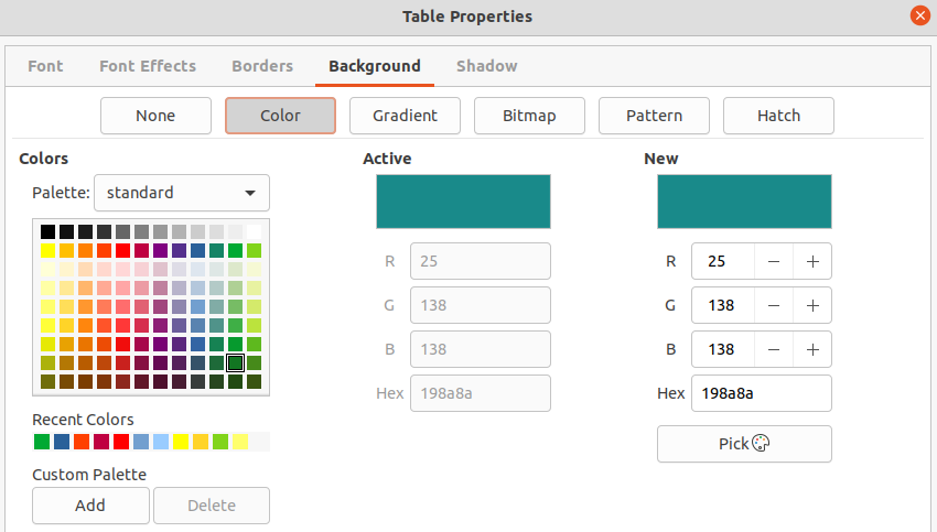
Background (Figure 50) – select a background (area fill) from None, Color, Gradient, Hatching, Bitmap or Pattern. The options available change to match the background selected. This page provides the same functions as Area Style/Filling on the Table toolbar. Refer to Chapter 6, Formatting Graphic Objects for more information.
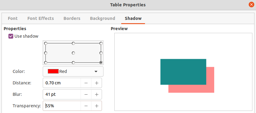
Shadow (Figure 51) – shadows can be added to a table. The option Use shadow must be selected before the other options can set. Refer to Chapter 6, Formatting Graphic Objects for more information.
Figure 51: Table Properties dialog - Shadow page
Tables are placed into text boxes when created and are treated just like any other graphic object in an Impress presentation. However, only the Position and Size dialog (Figure 11) can be used for tables. See “Position and Size dialog” following methods after selecting the table:
Right-click on the table and select Position and Size from the context menu.
Go to Format > Object and Shape > Position and Size on the Menu bar.
Use the keyboard shortcut F4.
The position of the table text box can also be changed by clicking on the border and dragging to move the table text box to a new position. Also, the table text box size can be changed by clicking and dragging on the selection handles. See “Working with text boxes” for more information.
Note
When the size of a text box containing a table is changed, the table also increases or decreases in size to keep the text box filled with the table.
Fields allow the automatic insertion of text into a slide. Fields are commonly used when creating templates and slide masters. For more information, see Chapter 2, Slide Masters, Styles, and Templates.
Insert a field into a slide as follows:
1) Select the slide so that it appears in the Workspace.
2) Go to Insert > Field on the Menu bar and select the type of field from the options in the submenu. The field is placed centrally on the selected slide in a text box.
3) If necessary, position and resize the field text box. See “Working with text boxes” for more information.
4) If necessary, format the text used for the field information. See “Formatting text” for more information.
The types of field available are as follows:
Date (fixed) – inserts the current date into a slide as a fixed field. The date is not automatically updated. Available date formats depends on the language setting in Tools > Options > Language Settings > Language. Right-click on the date field and select the required date format from the context menu.
Date (variable) – inserts the current date into a slide as a variable field. The date is automatically updated each time the file is opened. Available date formats depends on the language setting in Tools > Options > Language Settings > Language. Right-click on the date field and select the required date format from the context menu.
Time (fixed) – inserts the current time into a slide as a fixed field. The time is not automatically updated. Available time formats depends on the language setting in Tools > Options > Language Settings > Language. Right-click on the time field and select the required time format from the context menu.
Time (variable) – inserts the current time into a slide as a variable field. The time is automatically updated each time the file is opened. Available time formats depends on the language setting in Tools > Options > Language Settings > Language. Right-click on the time field and select the required time format from the context menu.
Author – inserts the first and last names of the author of the presentation. This information is taken from values entered in the LibreOffice user data. To modify this information go to Tools > Options > LibreOffice > User Data.
Slide Number – inserts the slide number into the current slide. Alternatively, go to Format > Slide Number on the Menu bar. To add a slide number to every slide, go to View > Master Slide on the Menu bar and insert the slide number field on the master slide.
Slide Title – inserts the slide title. The default slide name is Slide # if the slide has not been renamed.
Slide Count – inserts the total number of slides in the presentation.
File Name – inserts the name of the file used for the presentation. The file name only appears after the file has been saved.
When inserting text that can be used as a hyperlink, such as a website address or URL, Impress formats it automatically, creating a hyperlink, and applying color and underlining. If default settings are not being used in Impress, then the hyperlink has to be inserted manually.
Tip
To prevent automatically turning website addresses or URLs into hyperlinks, go to Tools > AutoCorrect Options > Options and deselect URL Recognition.
Tip
To change the color of hyperlinks, go to Tools > Options > LibreOffice > Application Colors, scroll to Unvisited links and/or Visited links. Select the checkboxes, then select new colors from the color palettes for the links and click OK. Note that this color change changes the color for all hyperlinks across all components of LibreOffice.
1) Select the slide where the hyperlink is going to be inserted.
2) Go to Insert > Hyperlinks on the Menu bar or use the keyboard shortcut Ctrl+K to open the Hyperlink dialog (Figure 52).
3) On the left hand side, select the type of hyperlink for insertion.
The top right part of the dialog changes depending on the hyperlink type. A full description of all options, and their interactions, is beyond the scope of this chapter. A summary of the most common choices used in a presentation is given below.
4) Create the hyperlink using the Hyperlink dialog, then click Apply to insert the hyperlink into the slide. The hyperlink is inserted into a text box.
5) Click Close or OK to close the dialog.
Internet (Figure 52) – select either Web or FTP protocol. Enter the required web address in the URL text box and a name for the hyperlink in the Text text box.
Mail (Figure 53) – enter email details in Recipient and the subject of the link in Subject.
Document (Figure 54) – creates a hyperlink to another document or to another place in a document, commonly referred to as a bookmark. Enter the details in the Path text box, or click on Open File to open a file browser. Leave this blank if the link is to a target in the same presentation.
Optionally, specify a target, for example a specific slide. Click on Target in Document to open a dialog where a target can be selected. If the name of the target is known, type it into the Target text box.
New Document (Figure 55) – creates a hyperlink to a new document. Select Edit now to edit the newly created document immediately or Edit later to only create the hyperlink. Choose the type of document to create from the File type drop-down list. Click on Select path to open a file browser so that a directory is selected for the new document.
Further Settings – this section in the Hyperlink dialog is common to all the hyperlink types, although some choices are more relevant to some types of links.
Frame – set the value to determine how the hyperlink opens. This applies to documents that open in a web browser.
Form – specifies if the link is to be presented as text or as a button.
Text – specifies the text that will be visible to the user.
Name – applicable to HTML documents. It specifies text that will be added as a NAME attribute in the HTML code behind the hyperlink.
Figure 52: Hyperlink dialog - Internet page
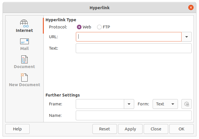
Figure 53: Hyperlink dialog - Mail page
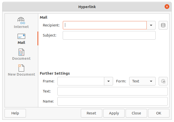
Figure 54: Hyperlink dialog - Document page
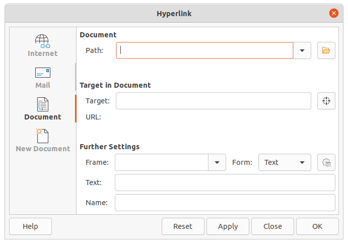
Figure 55: Hyperlink dialog – New Document page
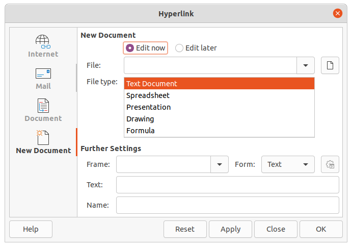
A hyperlink is inserted in the center of the current slide. To edit the text, the size of a hyperlink text box, or to reposition the hyperlink on the slide:
1) Select the hyperlink by dragging a selection across the text to display the text box border and selection handles. DO NOT click on the hyperlink because this will open the hyperlink.
2) Right-click on the selected hyperlink and select the type of formatting required from the options available in the context menu.
3) To reposition hyperlink, click and drag on the border to move the hyperlink on the slide.
4) Select Position and Size from the context menu or press the F4 key to open the Position and Size dialog where options can be selected to move the hyperlink or resize the text box. See “Working with text boxes” for more information.